Provence
25 years of craftsmanship. A brand that finally showed it.
Provence built a strong reputation over 25 years, but the brand never reflected it: a single logo lockup, no system, no strategy. Since the rebrand, clients and contacts have been reflecting the shift back to the team, the new identity reads as the company Provence actually is.
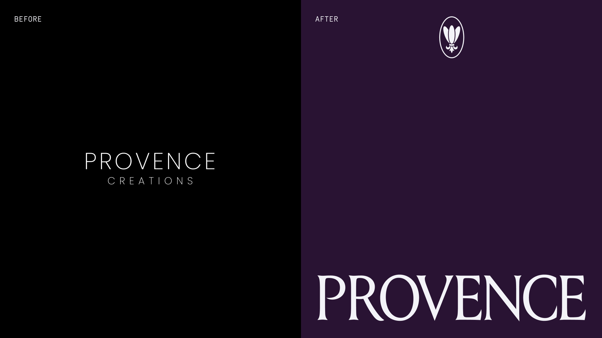
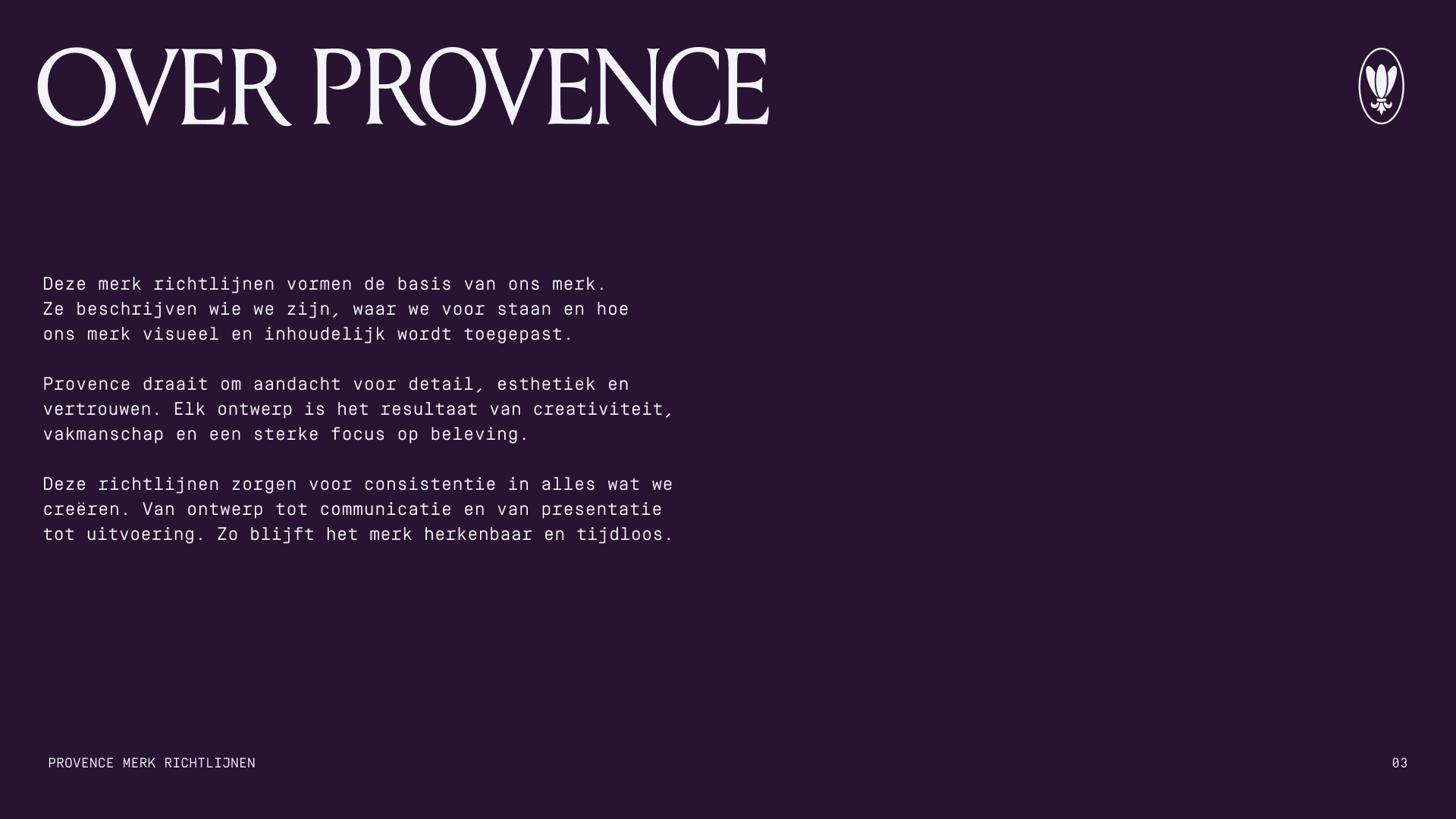
Provence is an interior specialist in Veenendaal, delivering kitchens, bathrooms, and complete interiors. We simplified the name from Provence Creations to Provence, repositioned the company from kitchen supplier to interior partner, and built its first complete brand system in 25 years: strategy, identity, and guidelines made to carry the next 25.
The challenge
Provence has been active for more than 25 years, building a strong reputation through craftsmanship, reliability, and long term client relationships. Despite this experience, the visual identity did not reflect the maturity of the company.
The existing branding consisted mainly of a simple logo lockup without a supporting visual system. It lacked consistency, recognisability, and the flexibility needed to support communication across touch points.
At the same time, the business had evolved beyond kitchens alone. Provence increasingly delivers complete interior solutions, guiding clients from first idea to final execution. The brand needed to reflect this broader role.
The challenge was to create a brand that respected the company’s history while making it relevant for the next 25 years of growth.
The approach
The project began with a strategic brand workshop to define Provence’s positioning, values, and role within the interior market. Together we translated more than two decades of experience into a clear foundation for the brand moving forward.
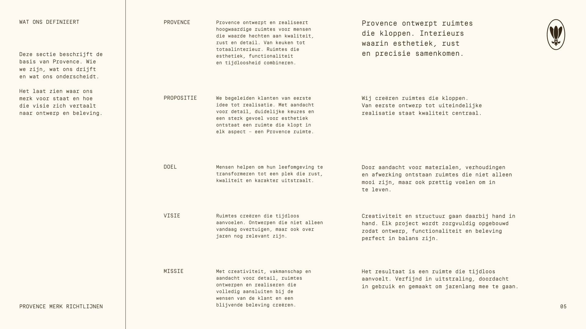
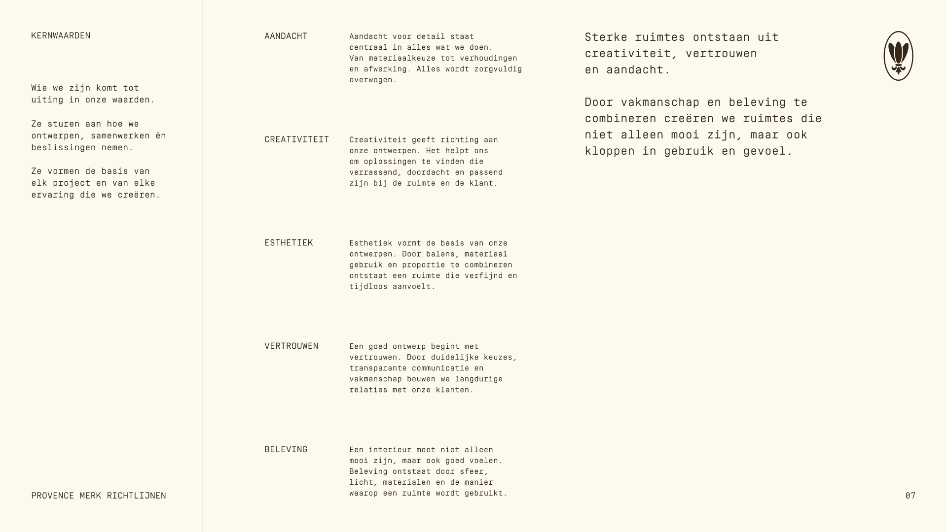
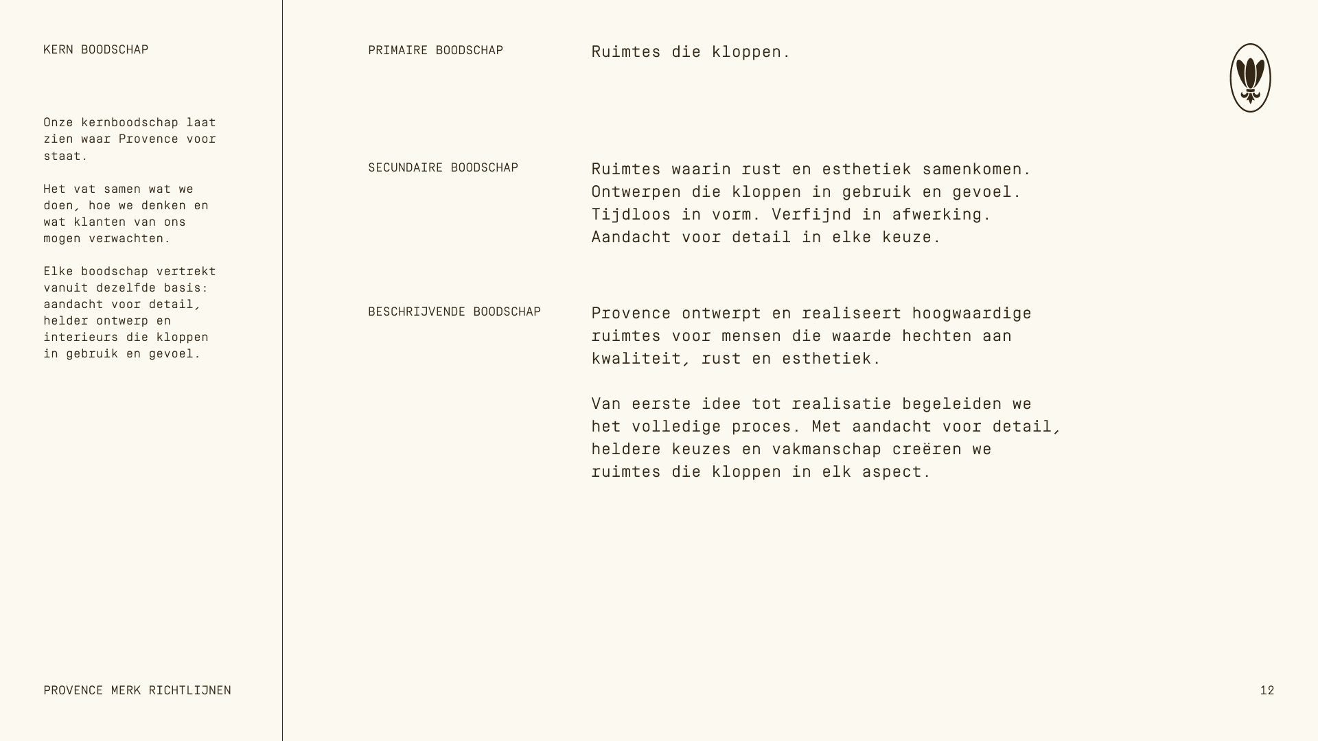
Rather than presenting Provence as a traditional kitchen specialist, the strategy positioned the company as a partner in creating complete interior environments. This repositioning shifted the perception from product supplier to interior specialist. A brand built around trust, craftsmanship, guidance, and cohesion across spaces.
A key step in the process was simplifying the name from Provence Creations to Provence. This change strengthened recognisability and created a more confident and timeless foundation for the identity.
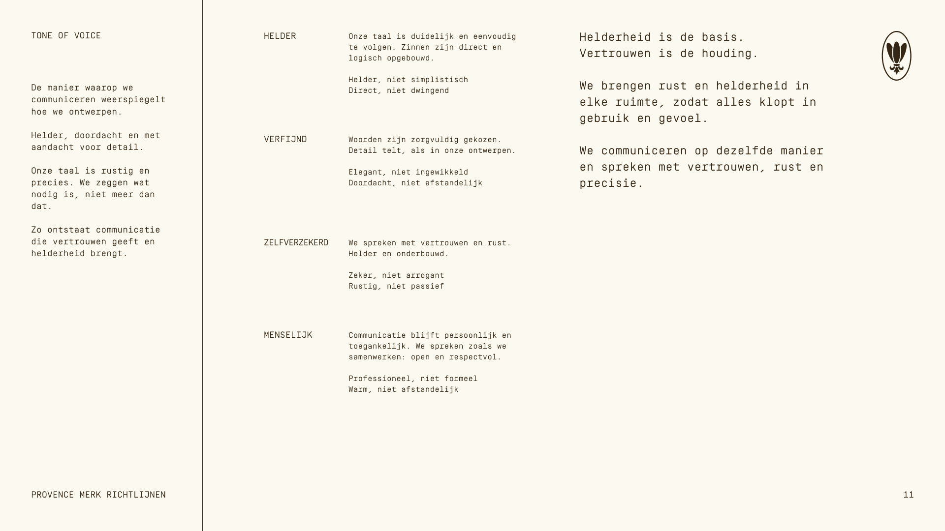
From this strategic base, the visual identity was developed as a calm and structured system inspired by architecture, materials, and the natural character associated with the Provence name.
The solution
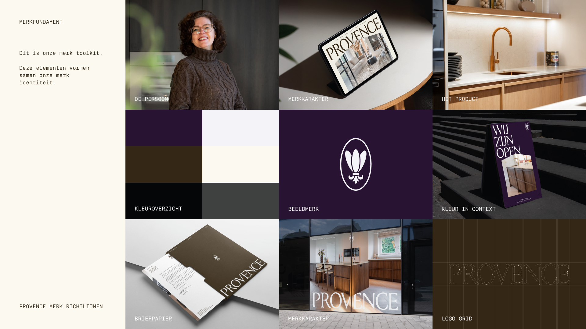
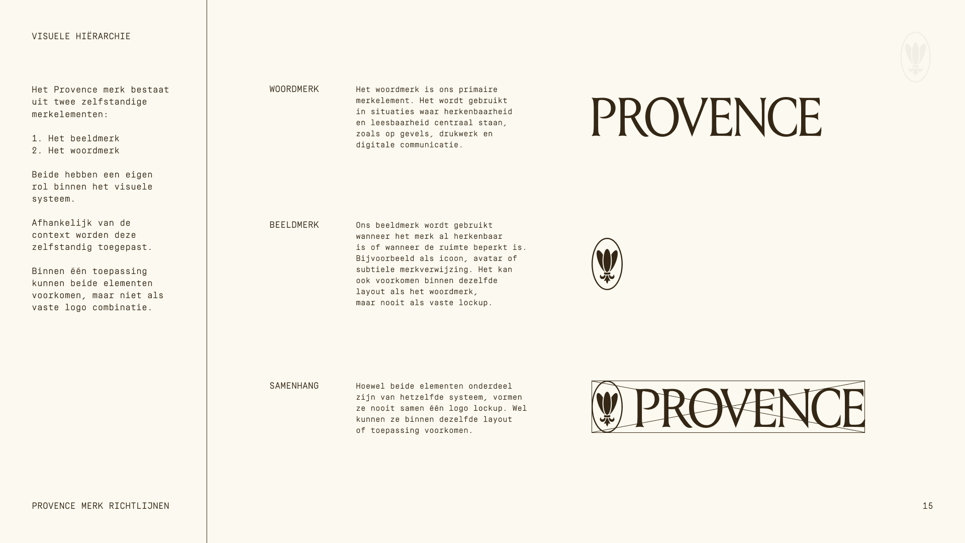
The result is a complete brand identity that transforms Provence from a logo driven business into a recognisable and flexible brand system.
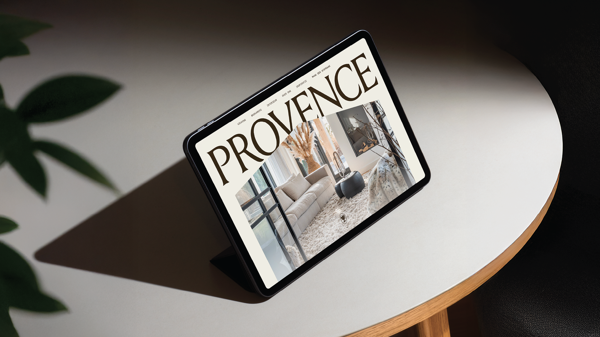
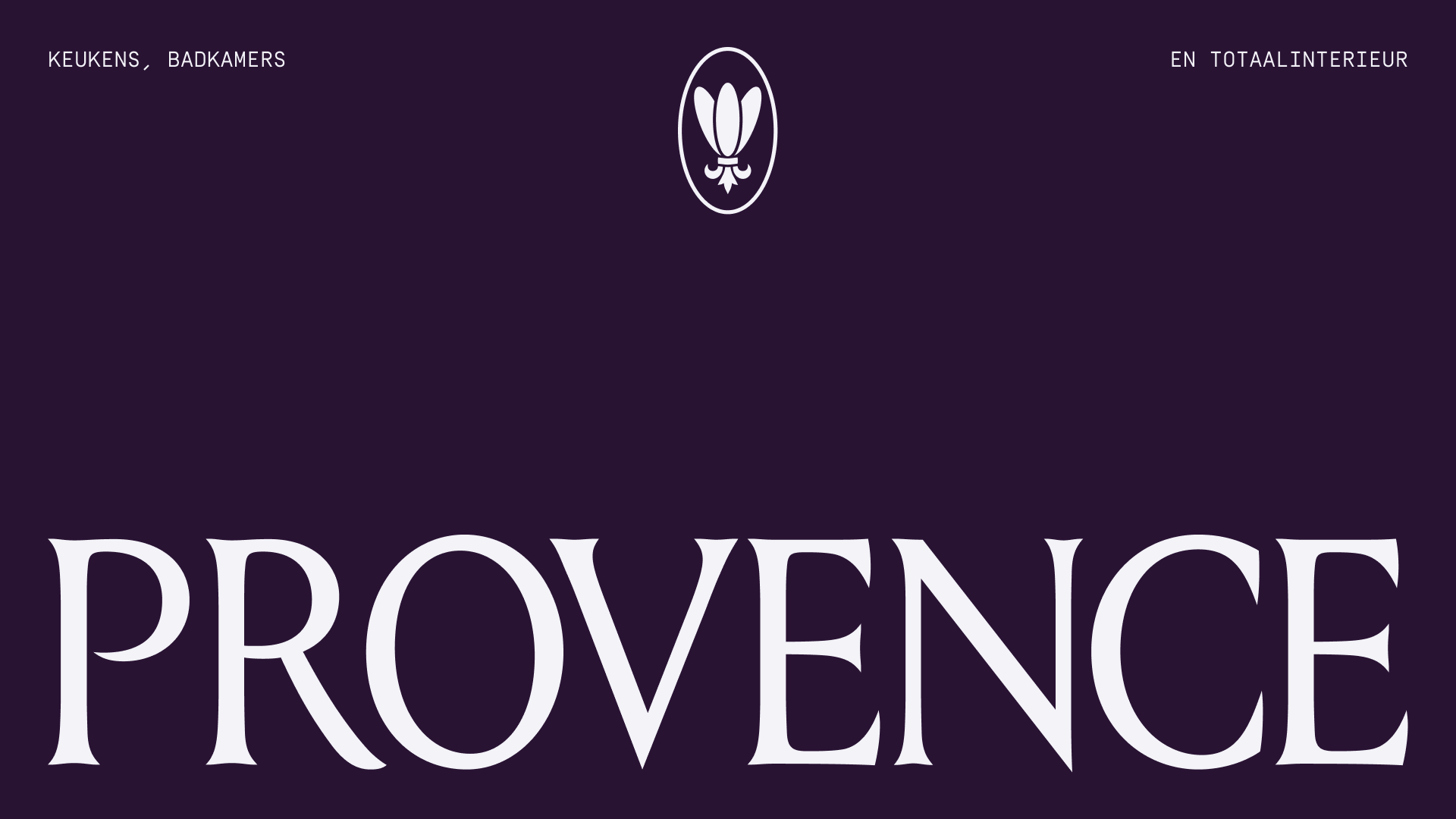
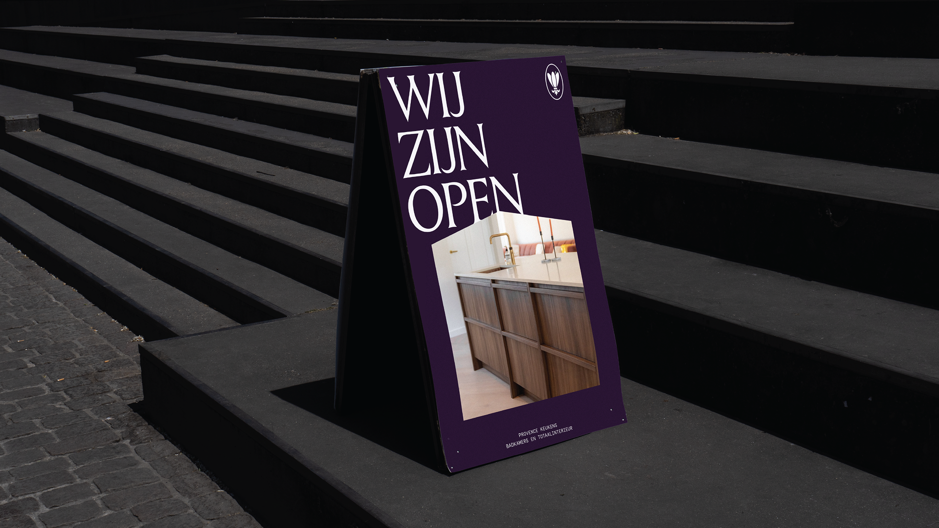
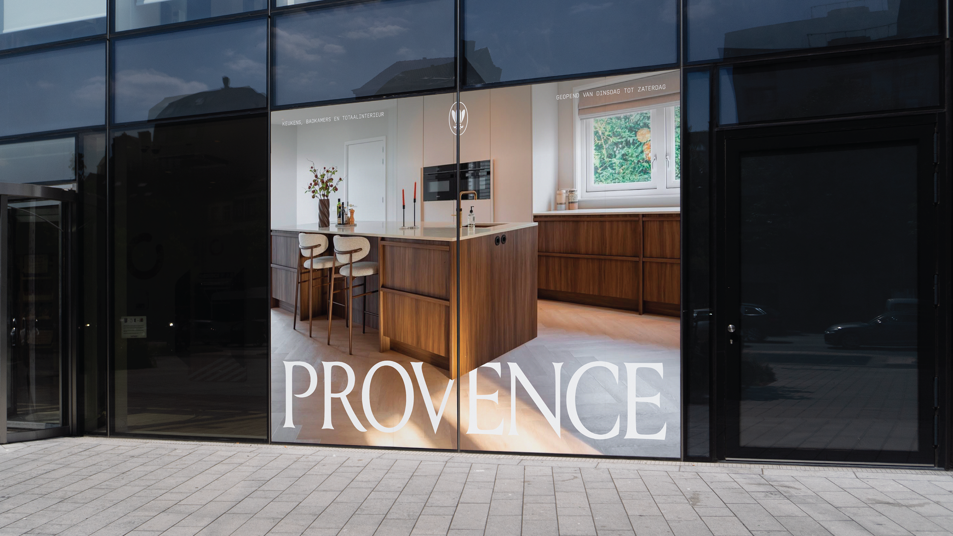
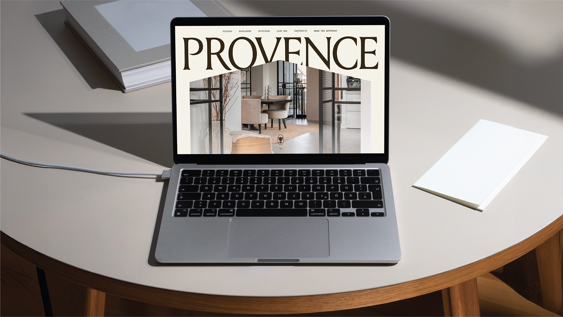
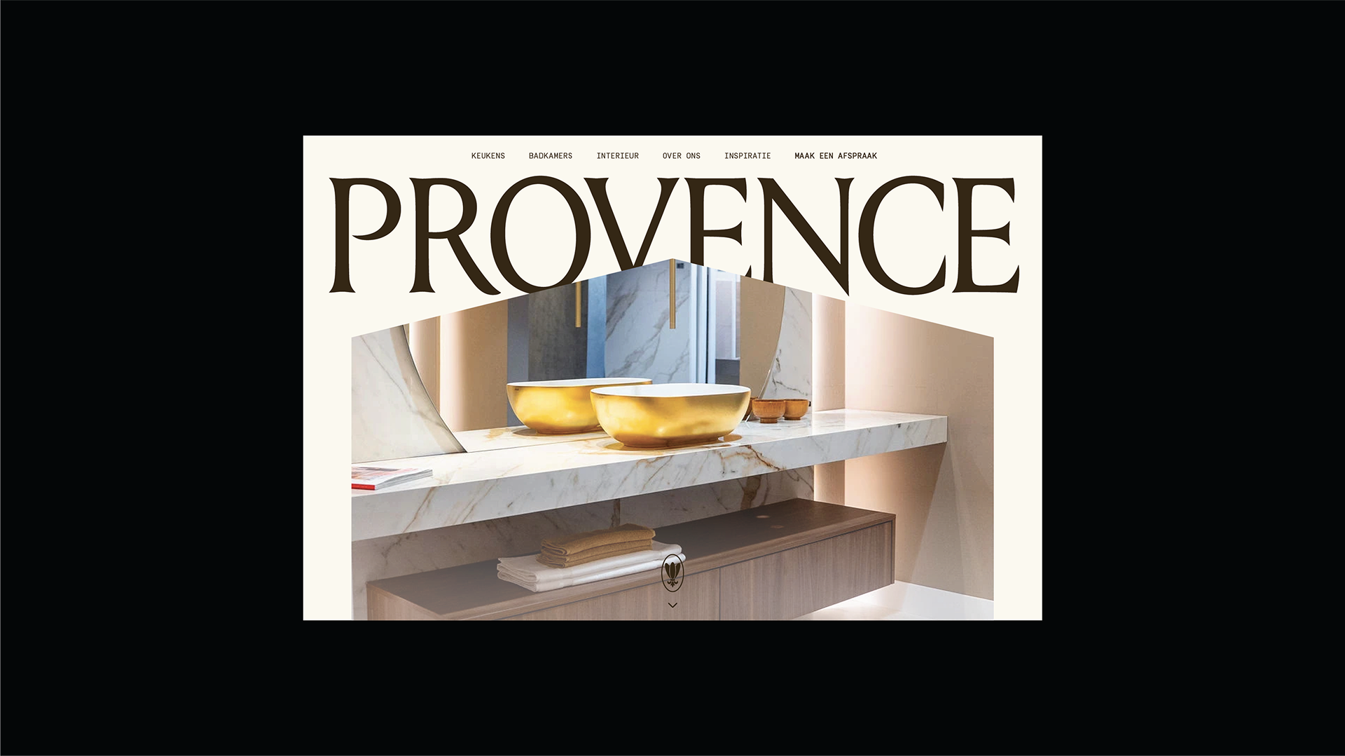
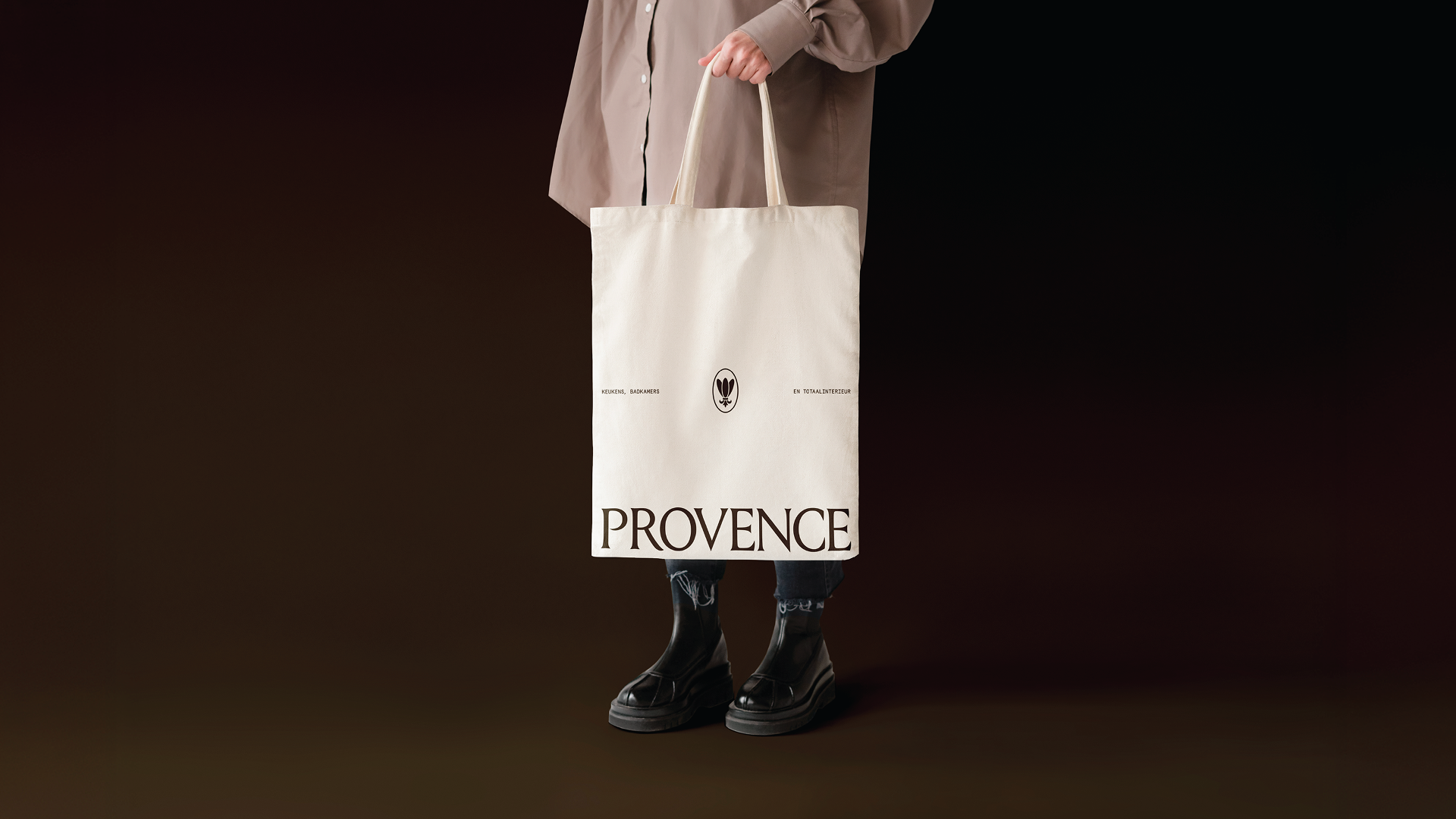
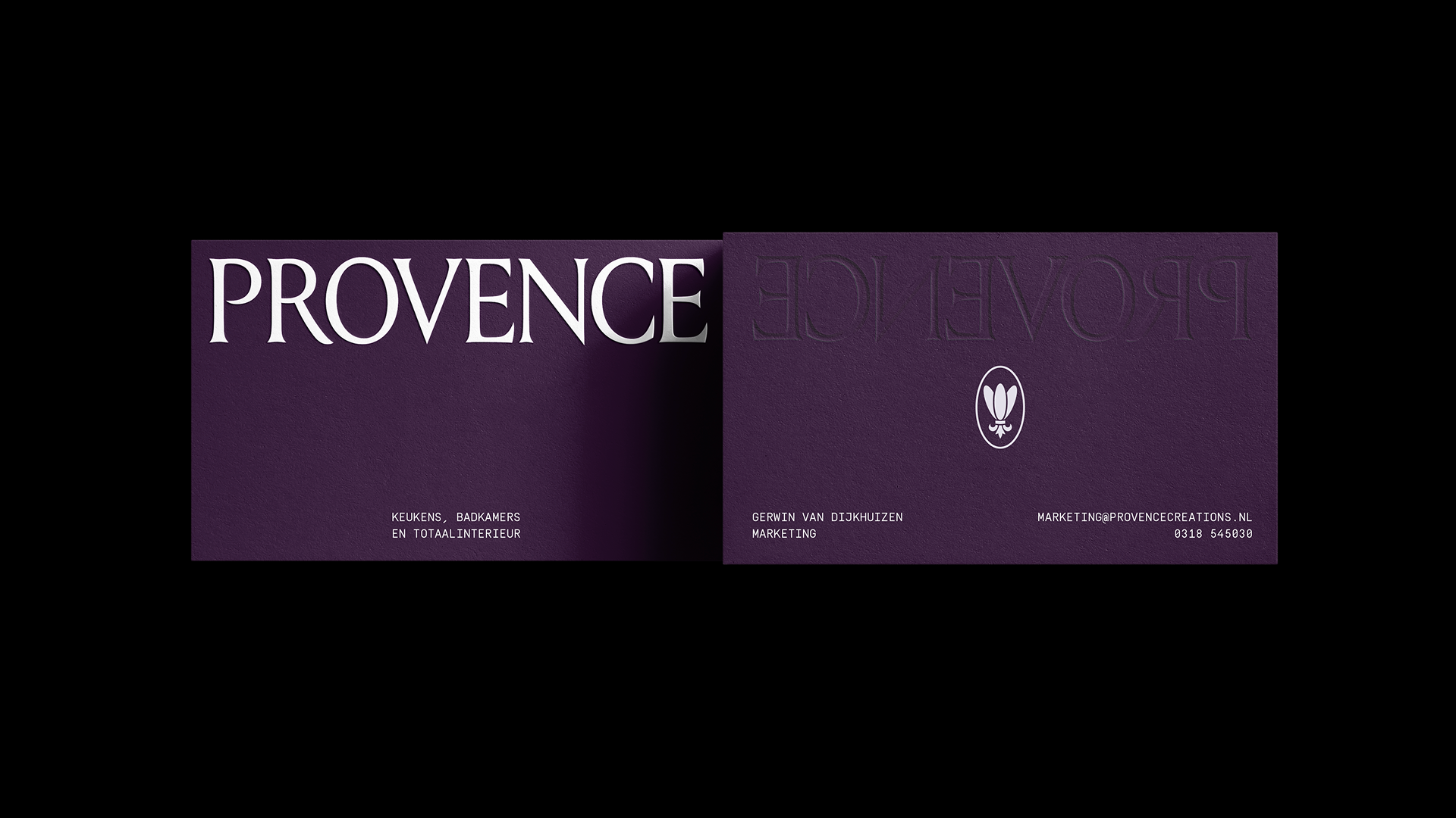
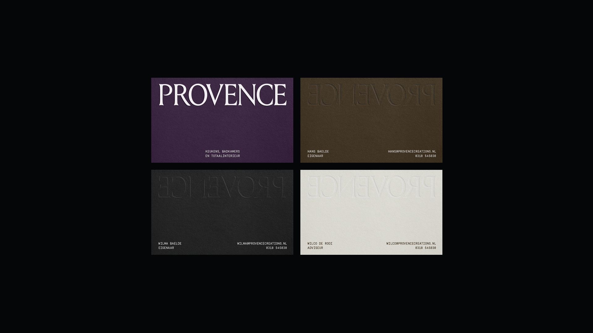
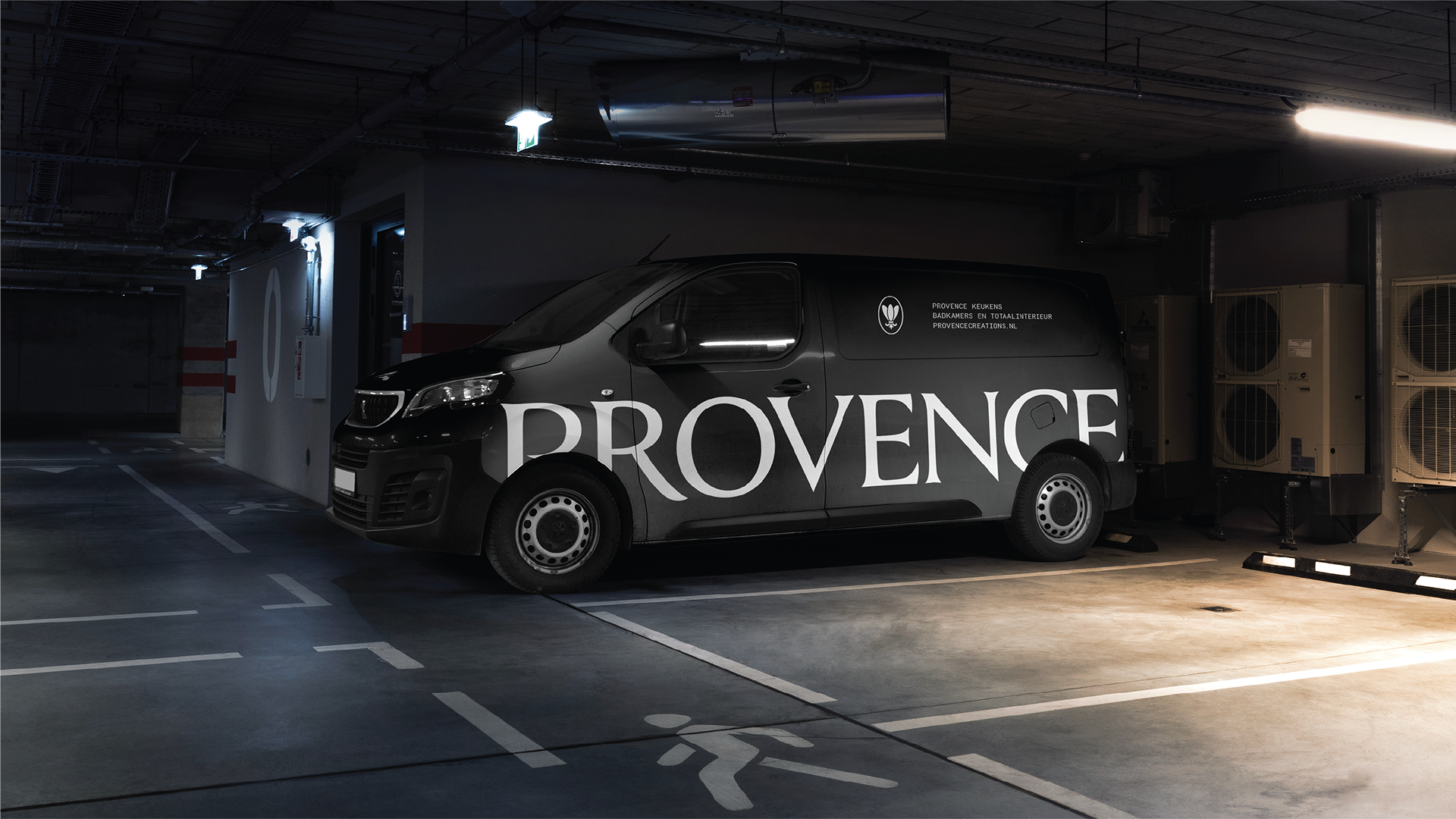
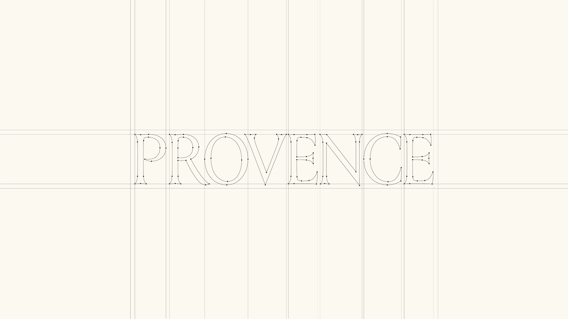
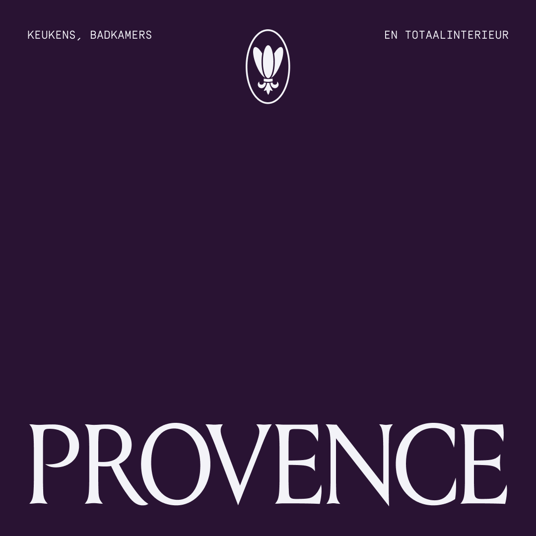
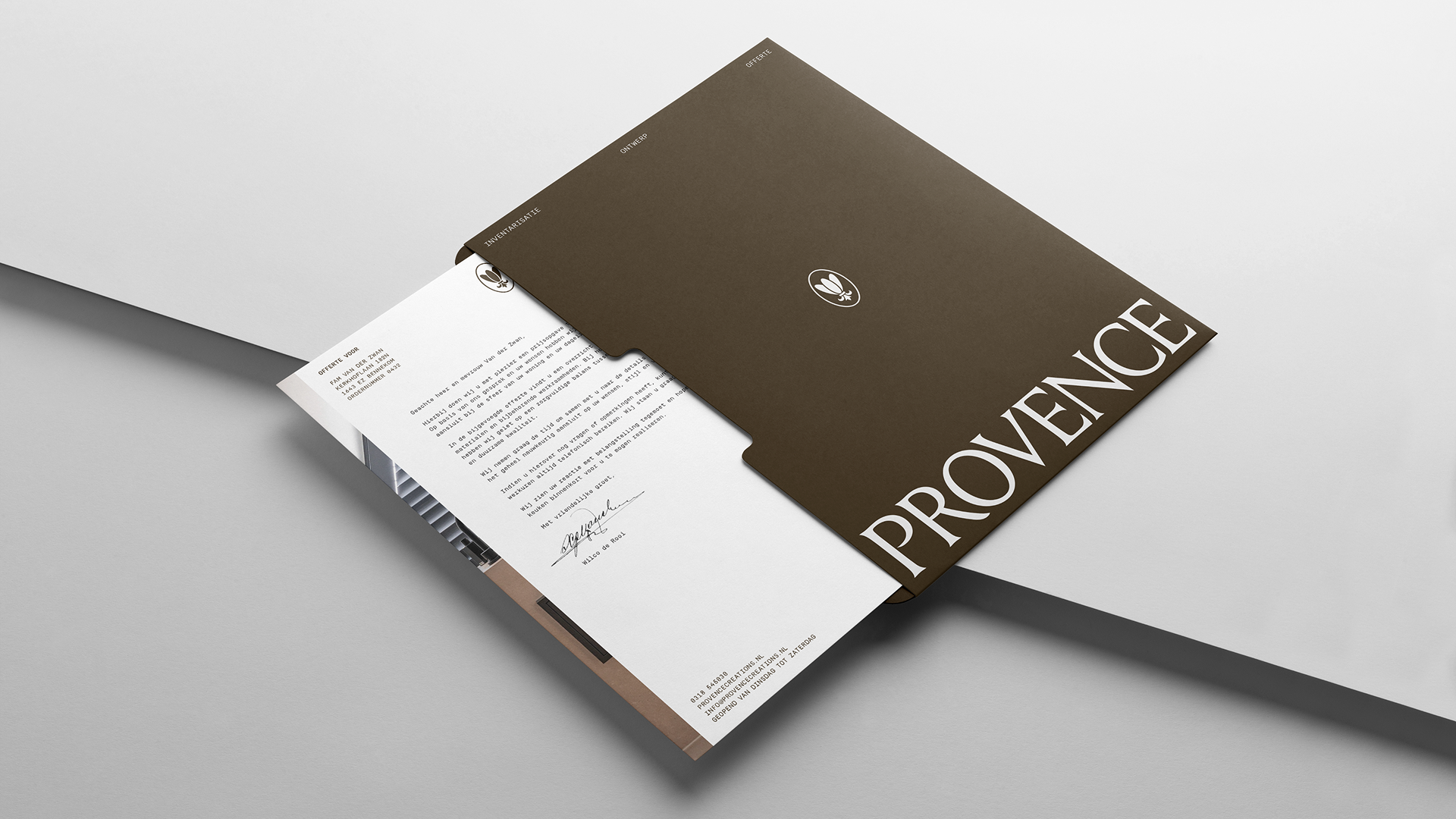
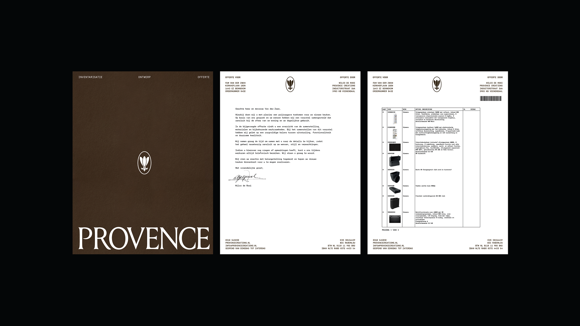
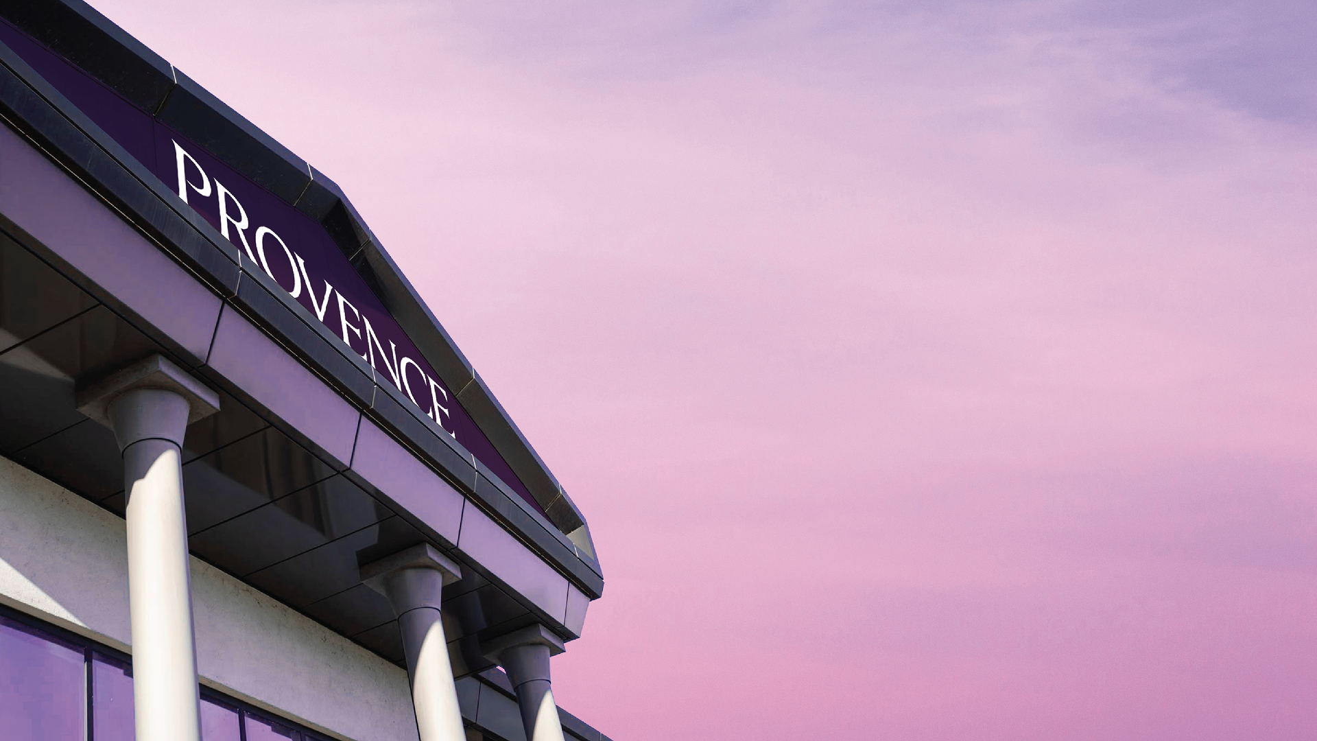
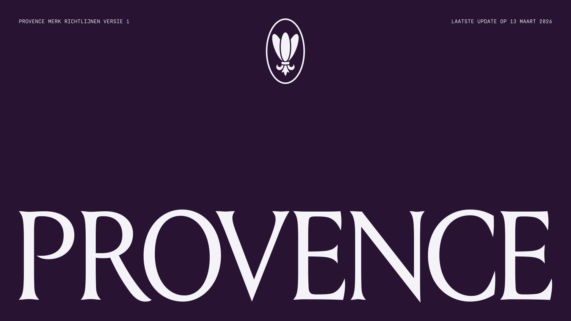
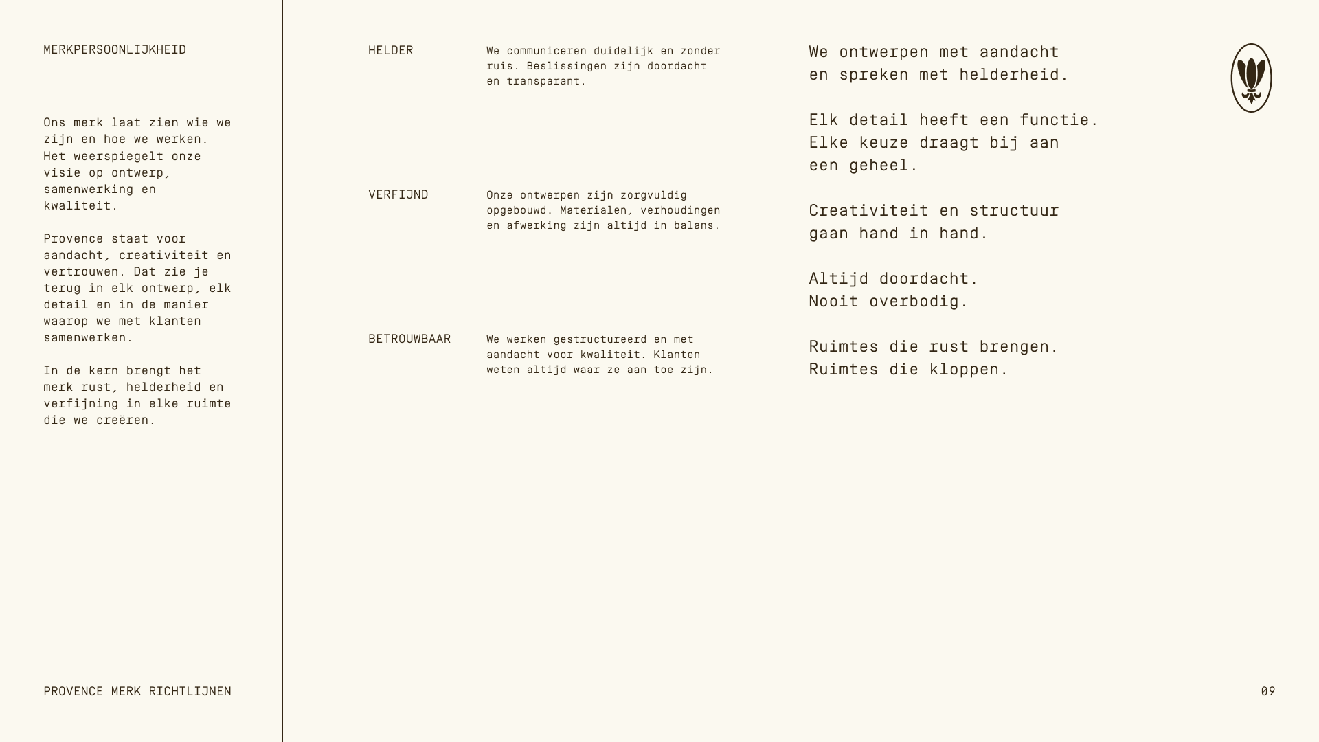
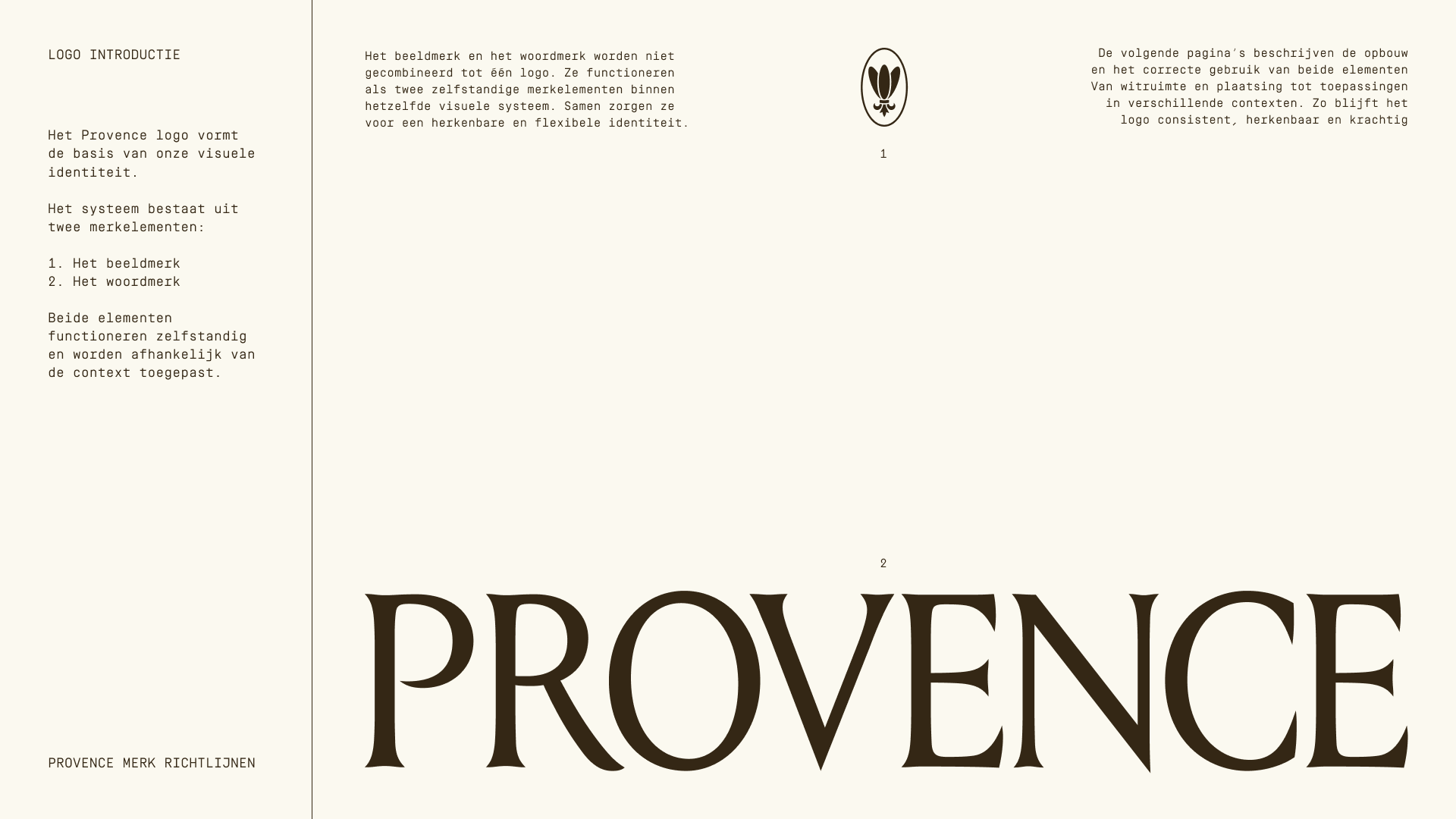
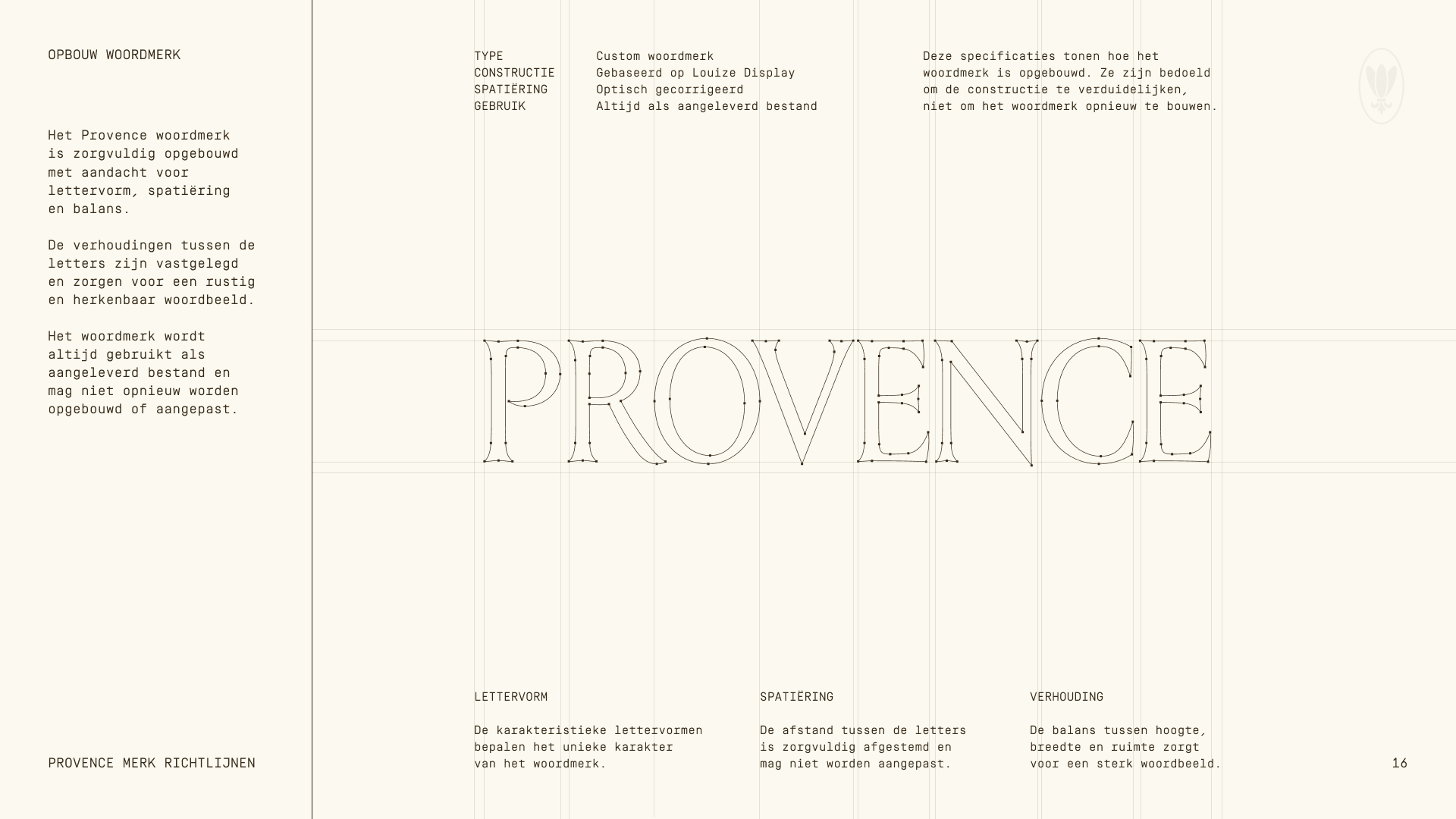
At the centre of the identity sits a refined typographic logo inspired by engraved letterforms and classical proportions. The result introduces a sense of calm authority and timeless craftsmanship while remaining contemporary in application.
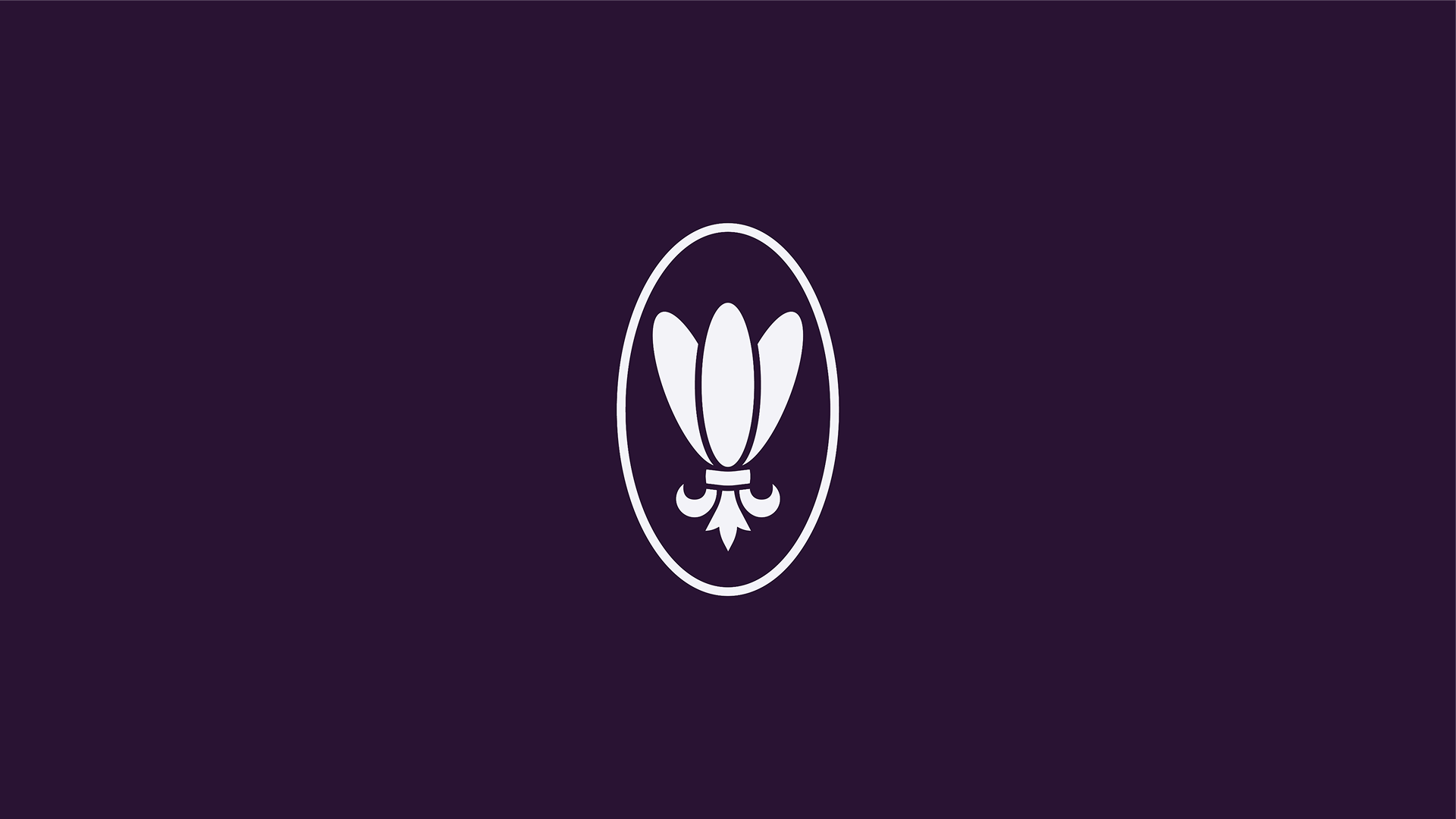
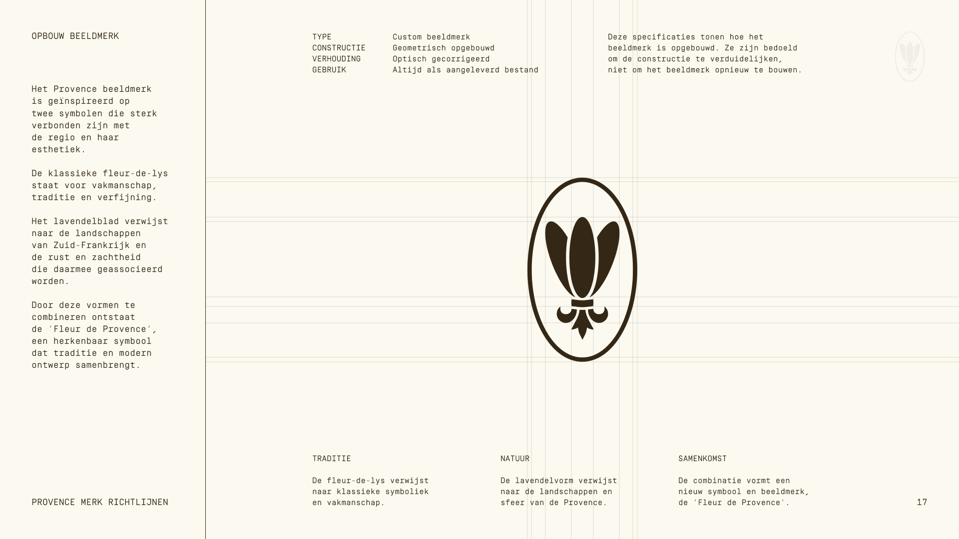
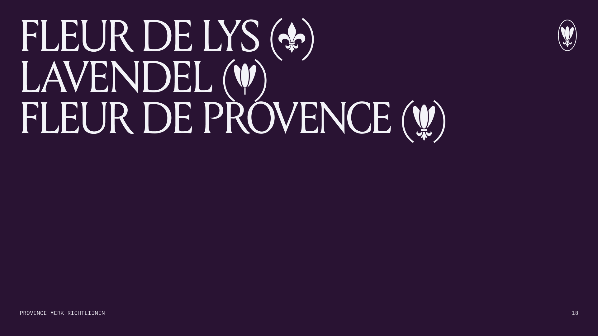
The symbol combines references to the fleur-de-lys and lavender forms associated with the Provence region, creating a distinctive mark that connects heritage with a contemporary interior context.
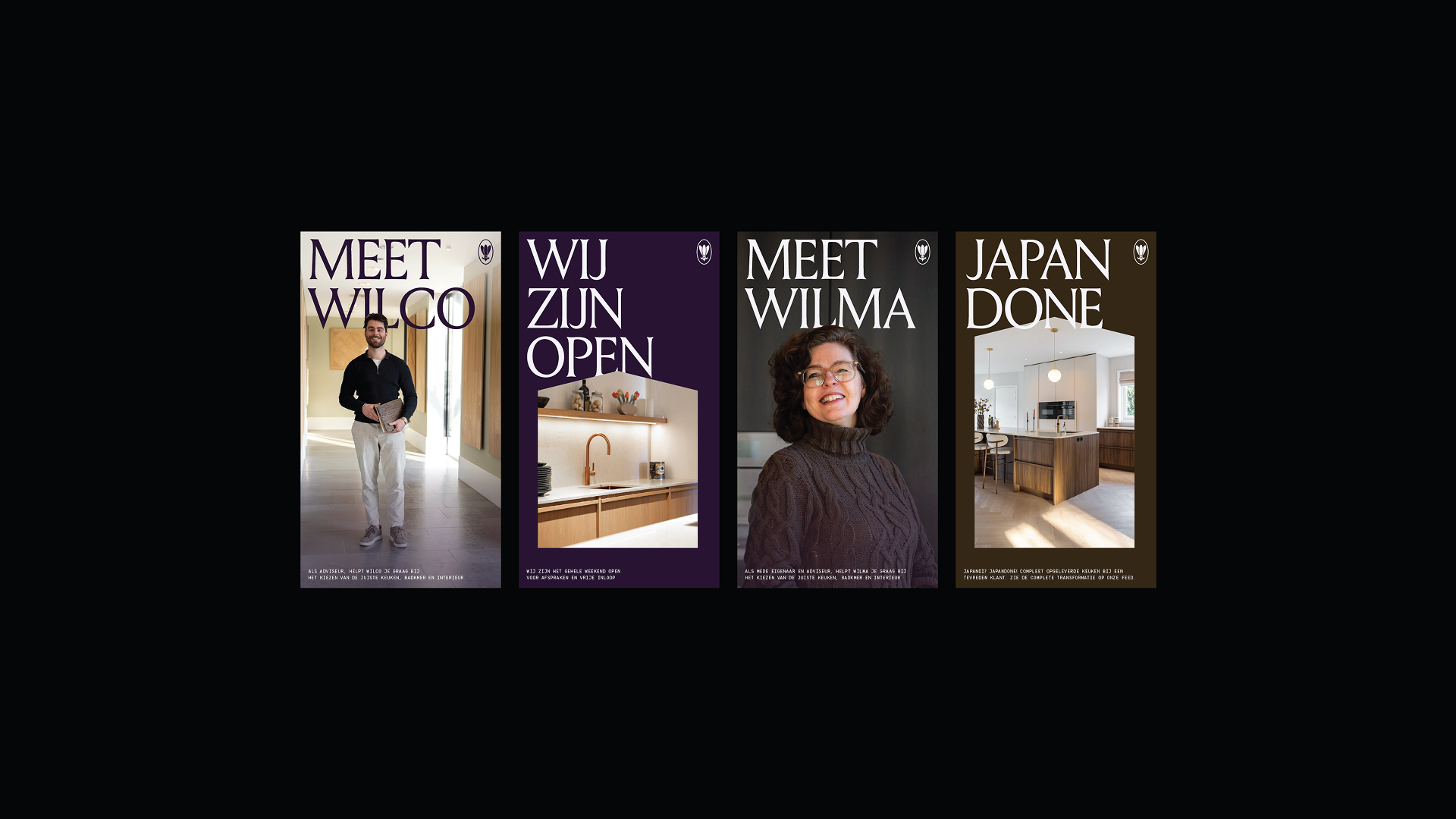
The typography system combines expressive headline letterforms with a precise and structured supporting typeface. This creates a clear hierarchy across communication while reinforcing both elegance and clarity.
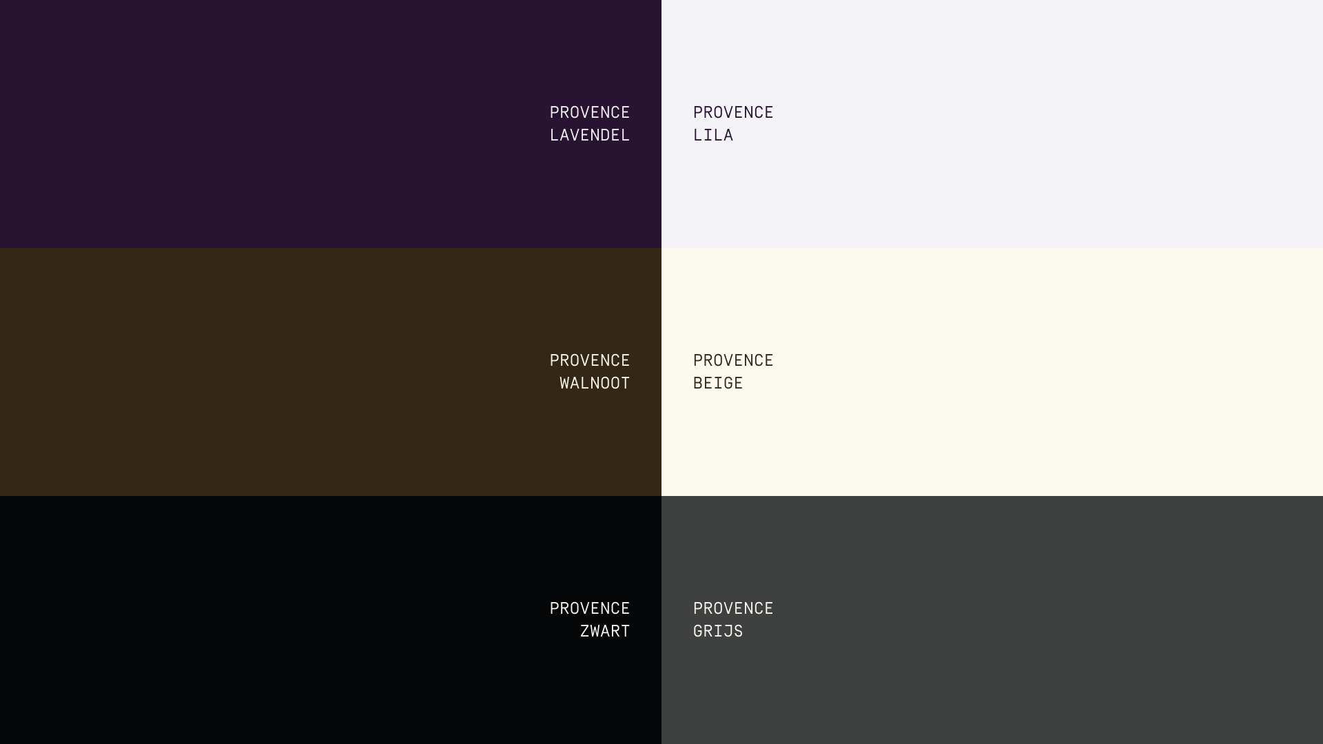
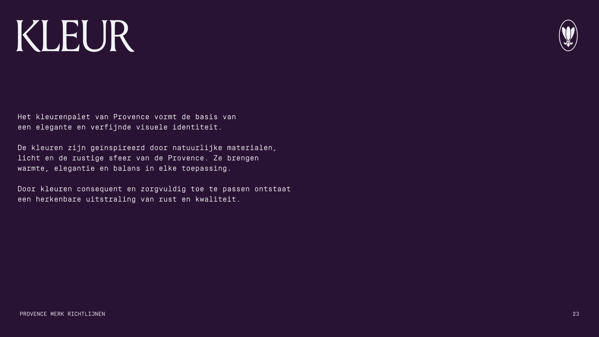
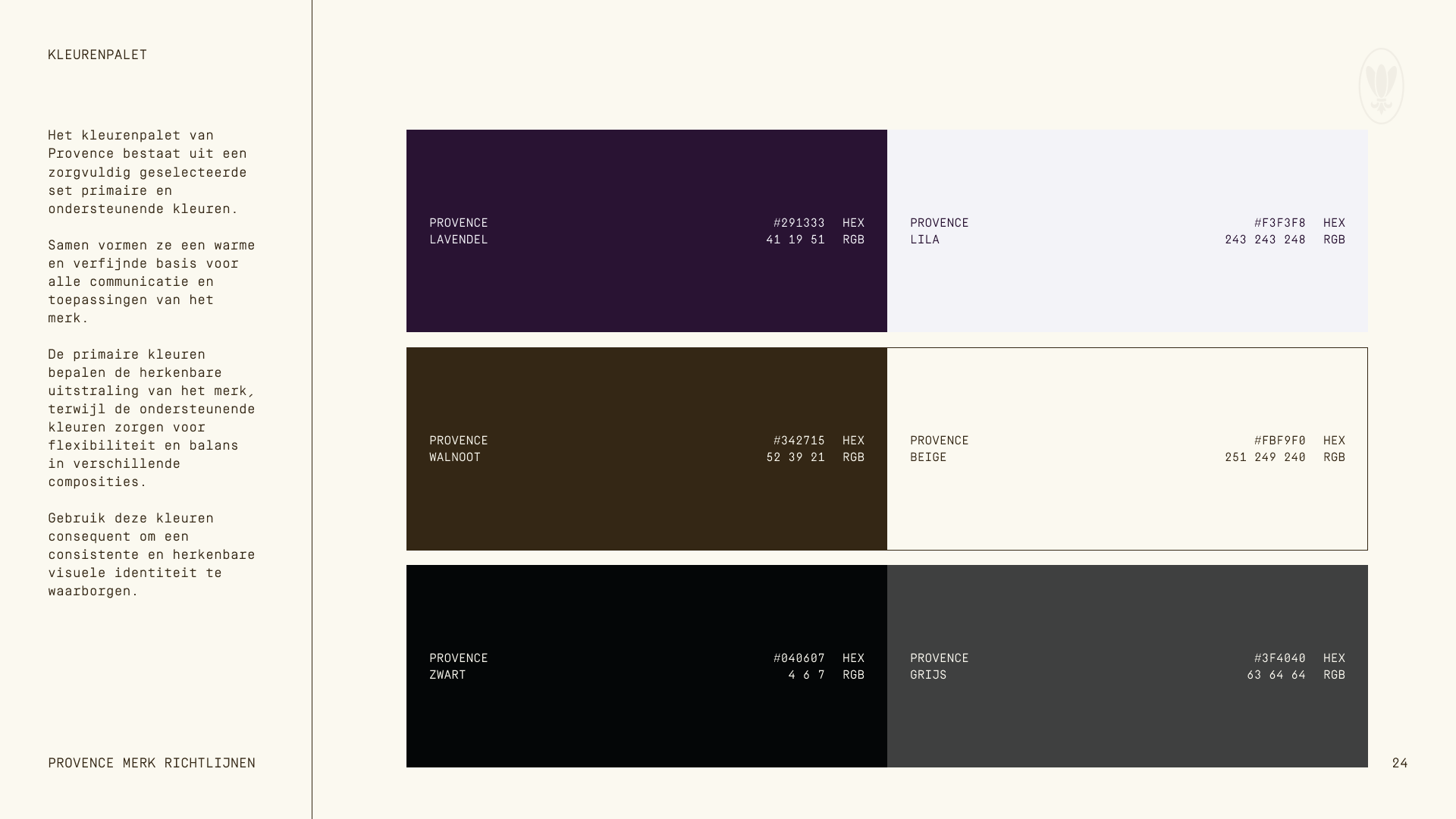
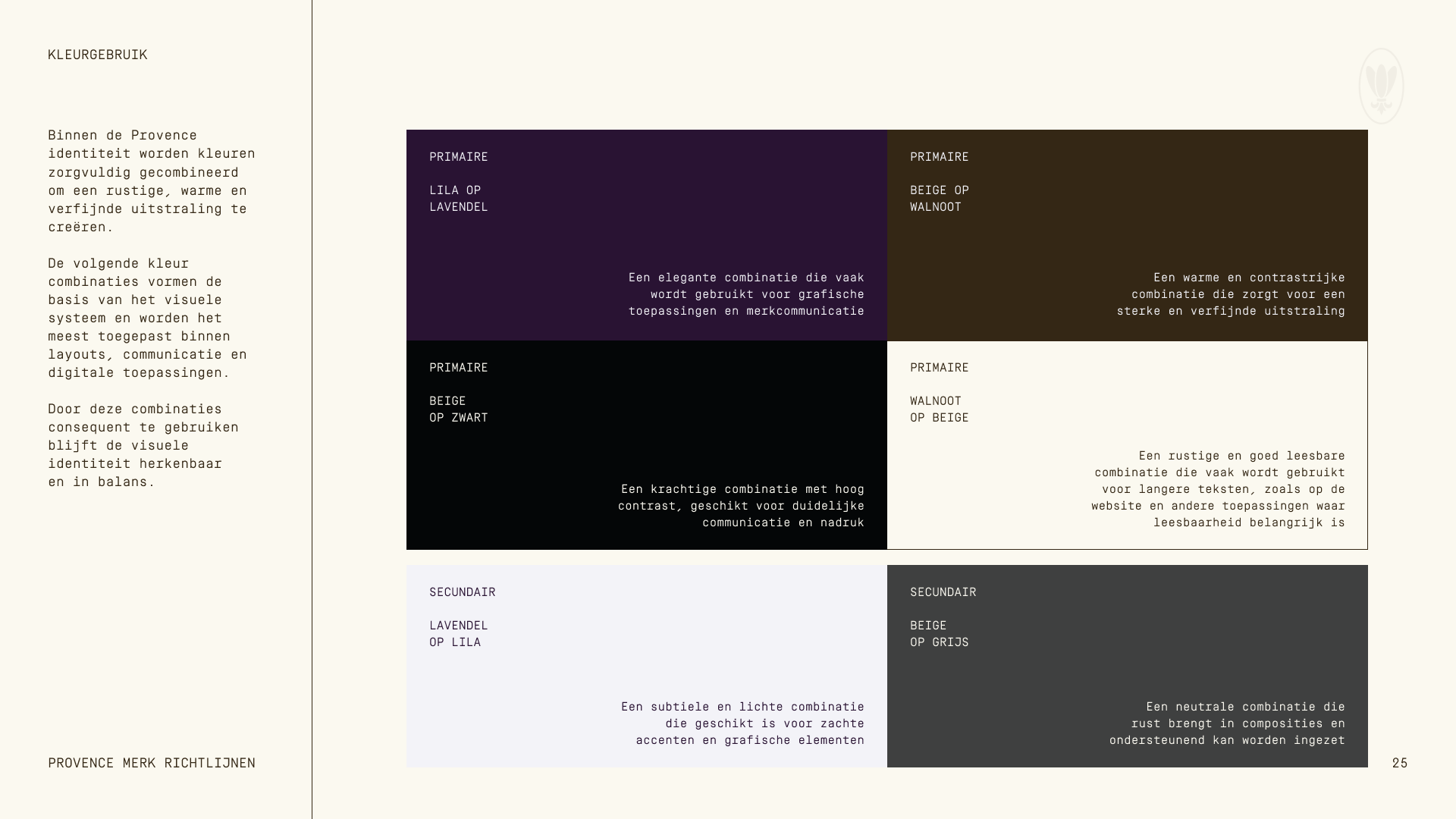
The color palette is inspired by natural materials and lavender tones connected to the Provence name. The result is a calm and recognisable color system that supports hierarchy while reinforcing atmosphere and warmth.
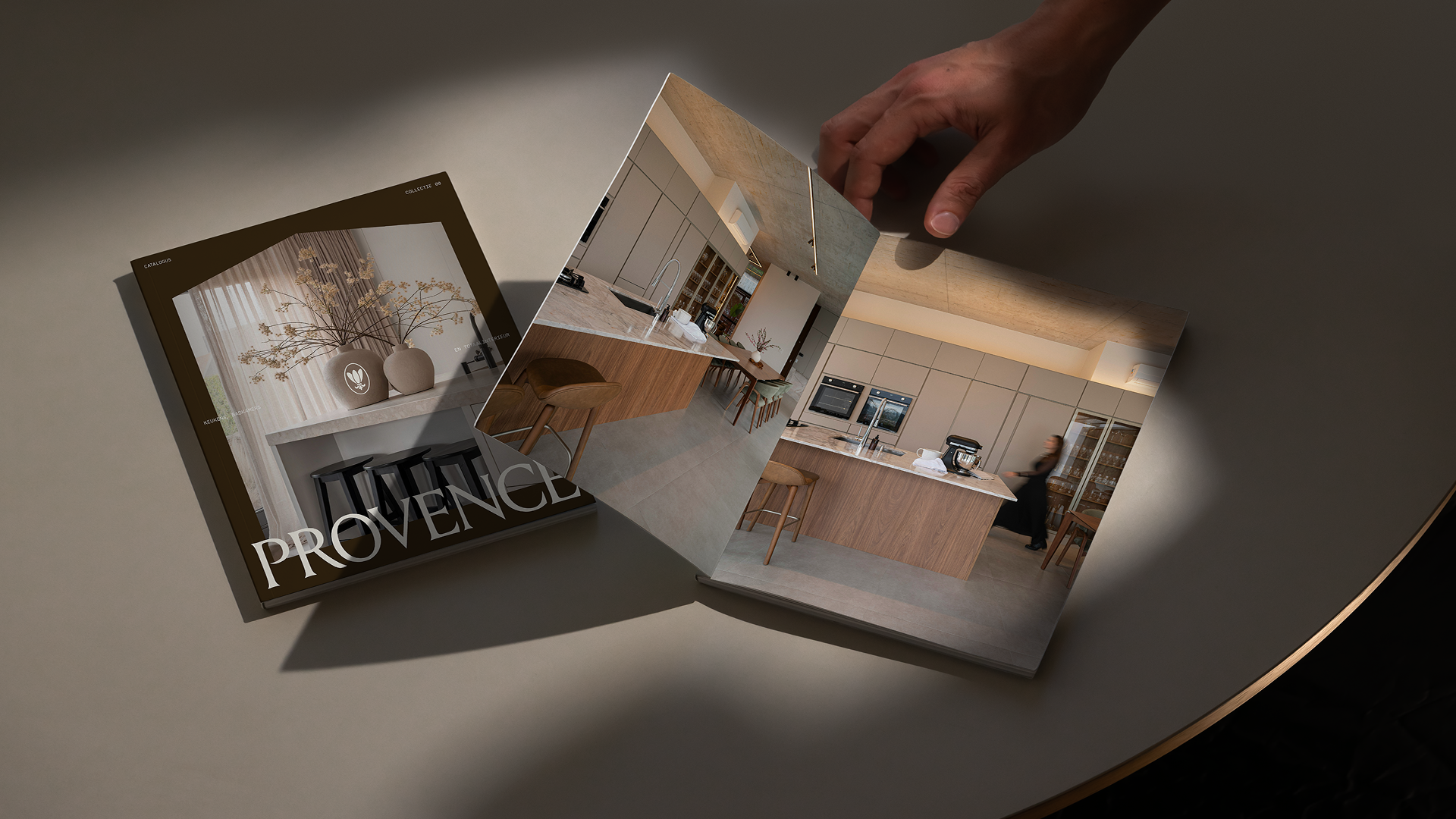
A distinctive graphic element based on the architectural silhouette of the showroom building is used as a framing device across photography and layouts. This creates a subtle but consistent visual signature throughout the identity.
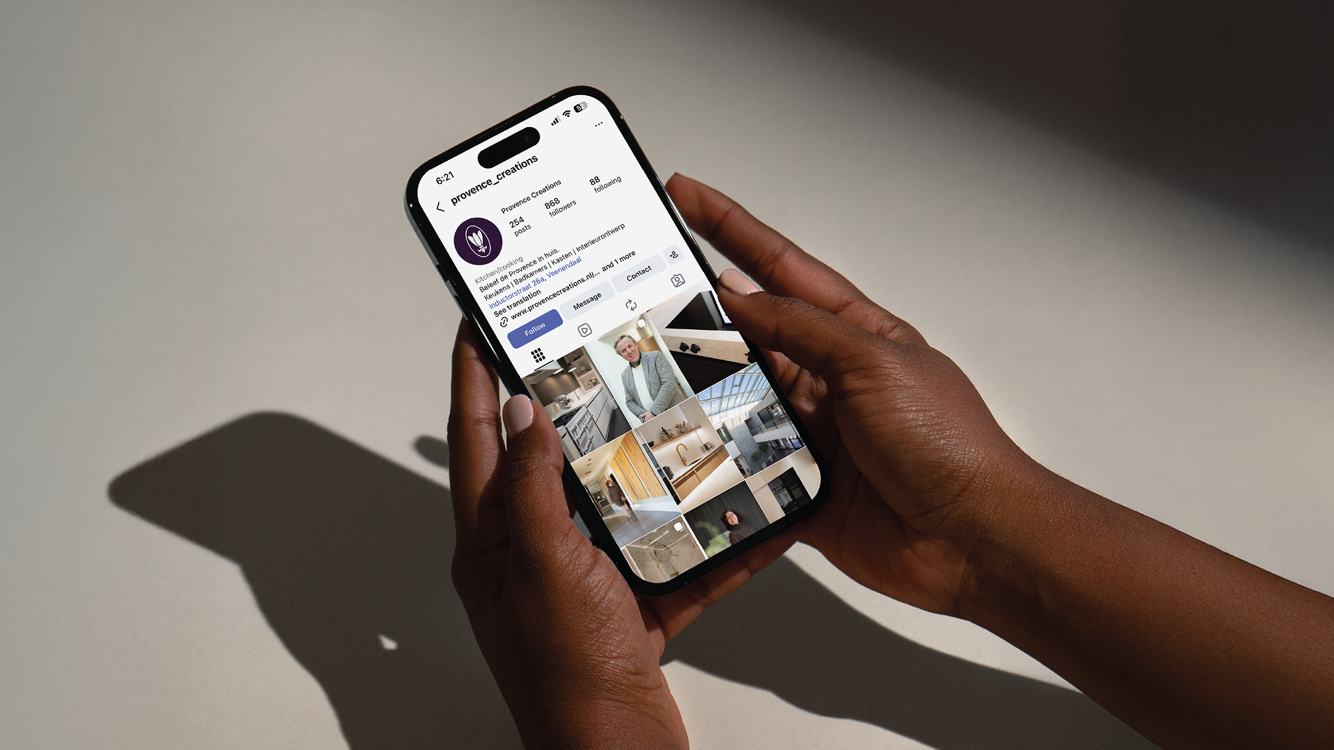
Photography focuses on materials, spatial composition, and lived interiors rather than isolated products. This supports Provence’s positioning as a specialist in complete interior environments instead of individual installations.
Together these elements form a coherent identity system designed to support Provence across showroom communication, print materials, signage, and digital touchpoints.
Impact
The new identity provides Provence with a brand foundation that reflects both its experience and its ambitions.
For the first time in its history, the company now operates with a complete strategy and visual system that supports consistent communication across all channels. The brand better represents the quality of work delivered in kitchens, bathrooms, and full interior projects.
By simplifying the name and introducing a structured identity system, Provence is now positioned as a mature interior specialist rather than a traditional kitchen supplier.
This shift allows Provence to communicate more clearly about complete interior projects instead of individual products, strengthening recognition across touchpoints and supporting long-term brand consistency.
The result is a brand that honours more than 25 years of craftsmanship while creating a strong and recognisable platform for the years ahead.
Read how
Gerwin van Dijkhuizen
experienced our collaboration

Provence had clear goals and a strong internal character. But none of it showed on the outside. A foundation had never been laid to give Provence the base it needed to keep growing.
It's obvious Youri has years of experience as a designer. Not only is he hugely creative and quick to understand where we wanted to go, he also truly mastered the branding process. Through clear planning, tight frameworks and sharp communication, he kept the process moving at all times. When you work with Youri, you work with the perfect balance between creativity and structure.
The end result is a clear foundation that gives the team character and direction, with an identity that genuinely reflects Provence as it is. We're hearing about that shift in identity from clients and acquaintances too.


These scaleups raised €6M+
Rebrands
built to scale
Schedule a call and find out exactly what your brand needs for the next stage.