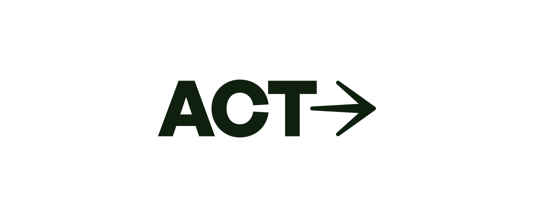
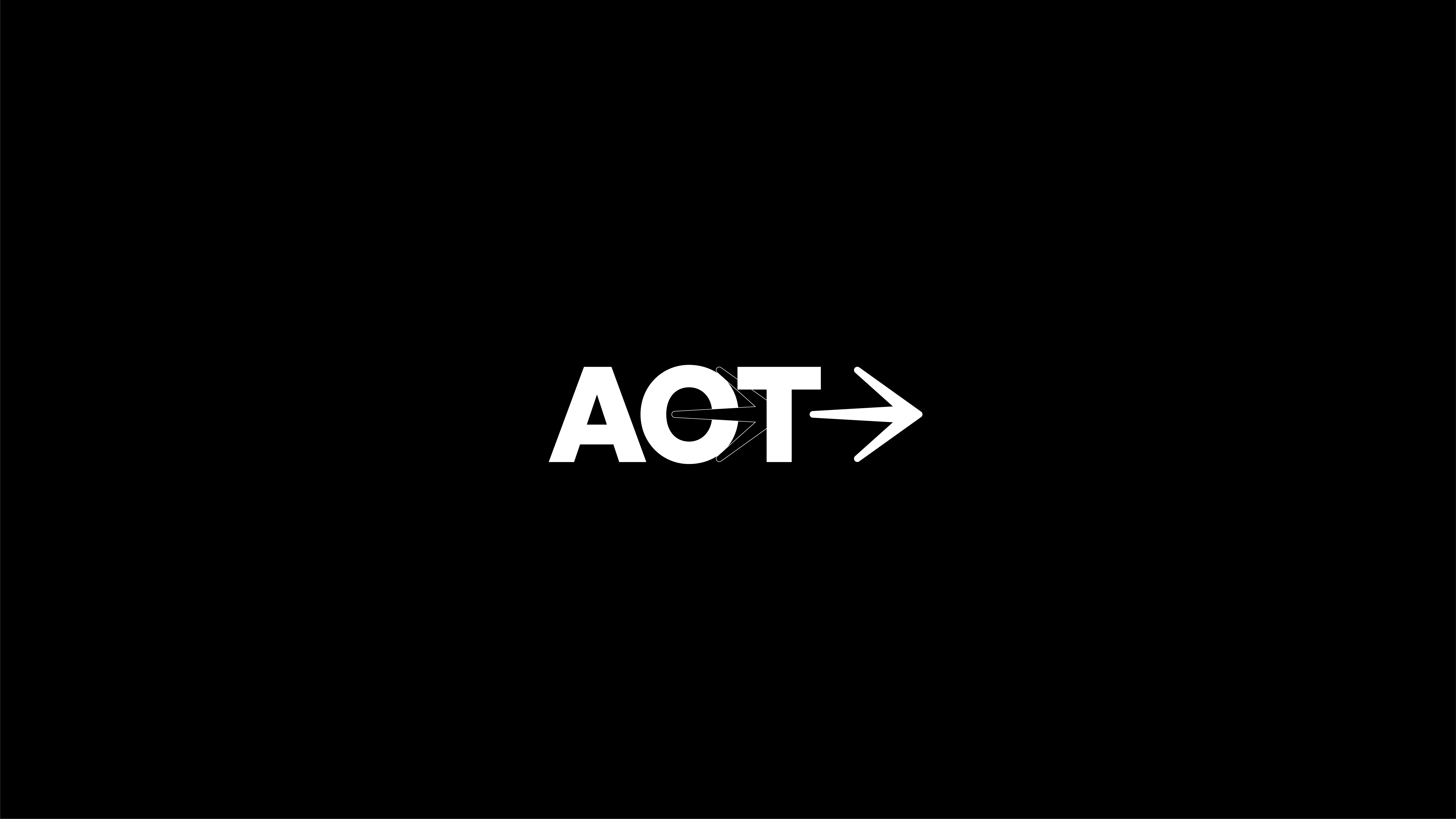
ACT

Built in two weeks. Launched to full classes.
ACT opened its doors with a brand identity built in two weeks, and took off immediately. Founder Joeri now runs full classes every day, with growing demand and a community proud to wear the brand.
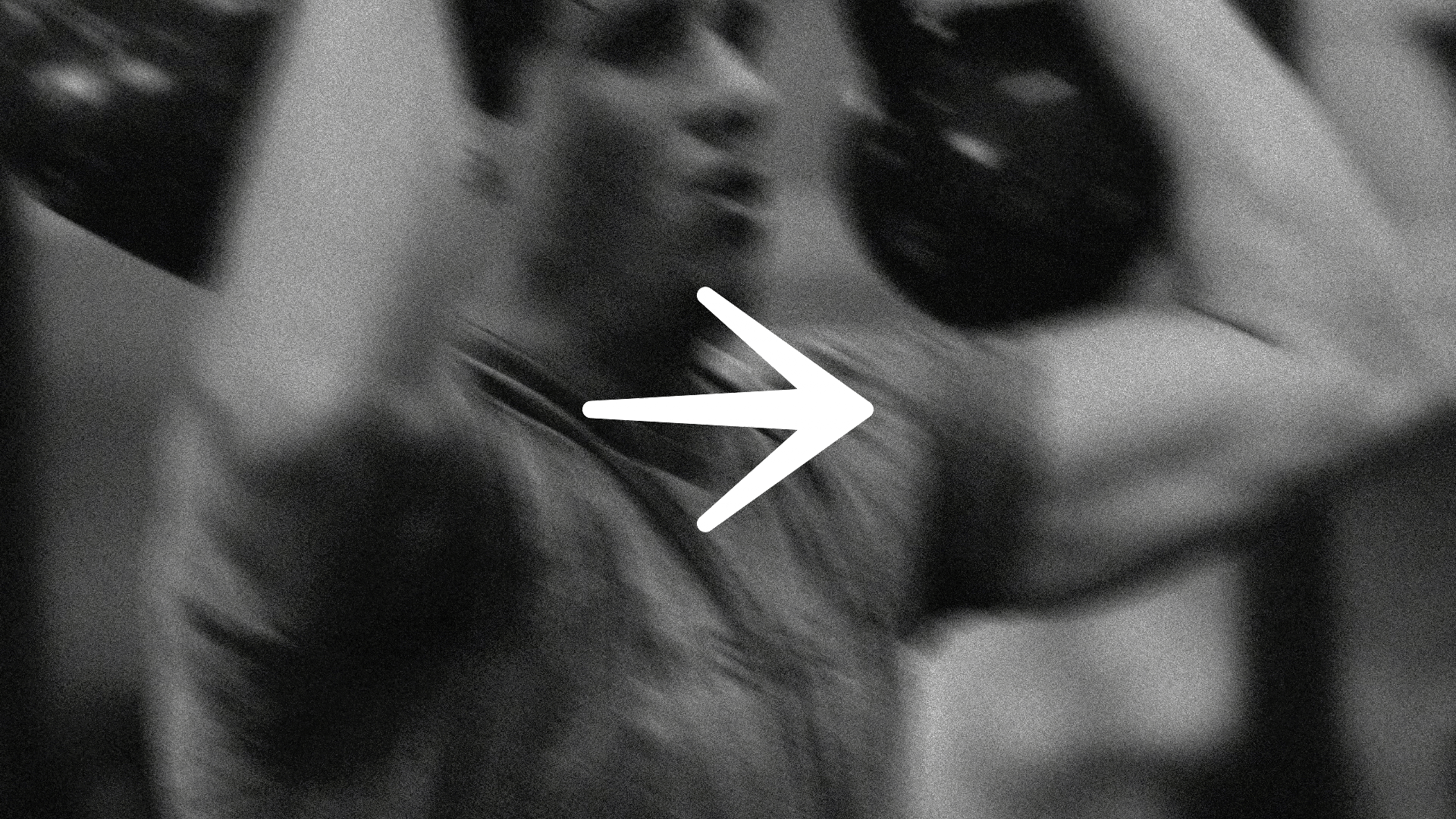
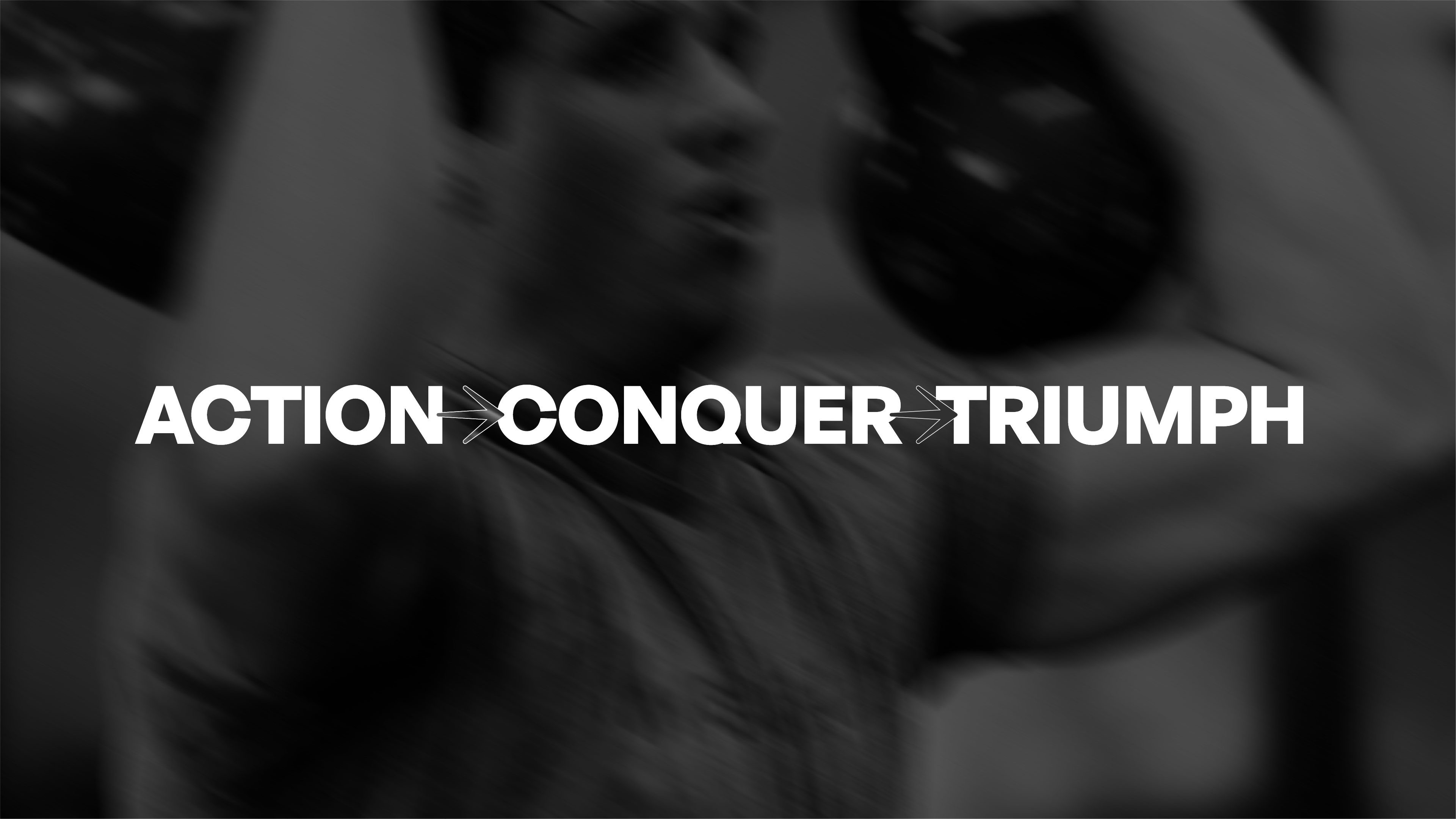
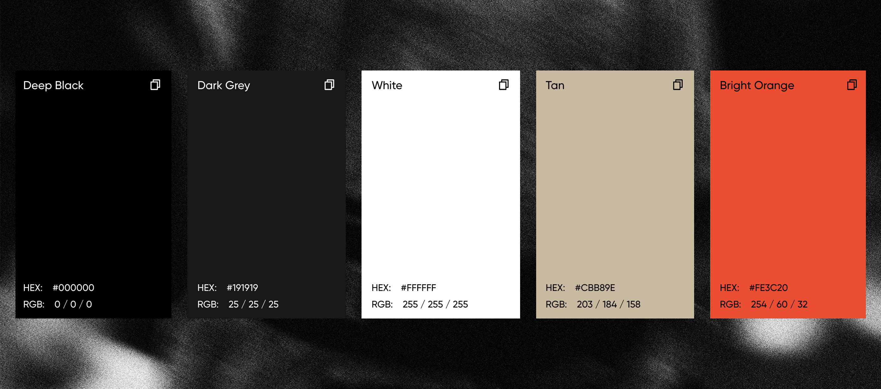
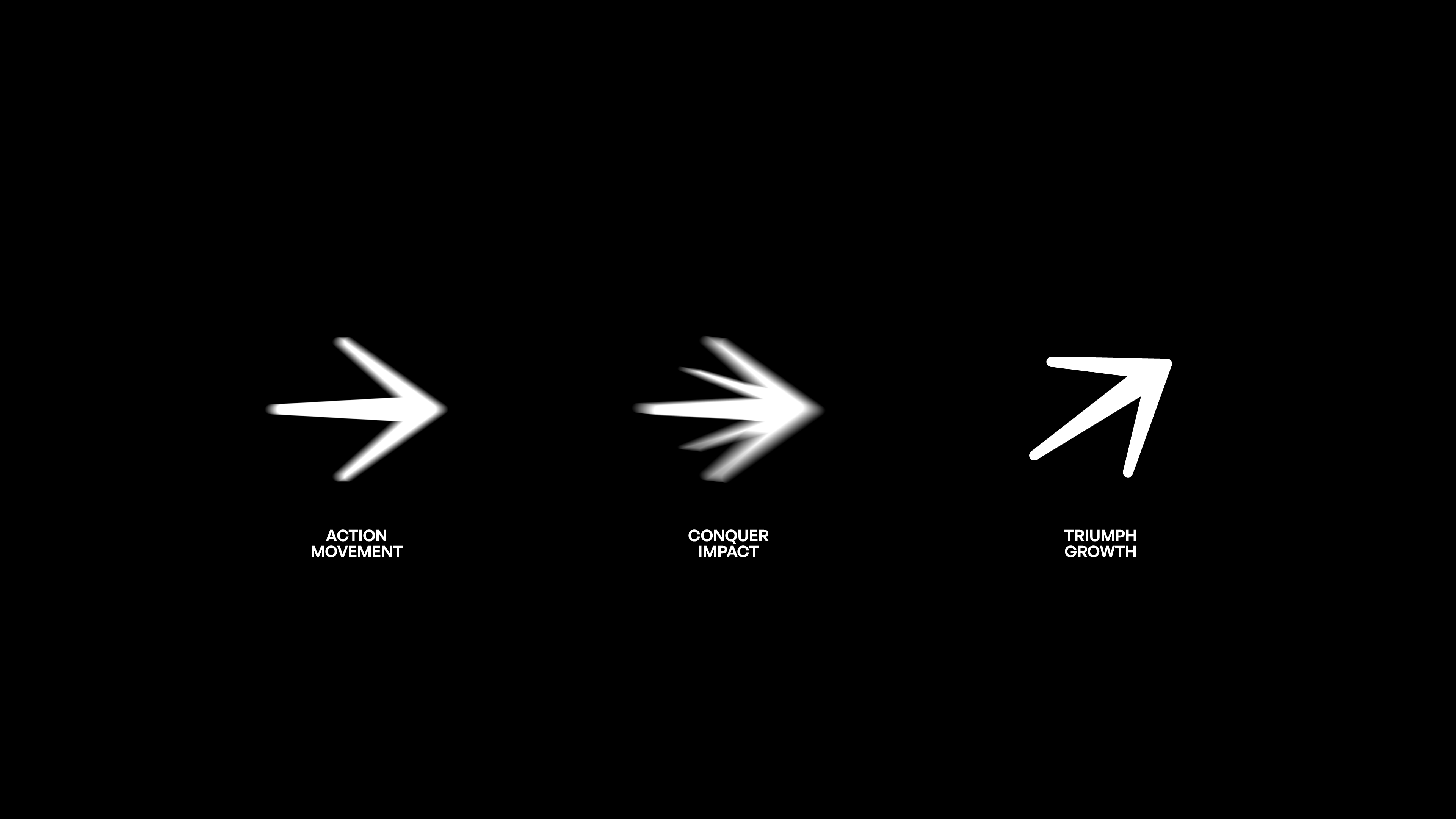
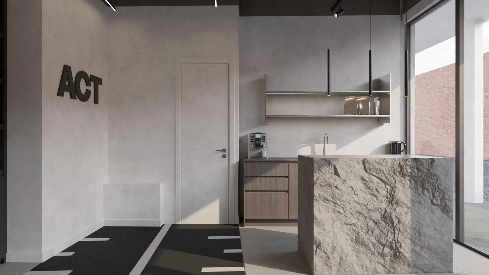
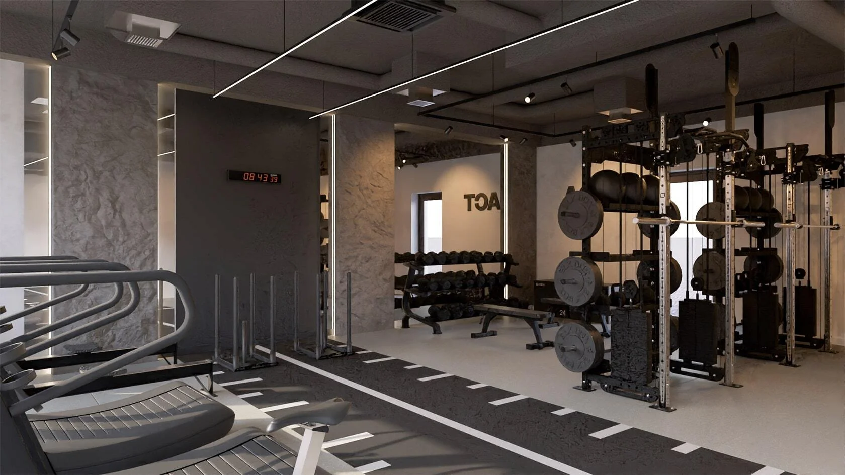
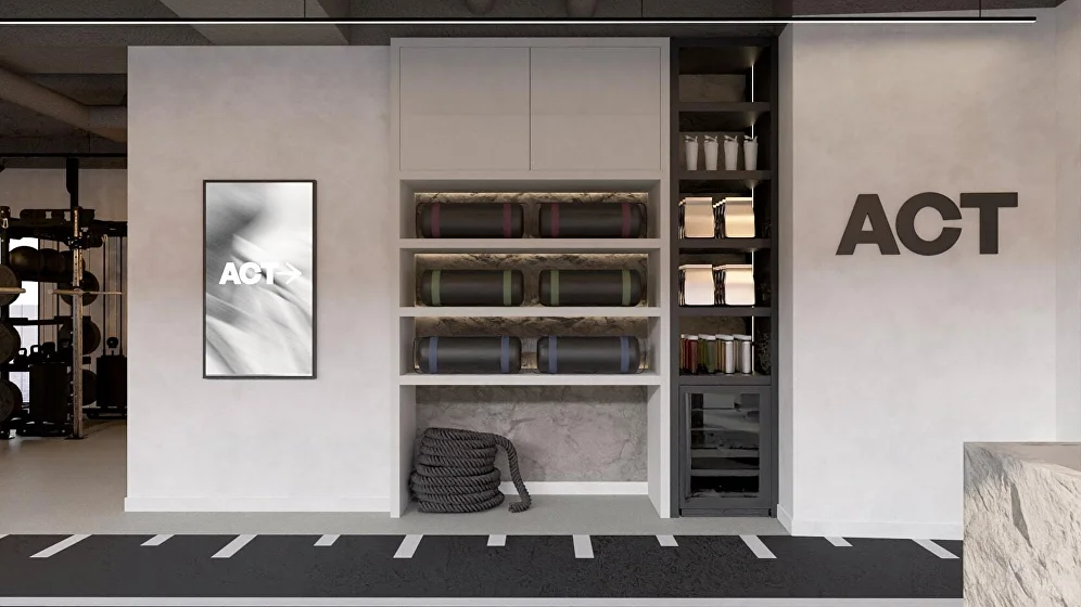
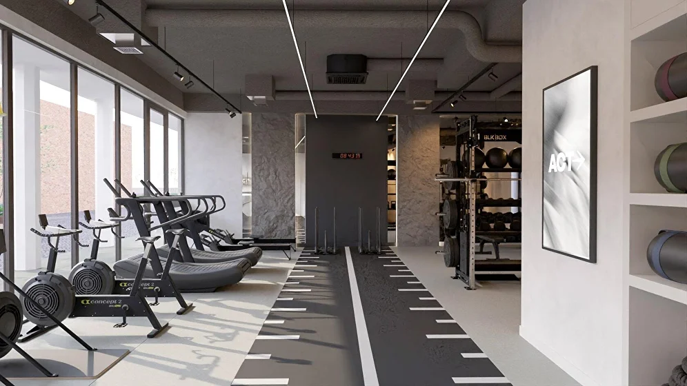
ACT is a group training gym built around a clear cycle: Action. Conquer. Triumph. Before launch, Joeri needed more than a logo, he needed an identity that carried the vision behind the concept and could stretch into supplements and merchandise later. One strategic workshop and two weeks of design delivered a brand in motion: a minimal arrow mark, grainy black-and-white imagery, and a system as driven as the training itself.

The challenge
Group training has become increasingly popular, but few gyms manage to create a true sense of belonging. ACT set out to do more than offer workouts. It aimed to build a community that drives consistent progress, physically and mentally. The challenge was to capture that spirit in a brand that feels structured, driven, and high-end without losing authenticity or accessibility.
The approach
The goal was to translate ACT’s core philosophy into a visual identity that feels in motion, strong yet human. Every detail was designed to reflect forward energy and collective strength, from the typography to the way imagery captures real movement. The brand had to feel alive, not static.
The solution
The identity centers on momentum. A minimal arrow symbol embodies progress and direction, while a grainy black-and-white imagery system mirrors the intensity of training. The design language is bold and clear, creating a sense of focus that reflects ACT’s coaching style and community.
Impact
ACT launched to immediate success. Founder Joeri now runs full-time classes every day with strong community engagement and growing demand. Members are proud to be part of ACT, and the sense of community is tangible. The new identity resonates deeply, setting ACT apart as a gym built on purpose, progress, and connection.


Read how
Joeri Horijon
experienced our collaboration

Before launching ACT, I was looking for someone who could do more than just create something visually appealing. I needed a brand identity that truly reflected the vision and values behind the concept: action, conquer and triumph. From the logo to the color palette and overall visual direction, I needed help shaping the entire branding which also has the potential to work for supplements or merchandise. Working with Youri was seamless from the start. He didn’t just execute design work, he asked the right strategic questions to get to the core of the brand. His approach is personal, creative, and purposeful. It felt like a true collaboration. The result is a bold, cohesive visual identity that perfectly aligns with my vision. The look and feel attract exactly the kind of audience I had in mind, and I’ve already seen tangible interest and received many compliments.


These scaleups raised €6M+
Rebrands


built to scale
Schedule a call and find out exactly what your brand needs for the next stage.