Dost
Dost outgrew its brand after raising. We rebuilt it in five weeks.
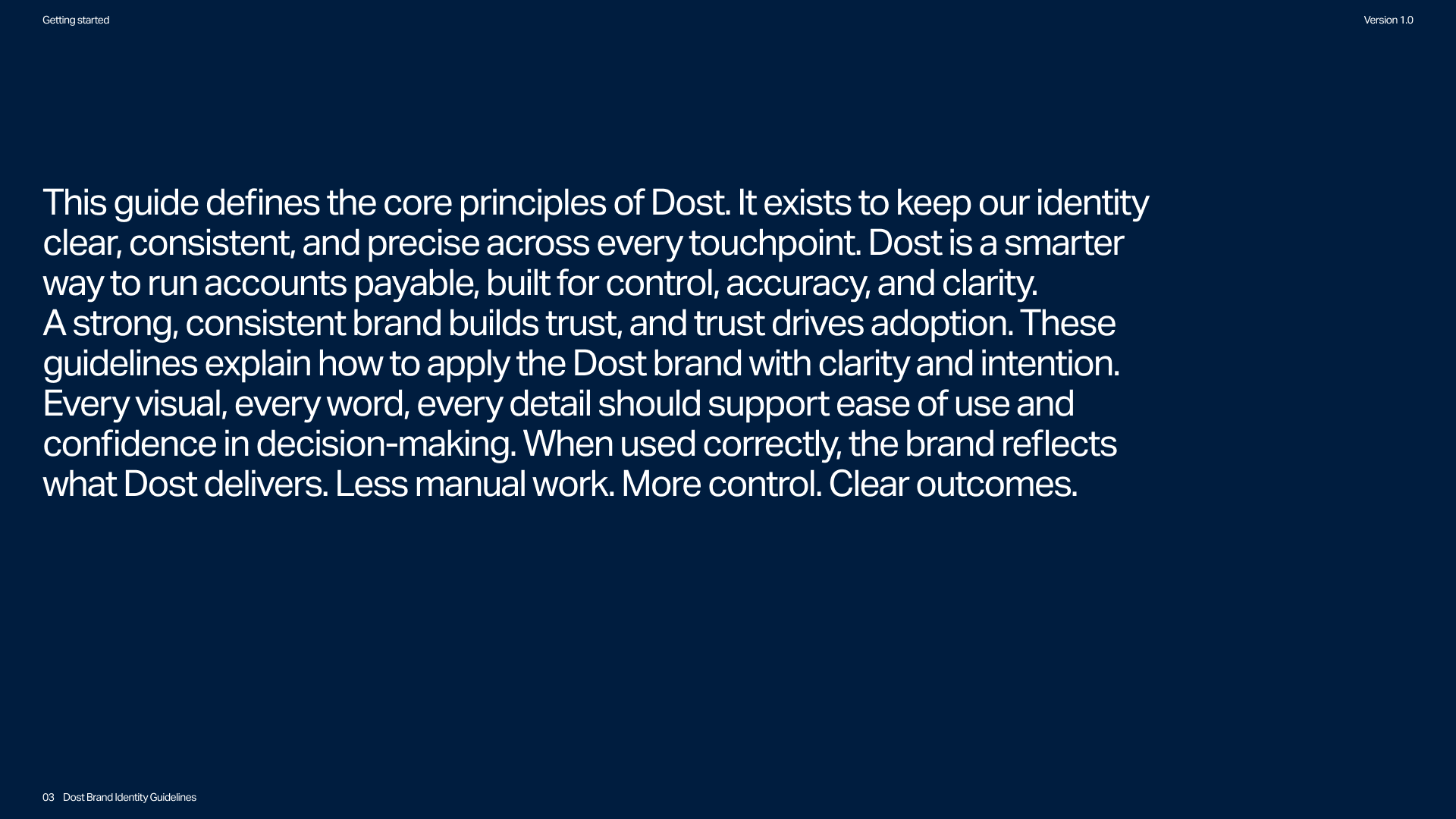
When Dost came to us, the company had raised its Series A and was scaling fast, but the brand hadn't kept up: one fixed logo lockup, no source files, no visual system. In five weeks, we rebuilt it into a complete identity around clarity, efficiency, and expertise, built to carry the company through its next stage of growth.
In the months since, Dost won the Fintech category at 4YFN, the startup competition of MWC Barcelona, one of the world's largest tech events, and was ranked among the Sifted 100 fastest-growing startups in Southern Europe.
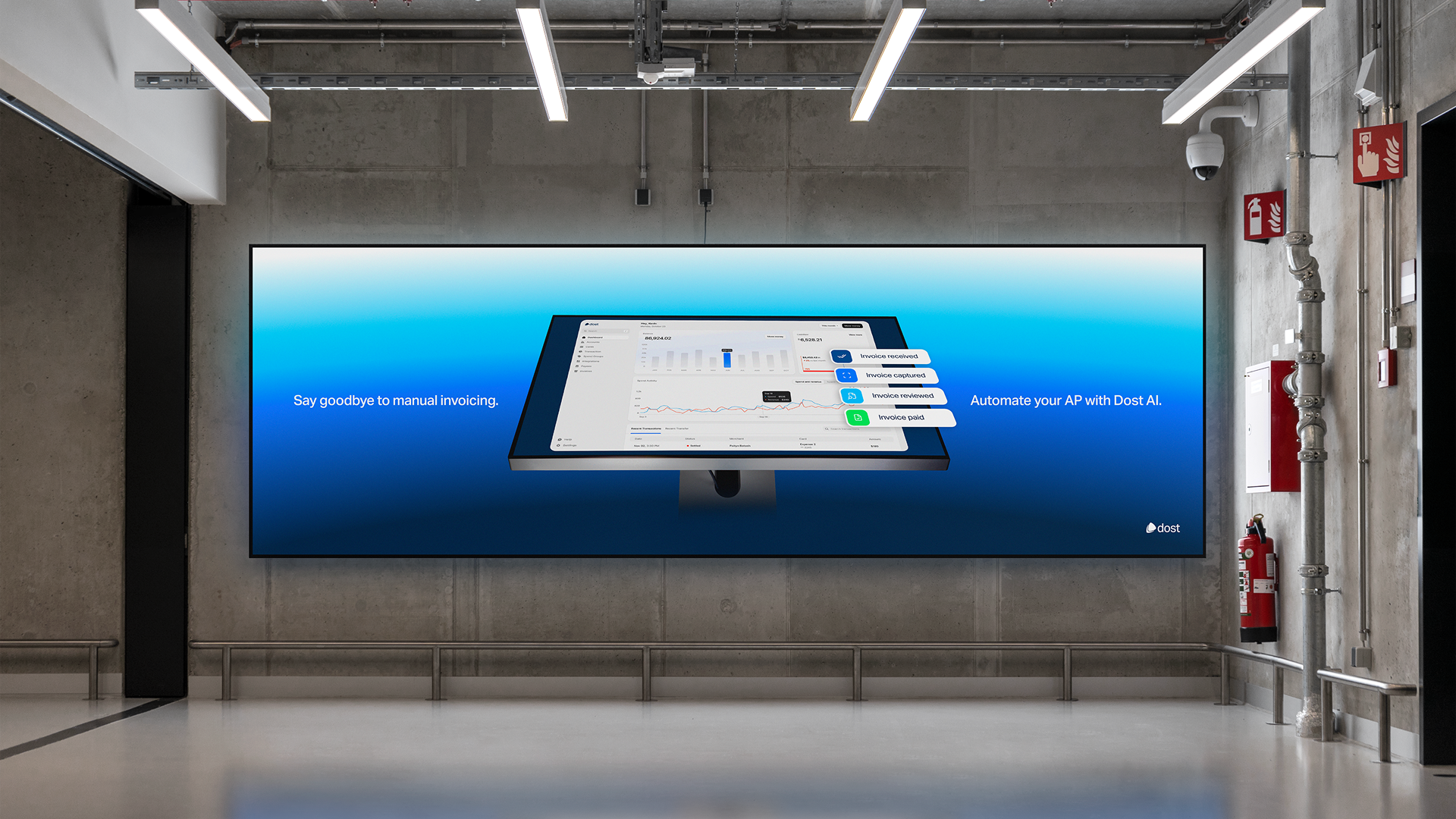
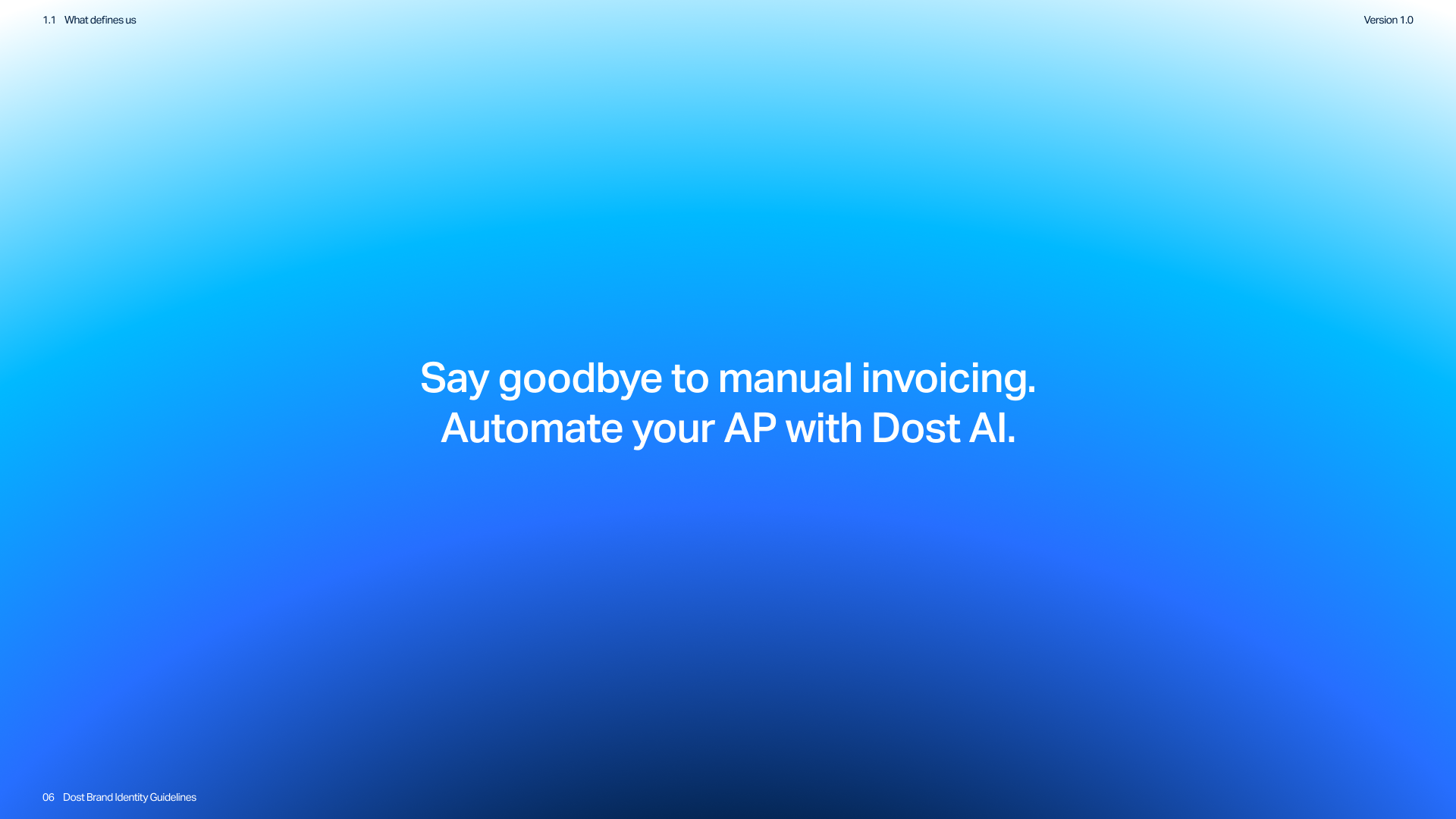
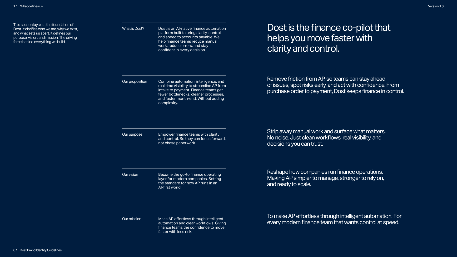
Dost is an AI-native finance automation platform that brings clarity and efficiency to accounts payable, combining automation, intelligence, and real-time visibility so modern finance teams can stop doing manual work and make confident decisions.
The challenge
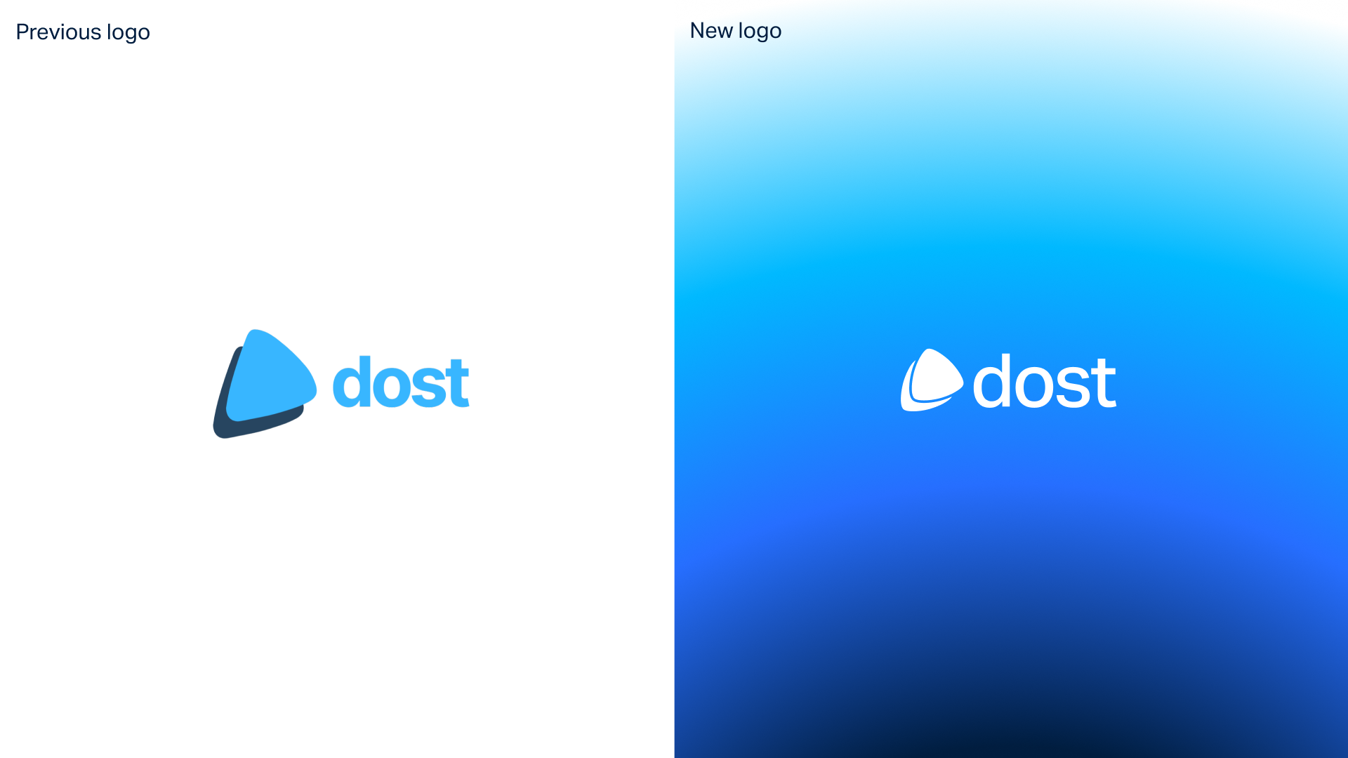
When Dost first reached out, the company was growing quickly but their branding did not reflect that progress. The entire identity consisted of a a few files and one fixed logo lockup, with no source files, no variations, and no supporting visual system.
The existing branding felt unpolished and inconsistent. It did not reflect the precision and reliability expected from a finance automation platform, nor the professionalism of the company behind it. As Dost entered a new phase of growth, the gap between product and brand became increasingly visible.
The goal was to refine and professionalise the brand while preserving its core recognisability. The new identity needed to communicate clarity and control, build trust with finance teams, and provide a structured system that could scale across product and marketing.
The approach
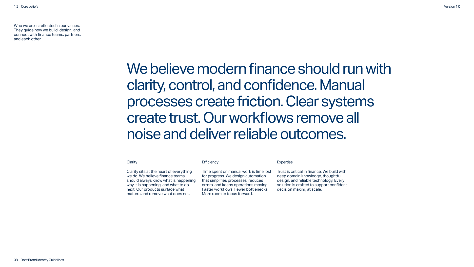
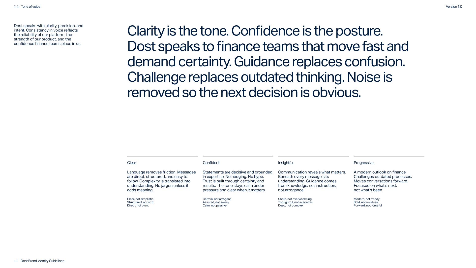
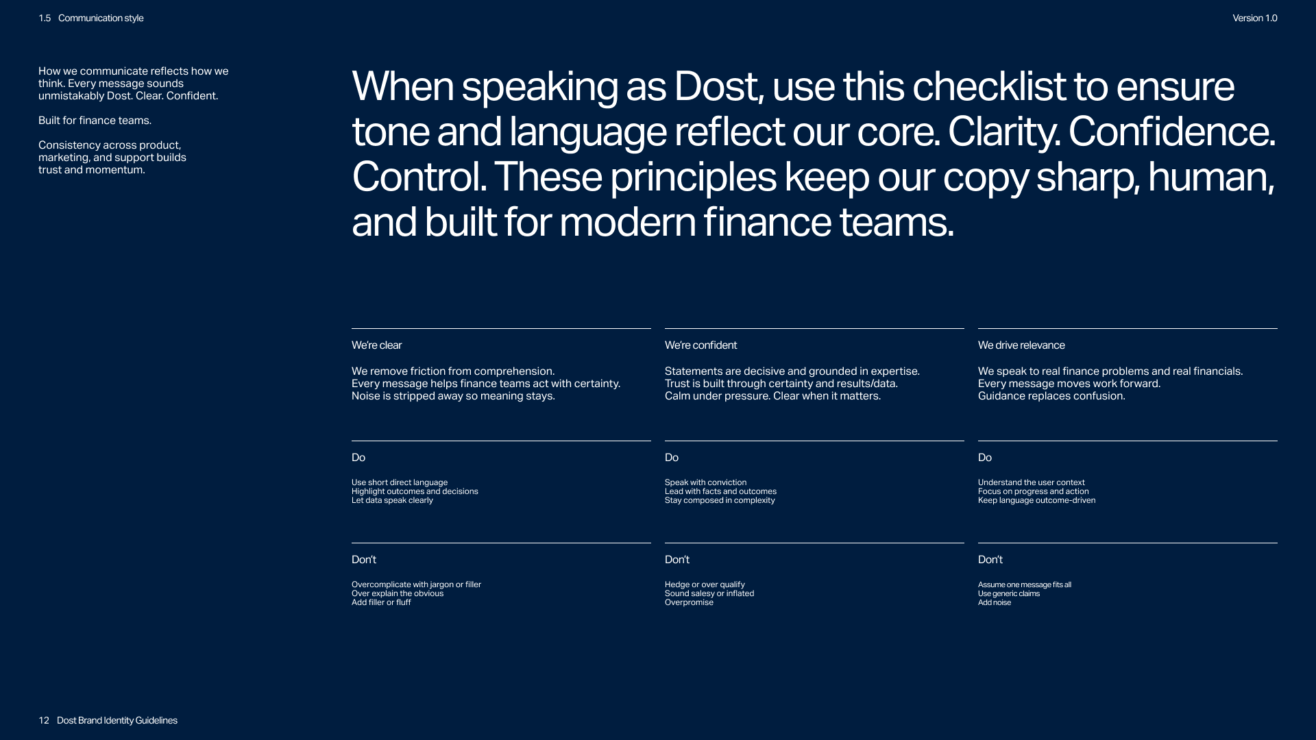
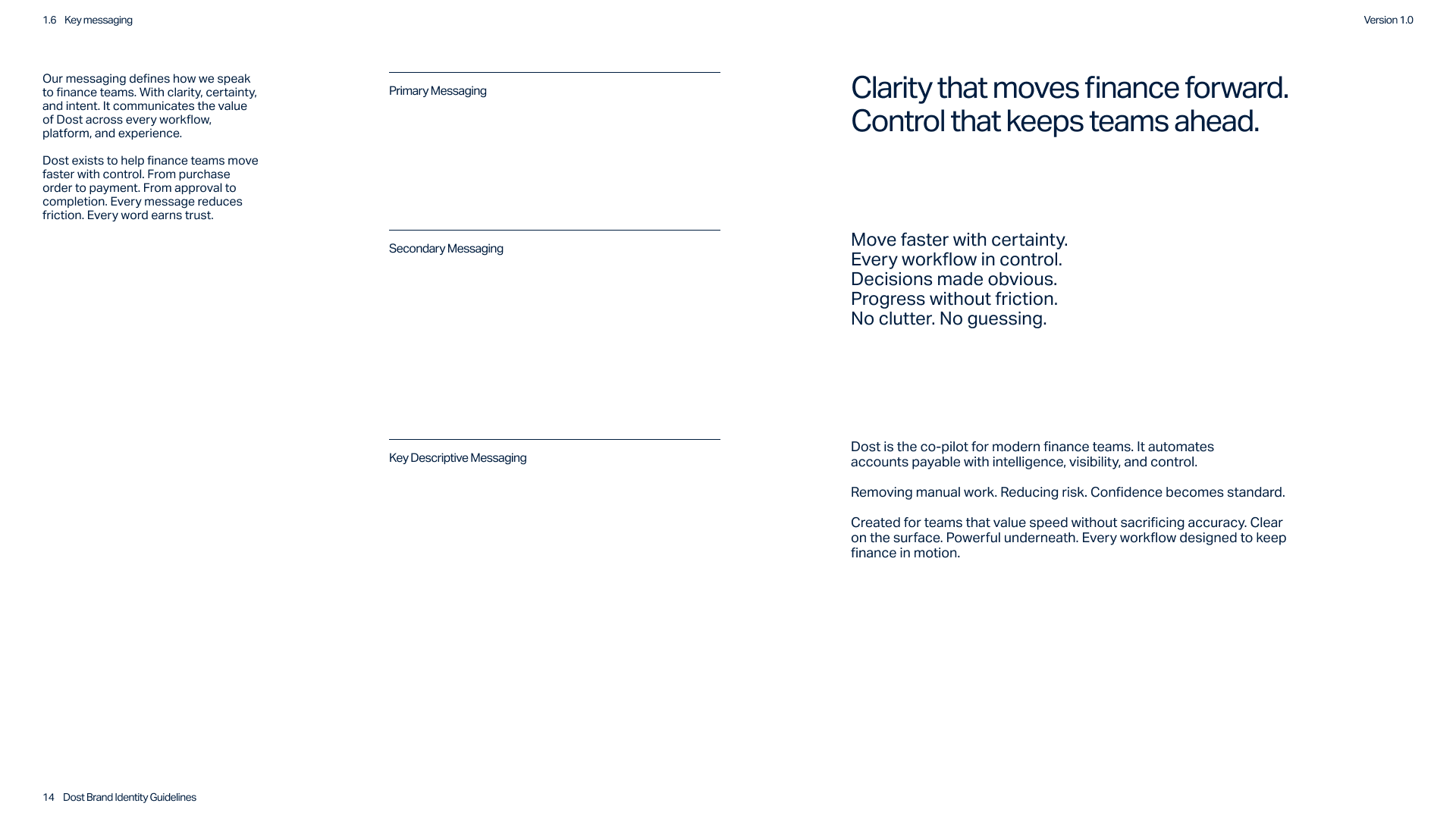
The project began with a strategic brand workshop where we defined Dost’s foundations and positioning. Together we established clarity, efficiency, and expertise as the core values guiding the brand across product, marketing, and communication.
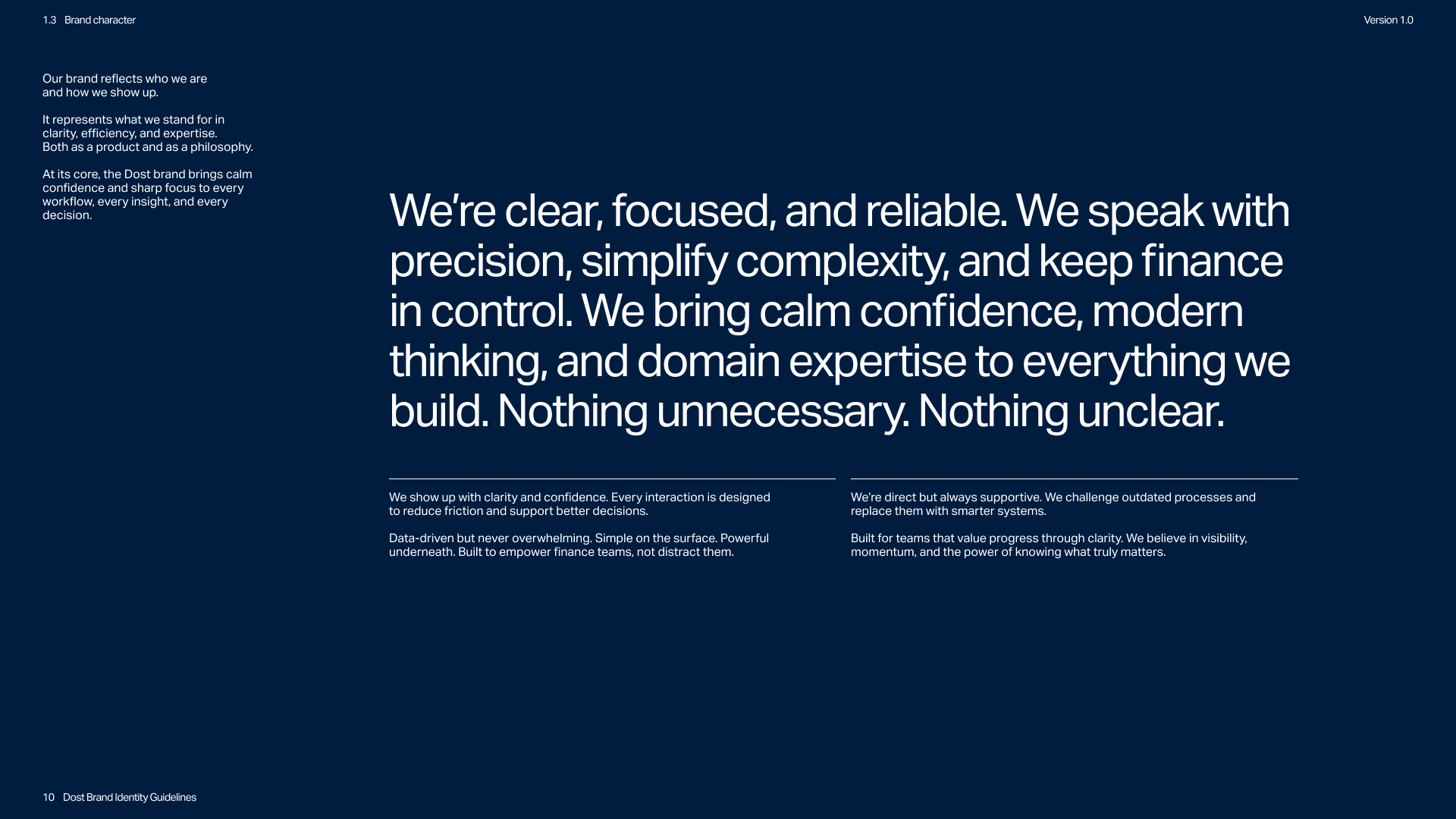
From this foundation we defined a brand focused on removing friction and enabling confident decisions. Dost communicates with precision and intent, translating complex financial operations into clear outcomes.
Rather than replacing the brand, the approach focused on refinement. The name and core concept remained unchanged while the identity was rebuilt into a complete and consistent system. Every element was designed to support clarity and consistency across touchpoints.
The solution
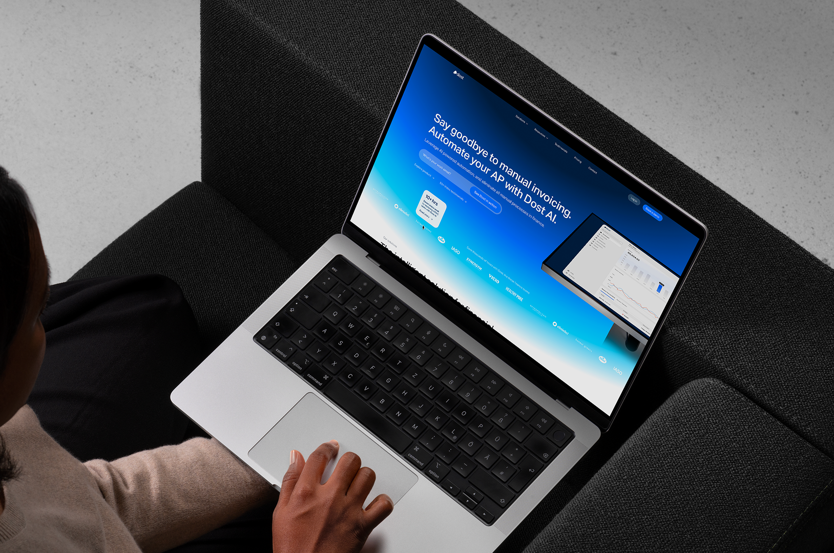
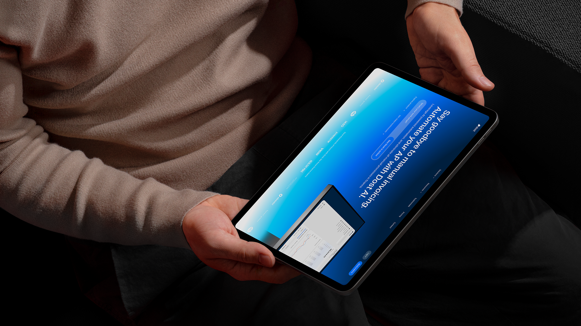
The result is a complete refinement of the Dost identity, transforming a minimal and inconsistent brand into a structured system designed for clarity and scale.
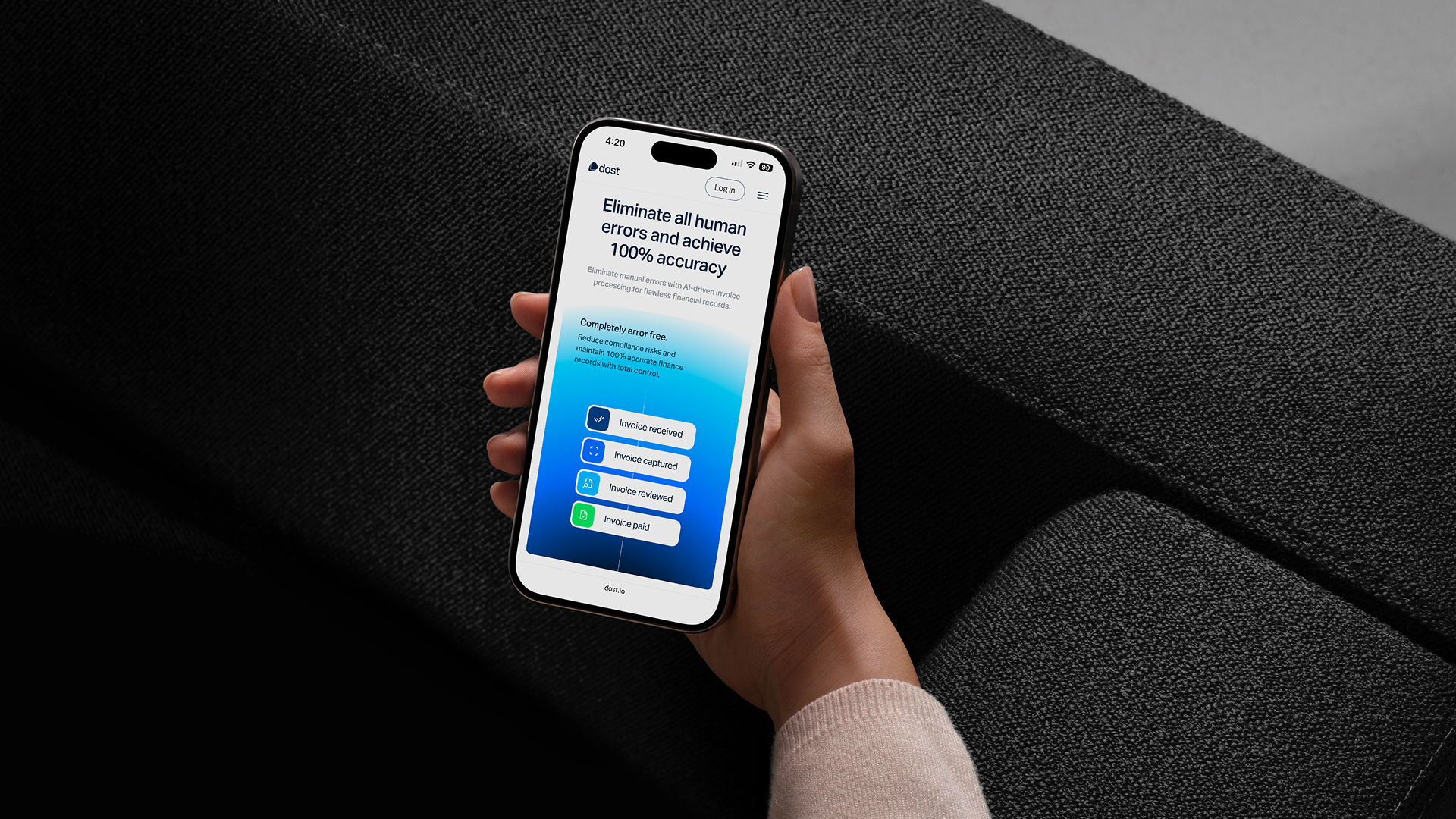
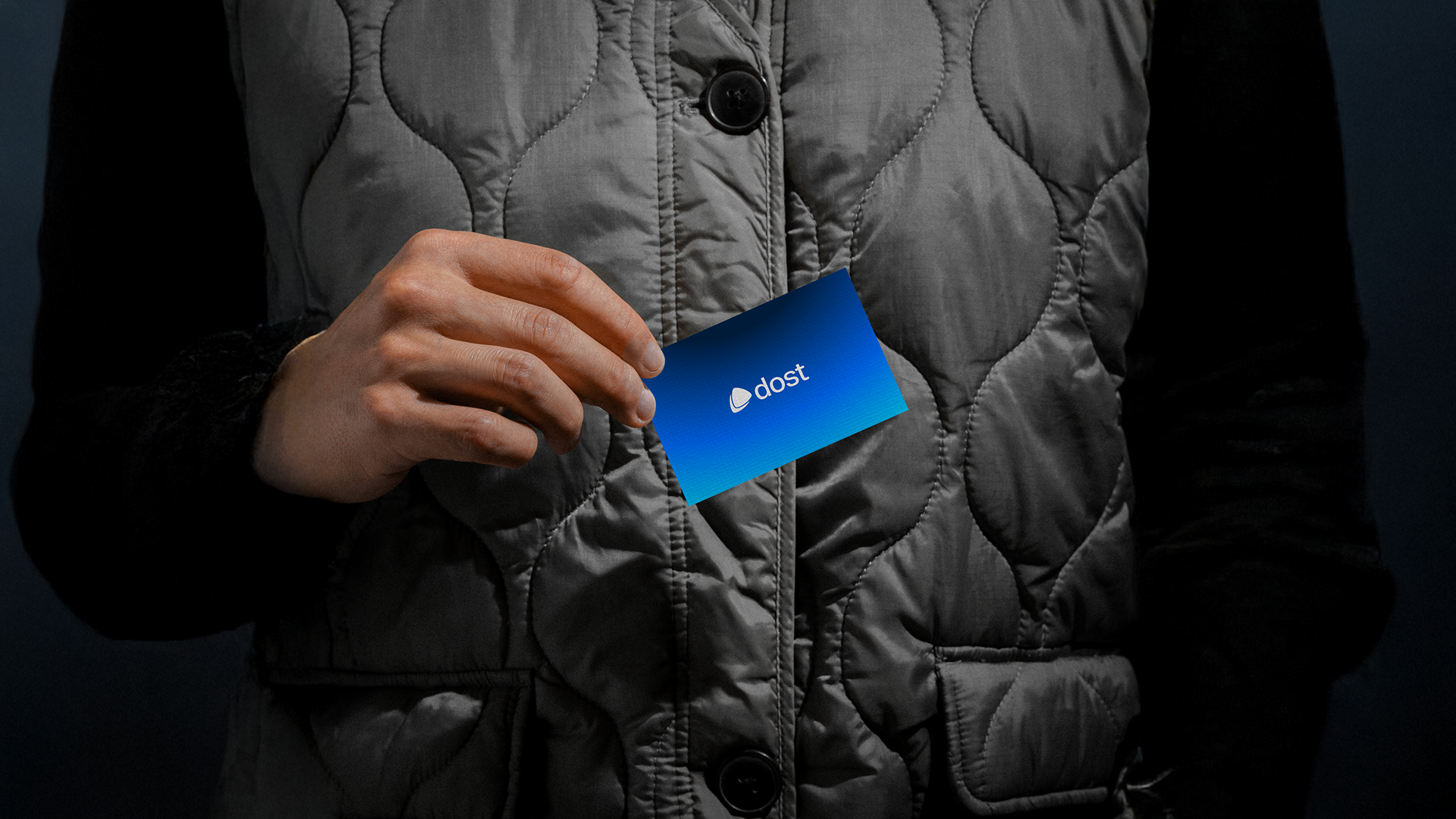
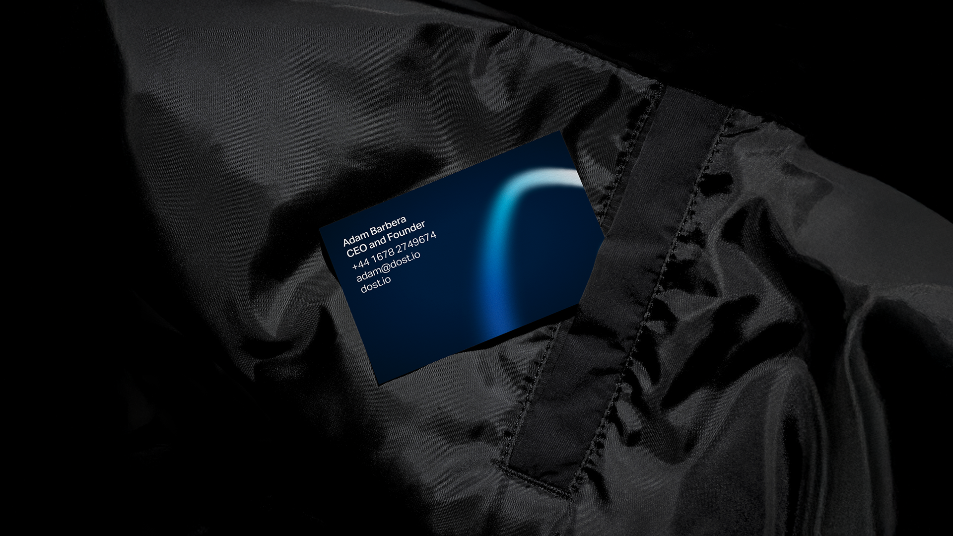
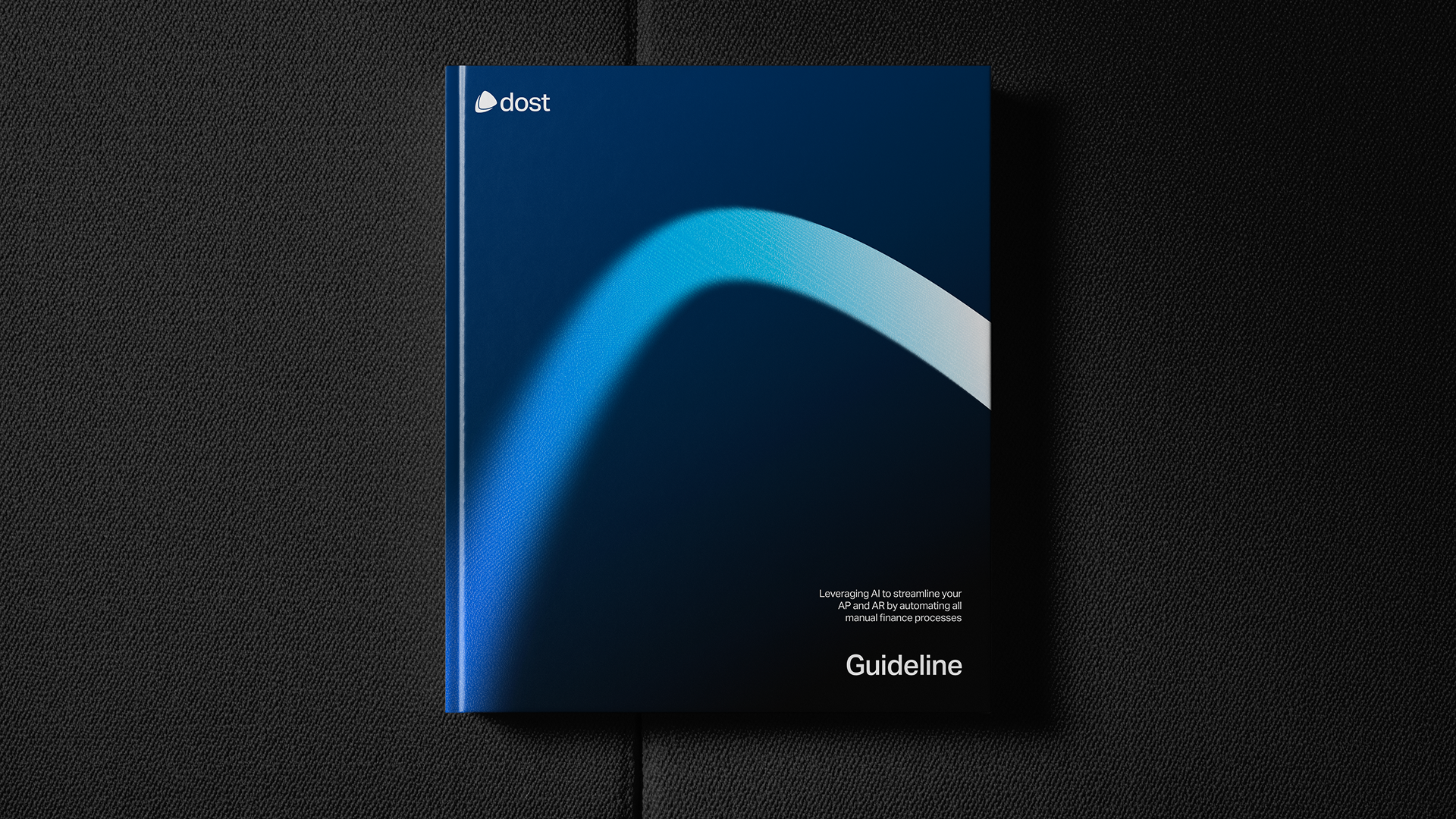
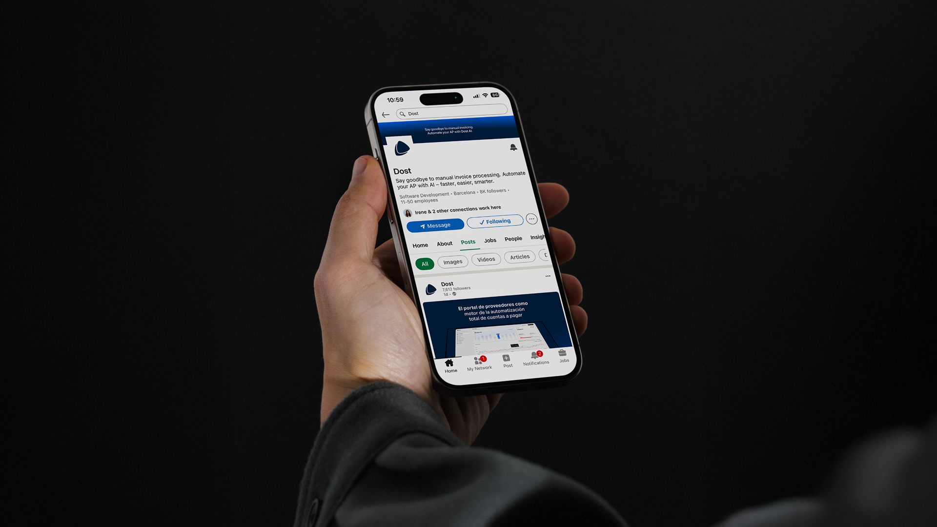
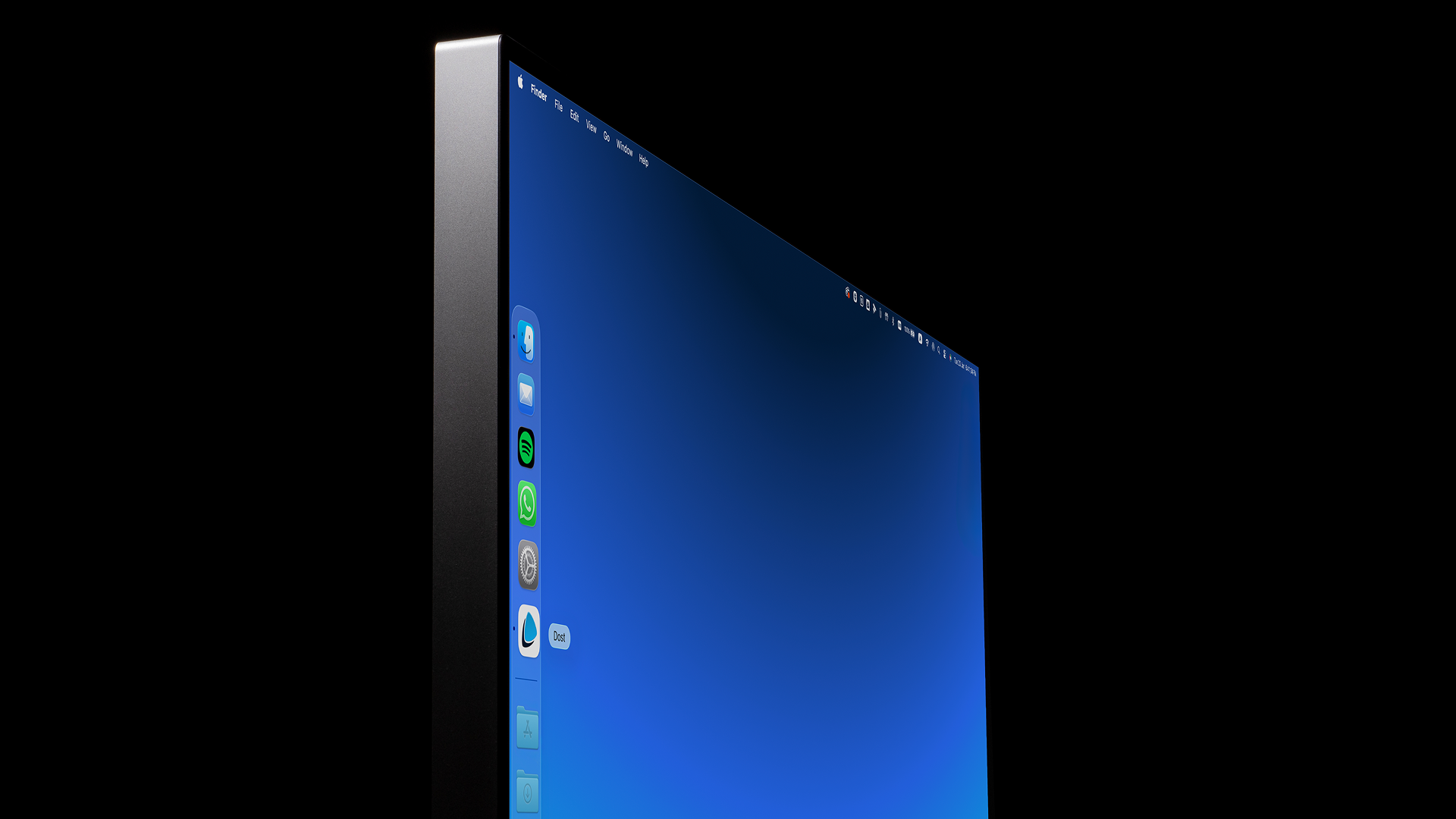
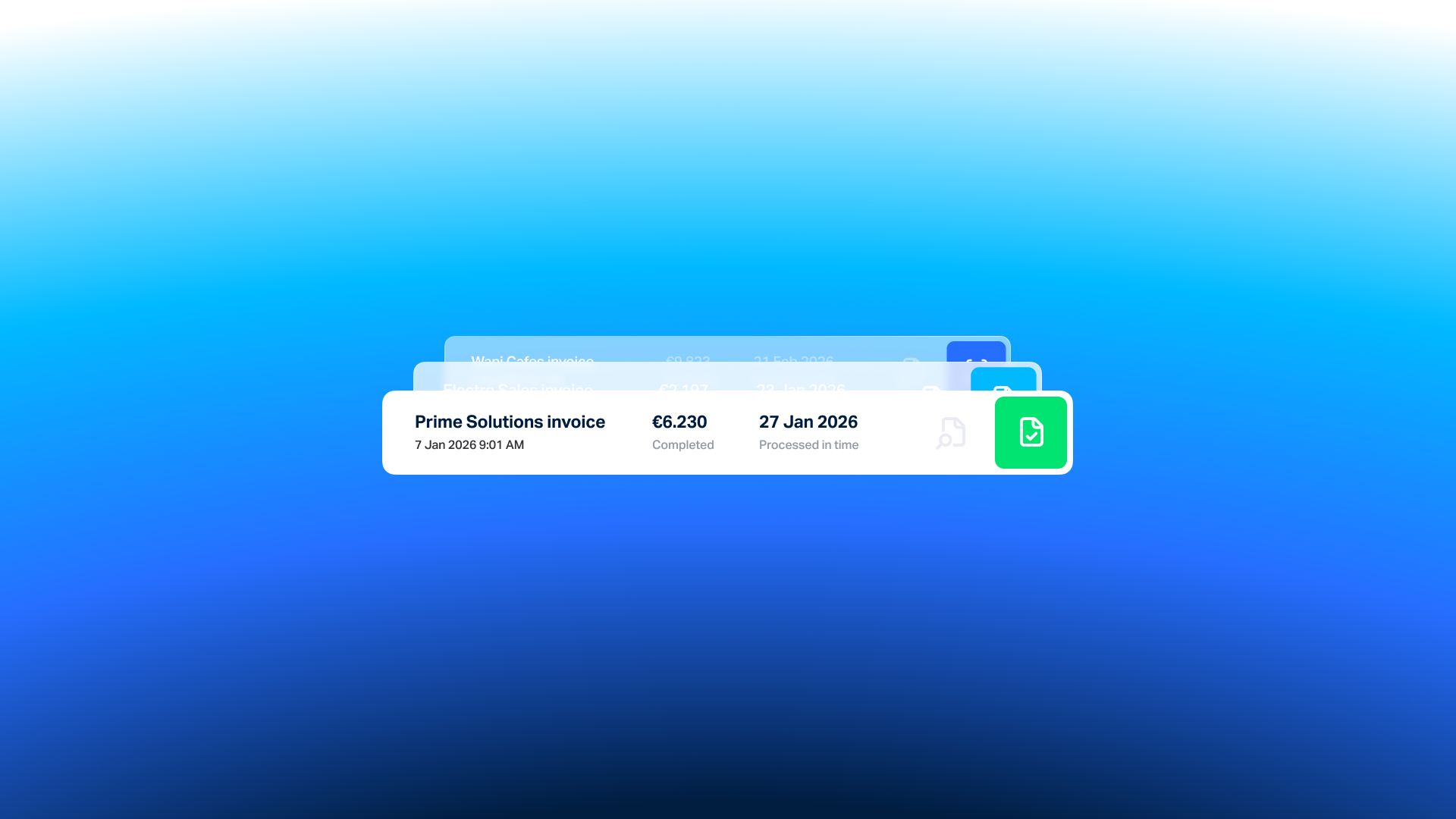
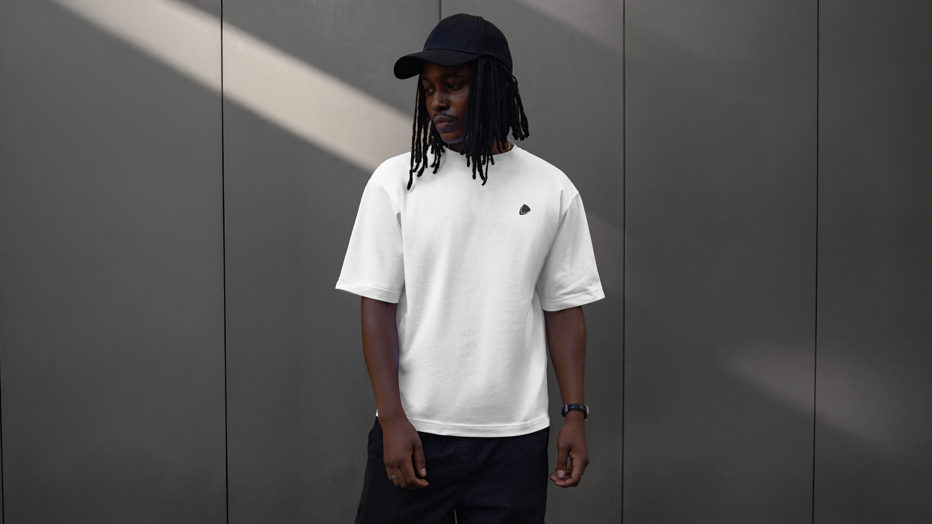
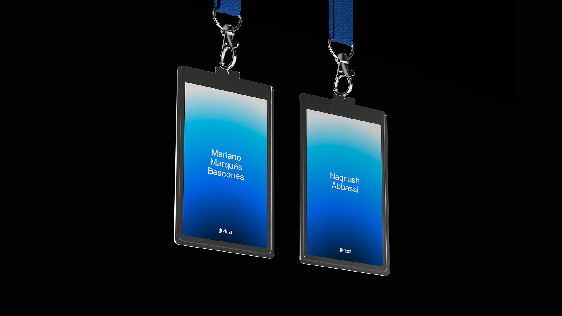
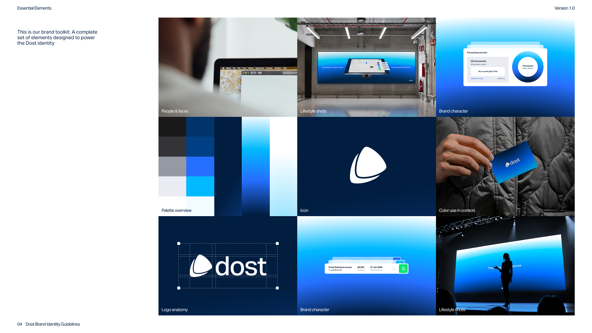
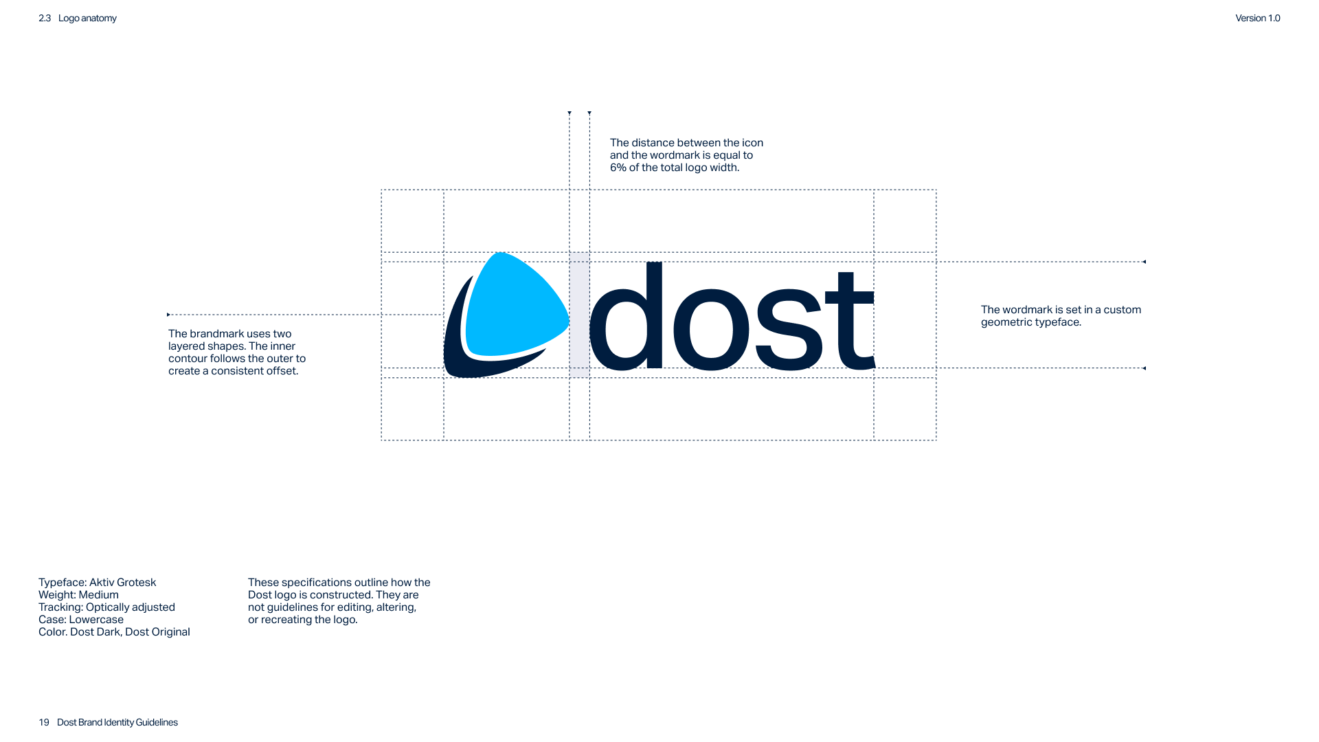
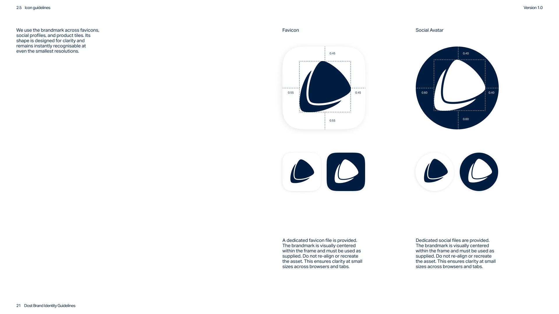
The logo was refined from the original mark, improving balance and geometric precision while maintaining recognisability. The new construction allows the logo to function consistently across applications, including strong black and white versions that were not possible before.
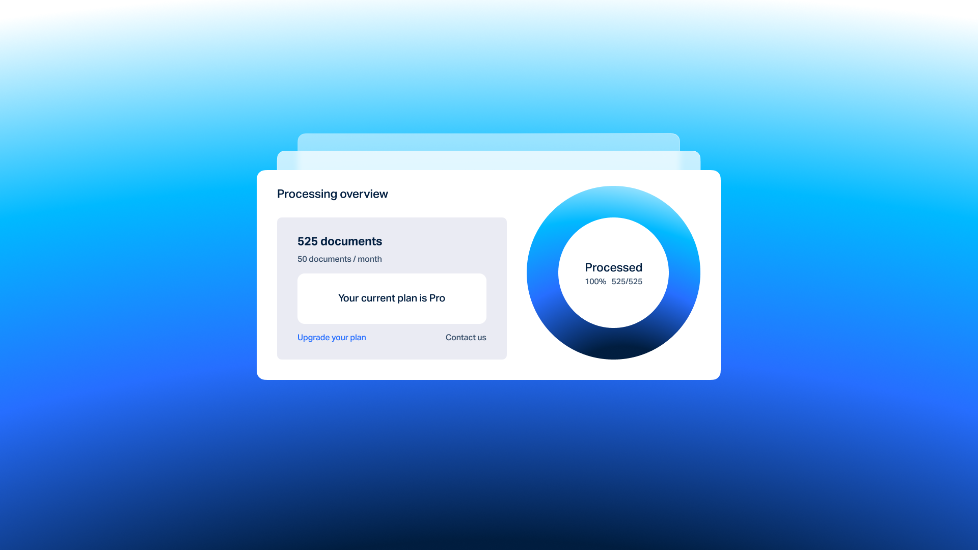
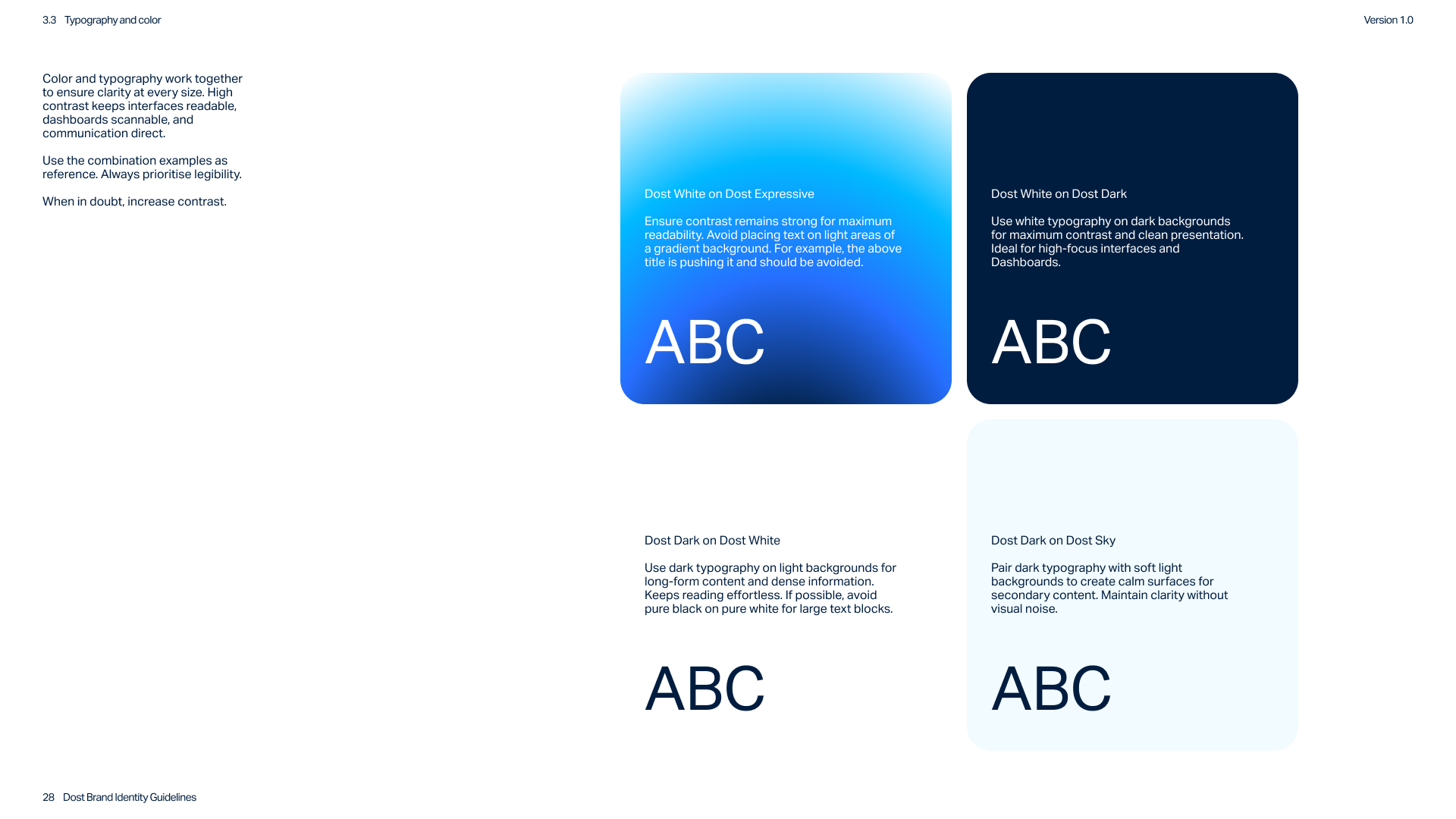
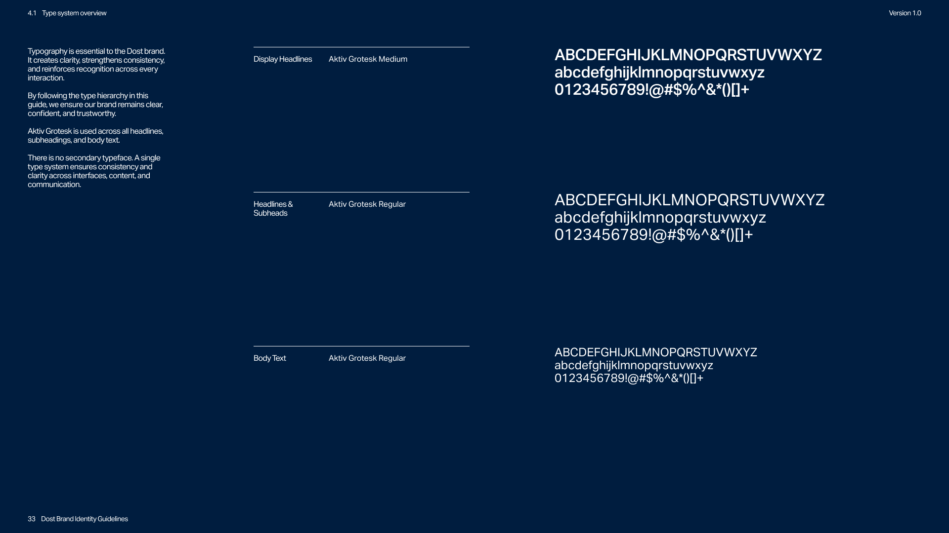
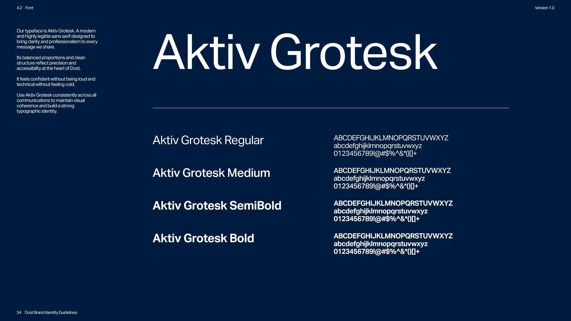
The typography system was upgraded from a generic startup typeface to Aktiv Grotesk, creating a more professional and structured voice. A single type system ensures consistency across interfaces and communication while reinforcing clarity and readability.
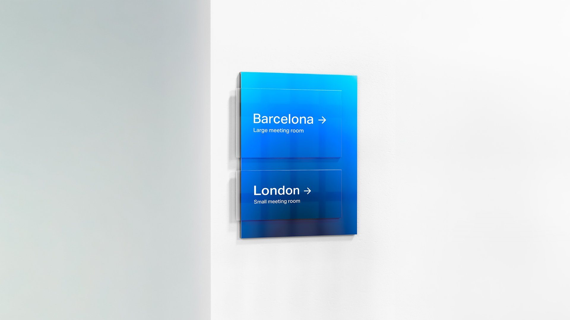
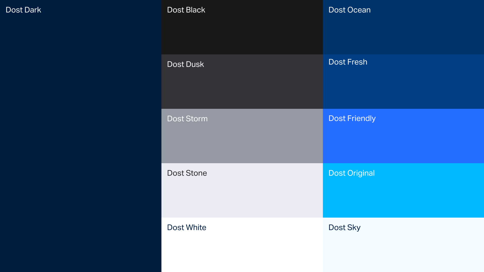
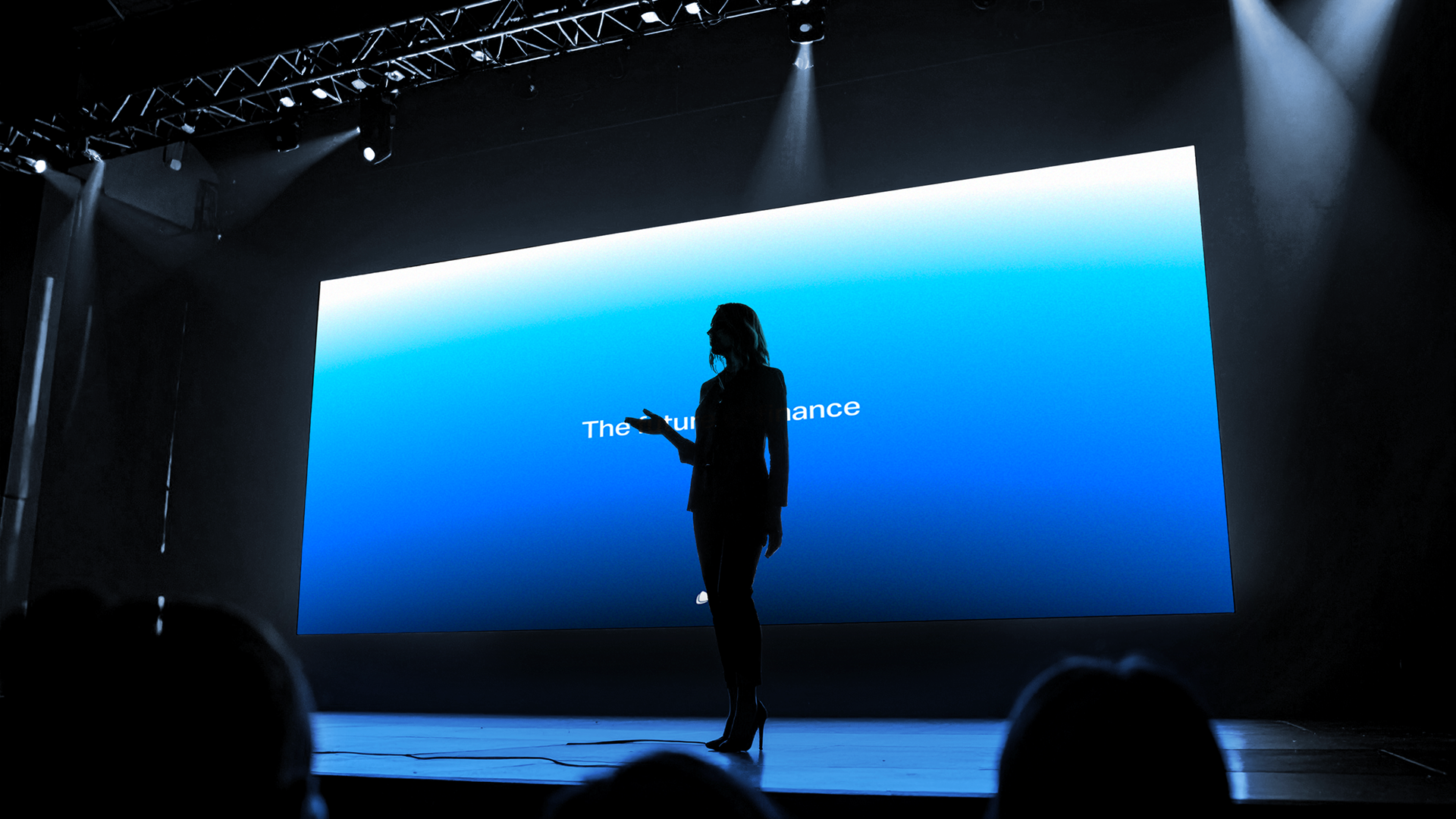
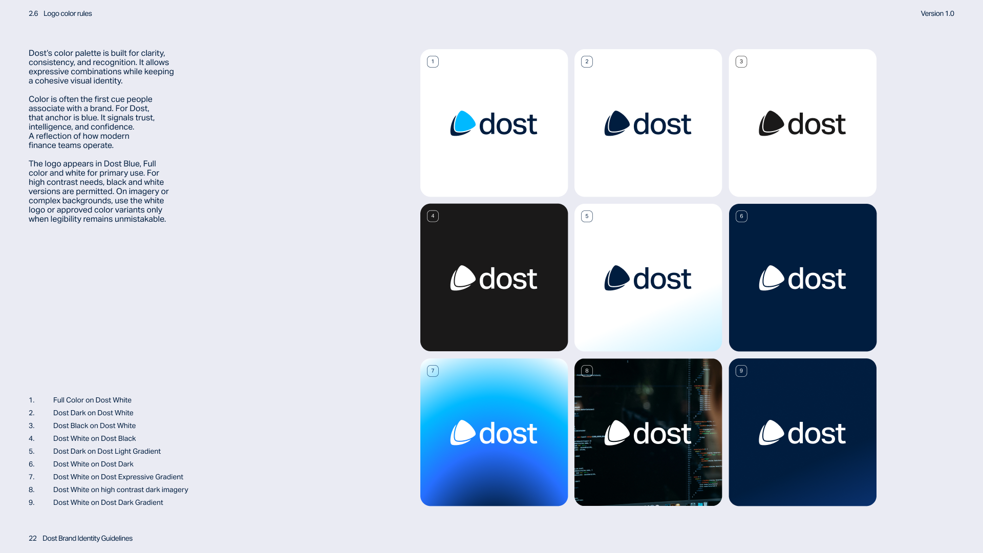
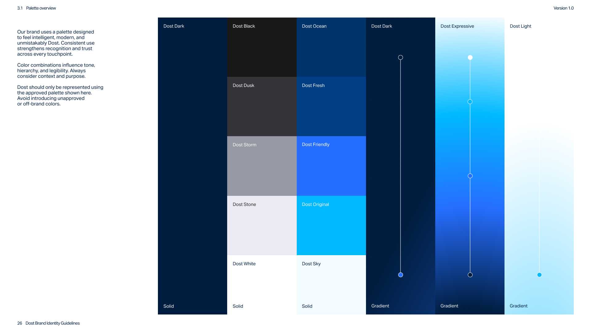
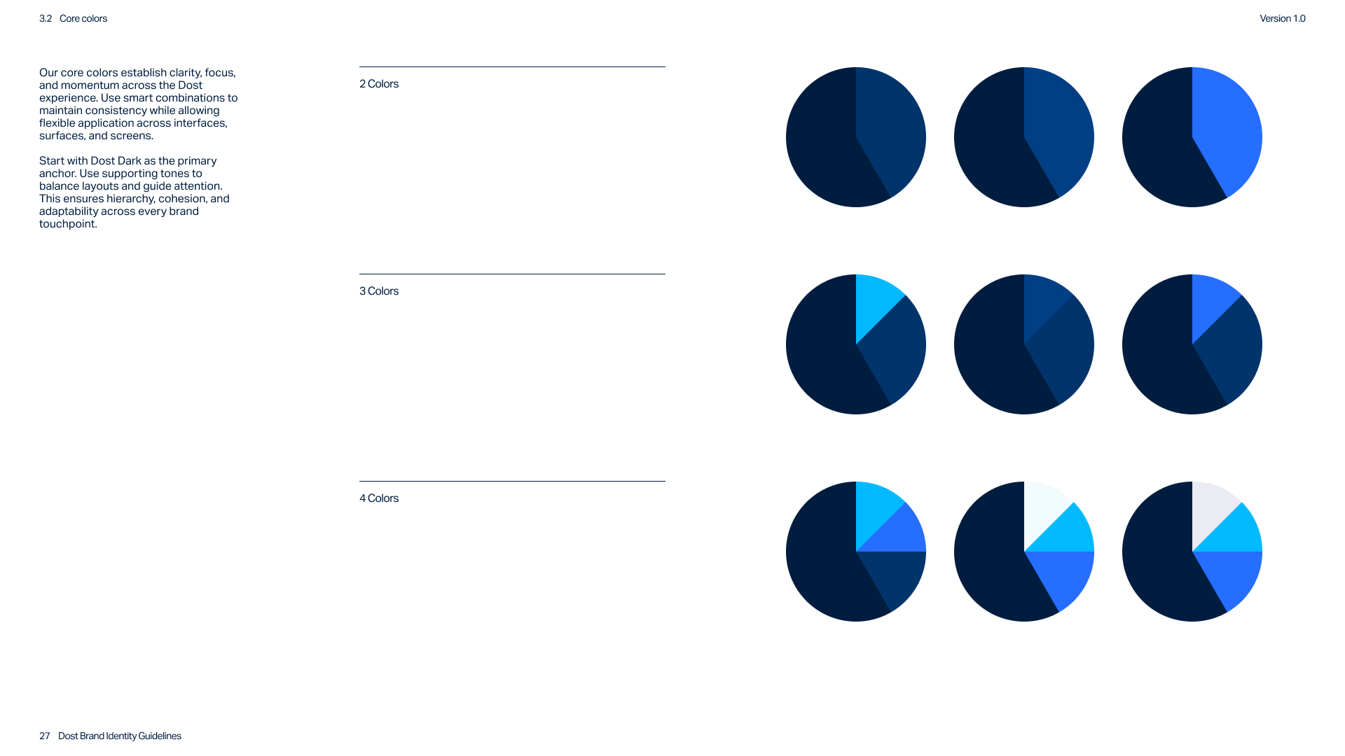
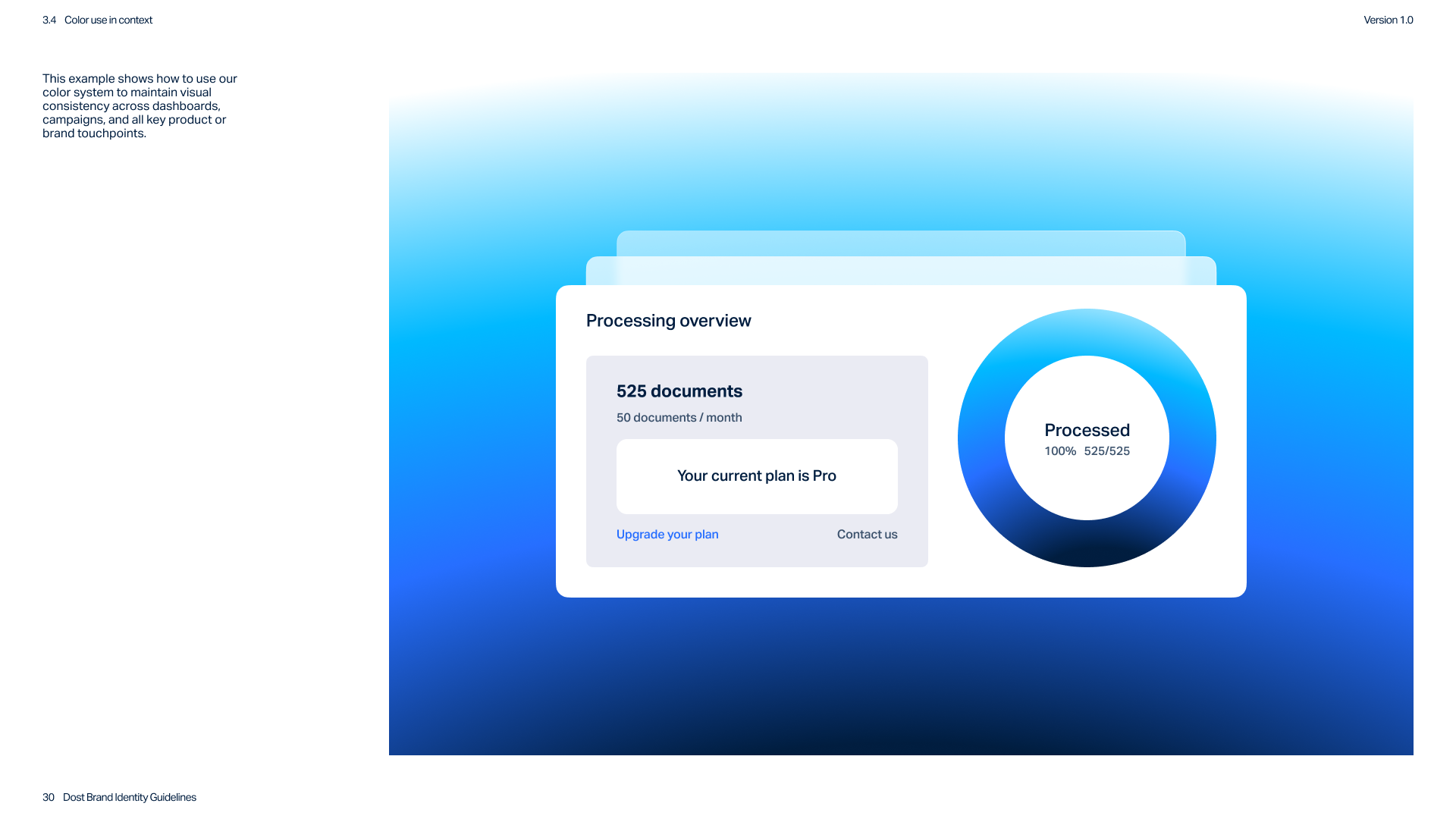
The color system was completely redesigned to create a more professional and flexible visual language. Dost’s recognizable blue was retained as a key element while becoming part of a broader palette designed for clarity and hierarchy.
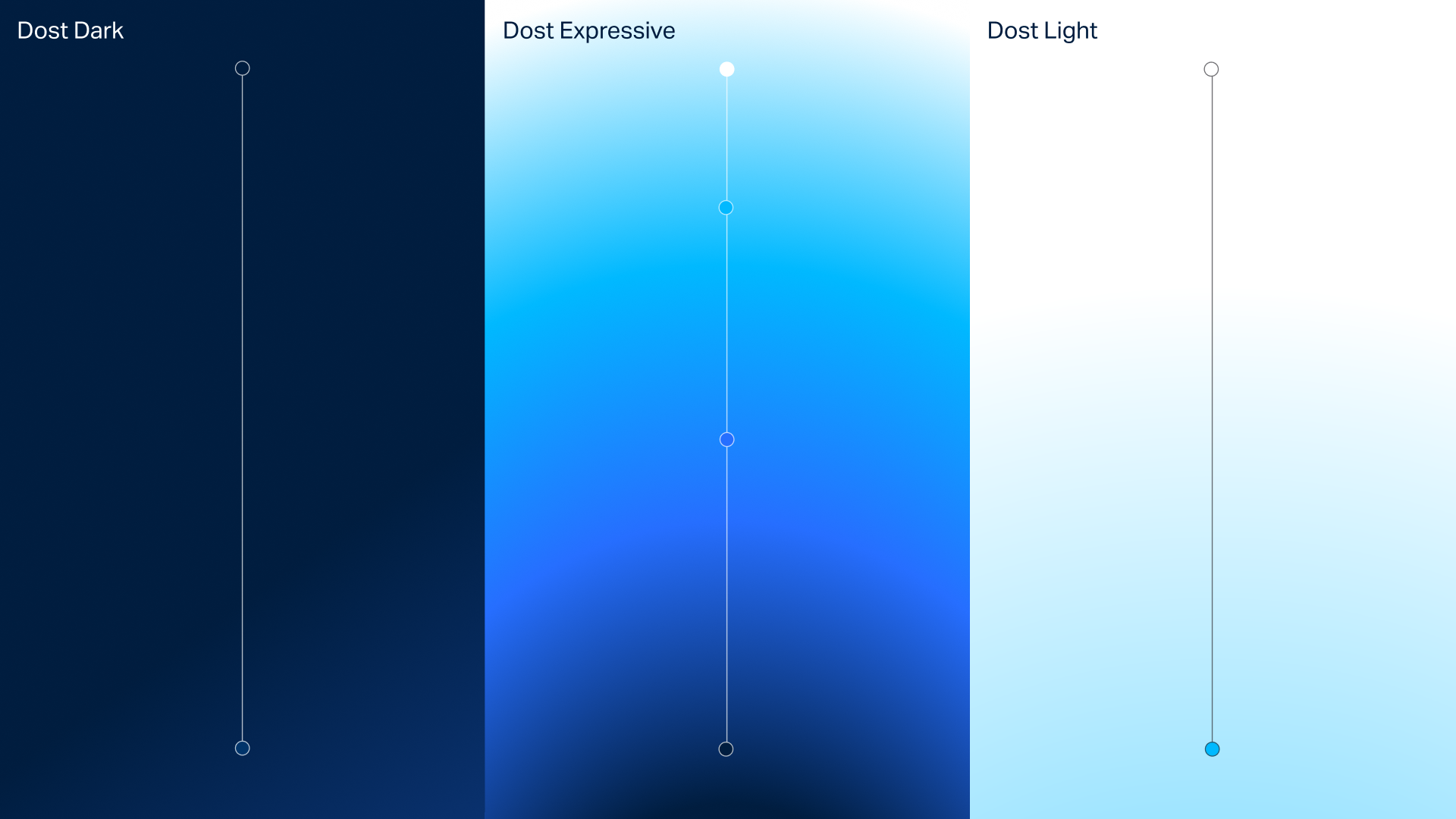
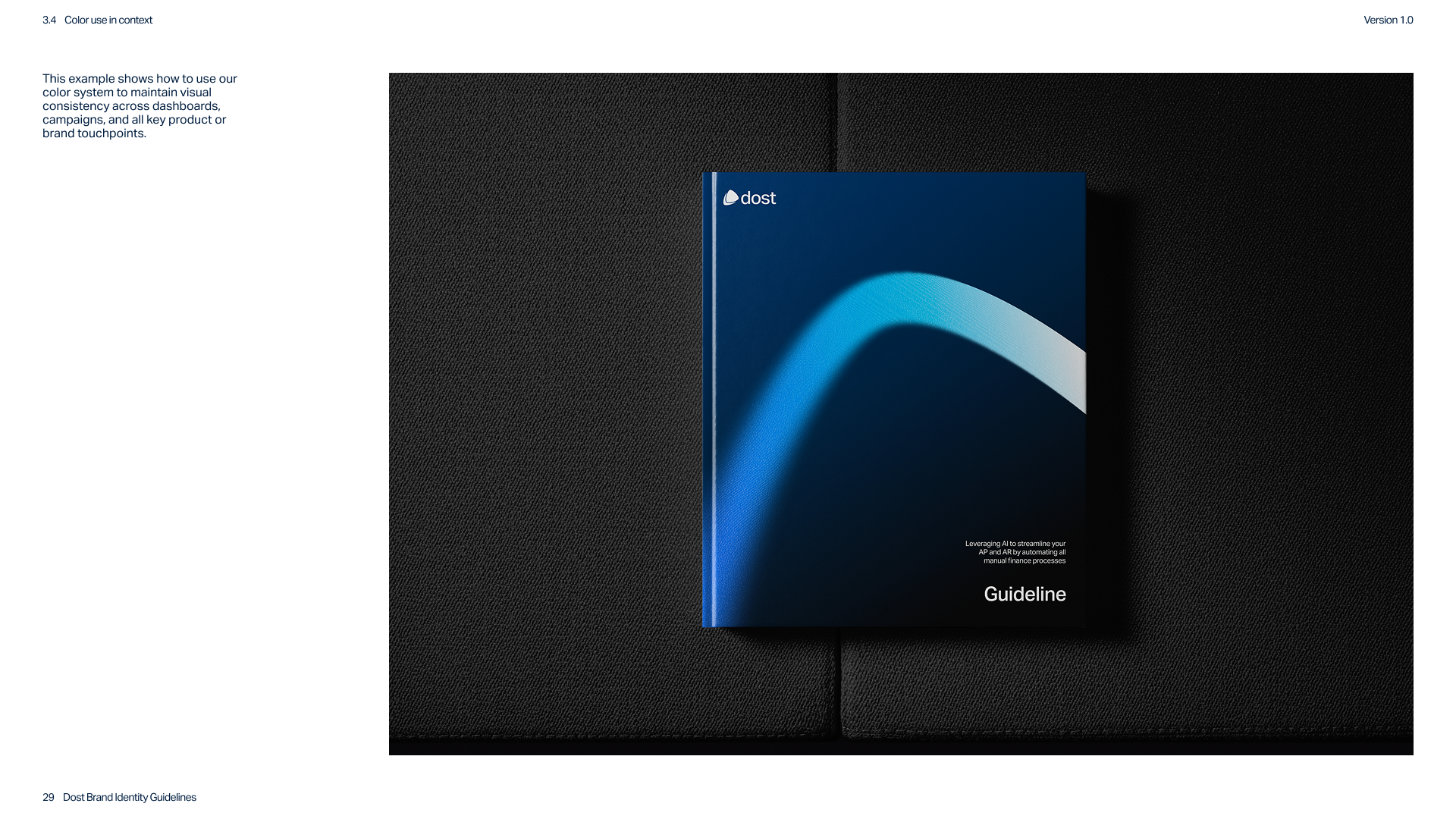
At the center of the identity sits an expressive gradient system that introduces depth and recognition while maintaining a clean and controlled appearance. The gradients provide a distinctive visual signature across product and marketing.
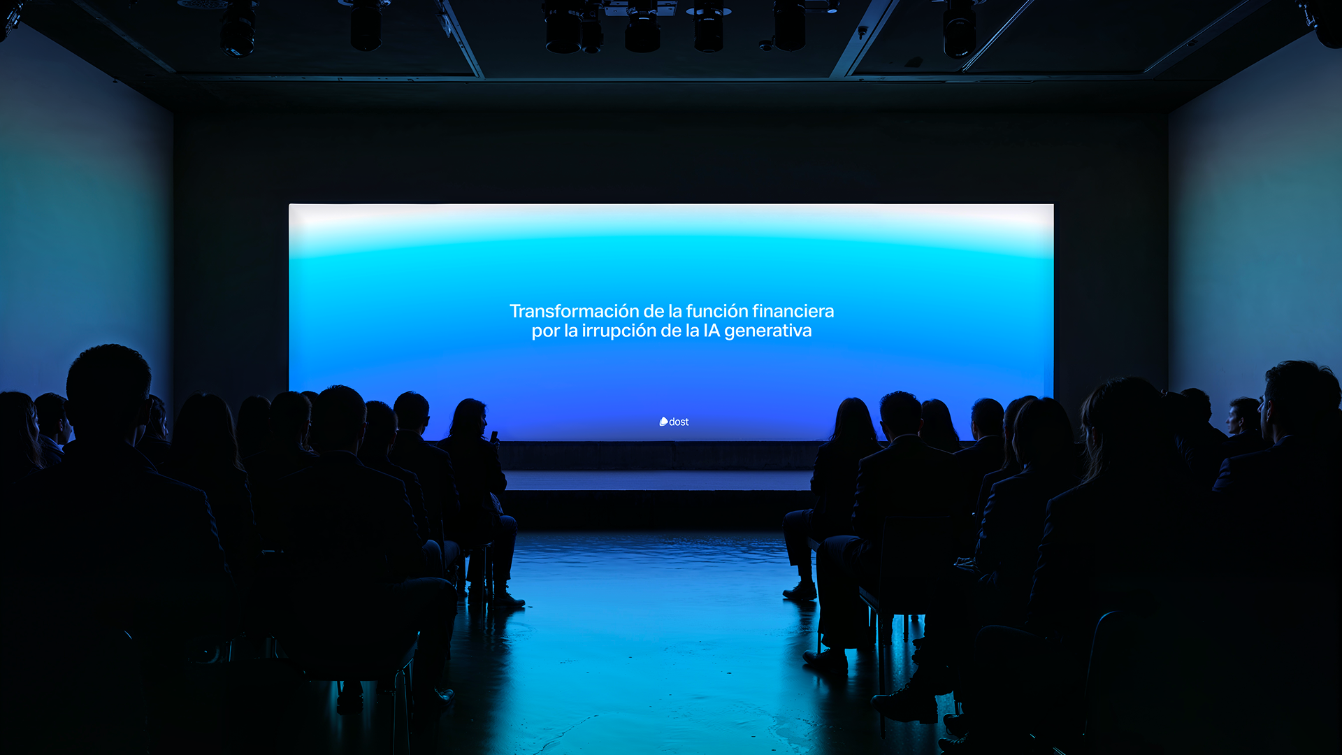
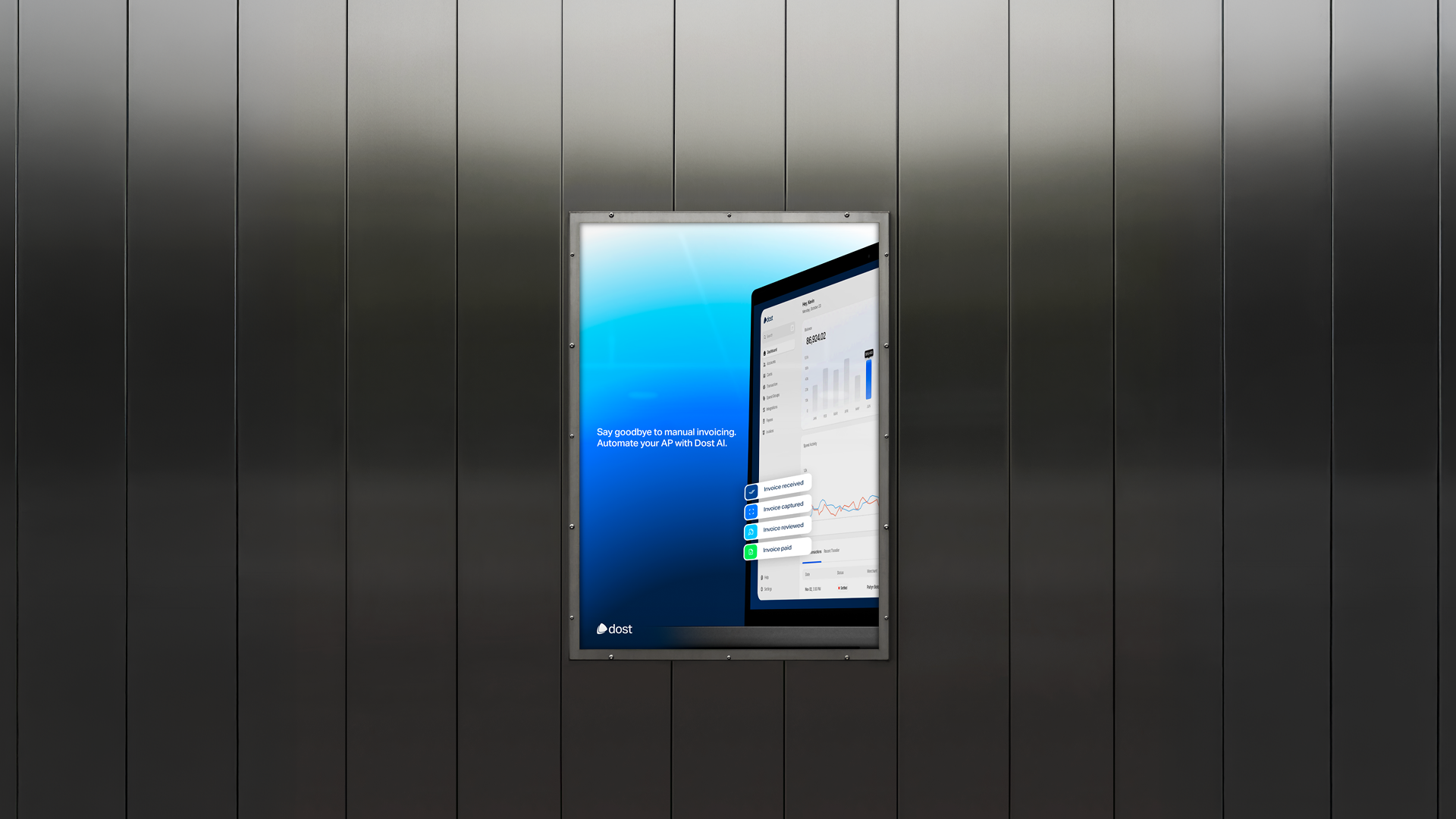
Together these elements form a complete brand system designed to support Dost across dashboards, marketing materials, and digital touchpoints.
Impact
The new identity gives Dost a clear and professional foundation aligned with the company’s growth. The brand now reflects the precision and reliability of the product while communicating clarity and confidence to finance teams.
The identity is currently being implemented step by step by the Dost marketing team using the brand guidelines as a foundation for consistent execution.
The company continues to grow rapidly, supported by a brand that is better aligned with its positioning and ideal customers. Dost now presents itself as a mature and reliable finance automation platform ready to scale.
Read how
Ariadna Batlle Bonet
experienced our collaboration

At Dost we had built something genuinely powerful. An AI-native platform solving a real, high-stakes problem for finance teams. What we needed was a brand that matched that ambition. Our communication style was still finding its voice, and as we scaled across markets we knew we needed a more "techie" identity that breathed authority and expertise the moment you encountered it. Something consistent, deliberate and unmistakably ours. We weren't fixing a broken brand. We were levelling it up to reflect the company we already were and the one we're becoming.
Working with Youri was outstanding. He didn't jump straight into design. He immersed himself in the business and our buyer personas, interviewing everyone who mattered: sales, marketing, product, the founders, success... Then he ran a four-hour workshop where, together, we built out the brand attributes, the communication style and the visual direction. It was incredibly dynamic, interactive and participative. Youri guided the whole thing brilliantly, and what really stood out was how he got the team comparing perspectives and aligning around a shared vision. He surfaced nuances in how we each saw the brand and brought everyone together around one clear, confident direction. That alignment alone was worth it.
The transformation has been remarkable. Dost now looks and sounds as advanced as the technology behind it. Fresh, professional and genuinely distinctive. We've achieved real consistency across every channel, along with a decisive communication style and a positioning statement we can own and repeat everywhere we show up. We've built recognisable brand assets that make Dost stick through repetition, so the brand compounds every time someone encounters it. It's a brand we're proud to put in front of CFOs, partners and investors. Youri is one of the reasons it punches at the level it does today.
Thank you Youri!


These scaleups raised €6M+
Rebrands
built to scale
Schedule a call and find out exactly what your brand needs for the next stage.