Opereit
Rebranded to Opereit. A month later, €2.5M pre-seed closed.
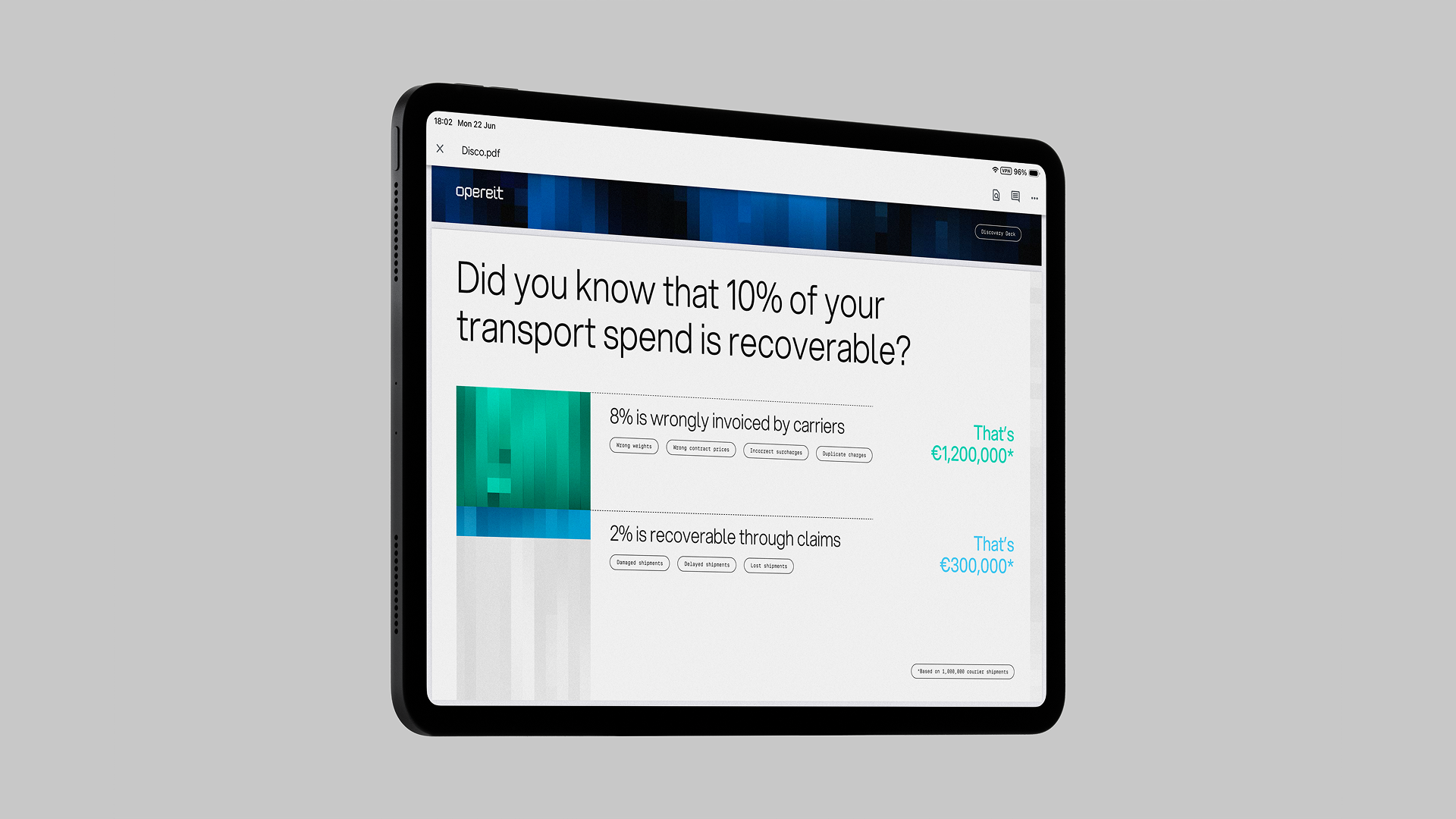
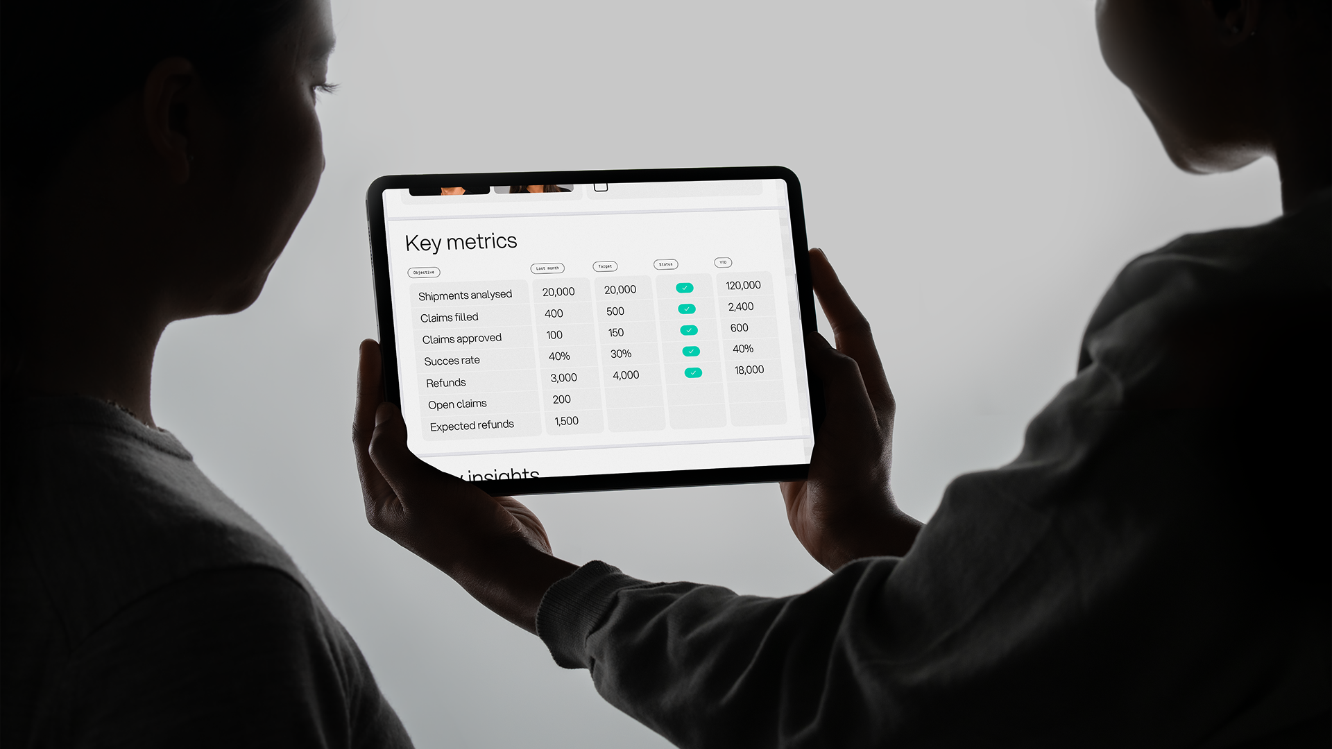
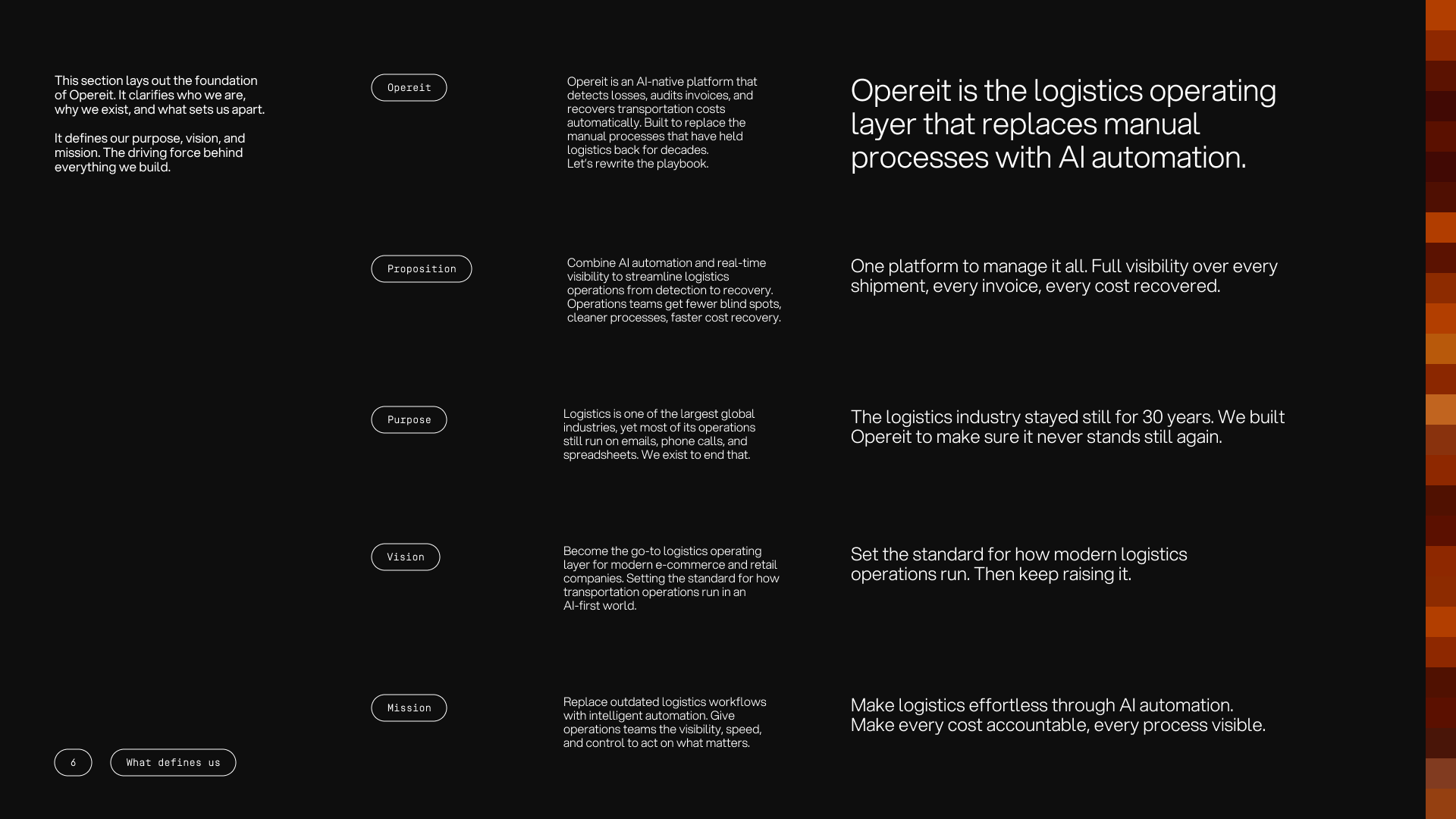
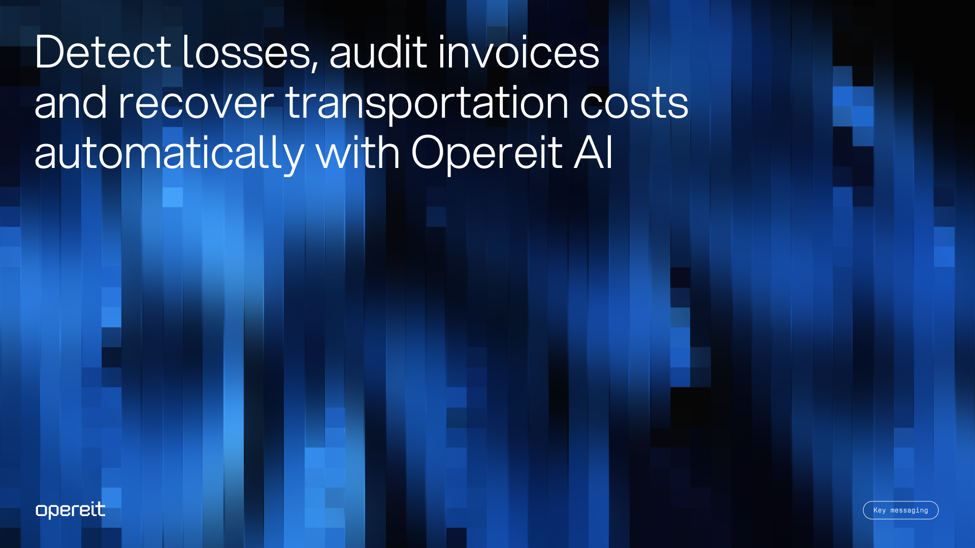
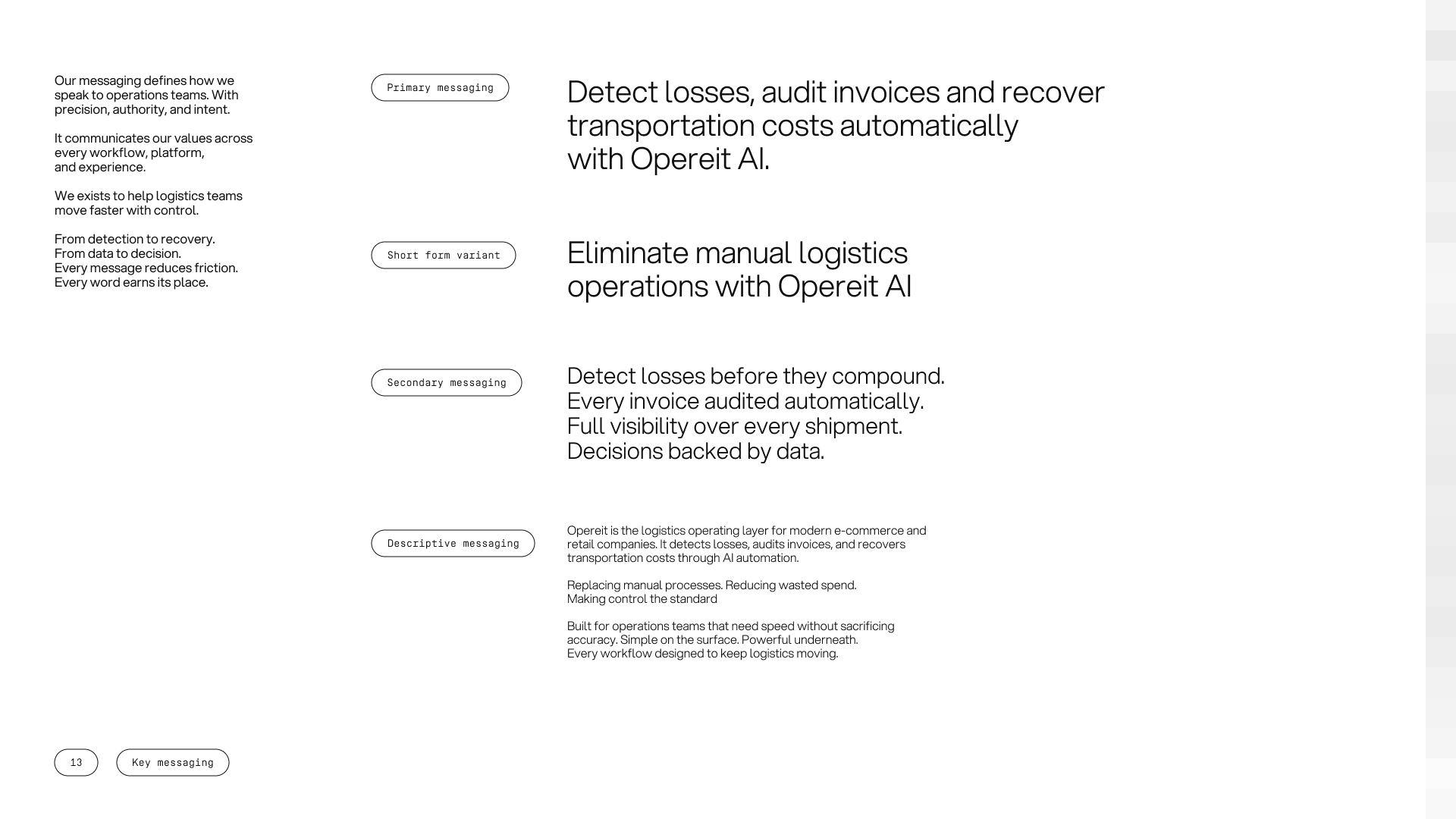
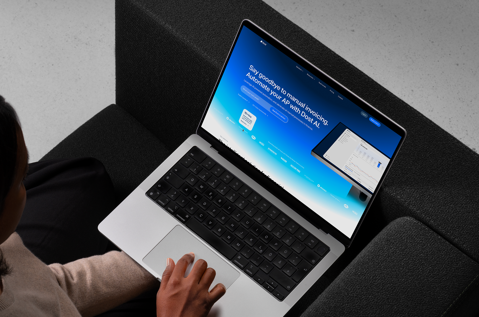
Opereit is an AI-native logistics and transportation platform. It helps logistics and operations teams recover transportation and shipping costs and gives them visibility over fragmented carrier data. It sits on top of a company's existing stack rather than replacing it, and goes live in about three minutes.
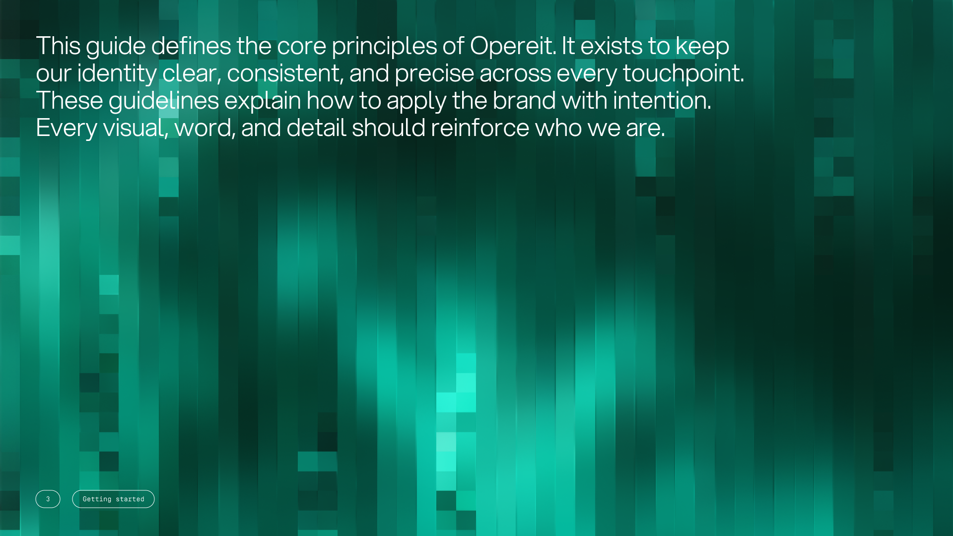
The identity below is the one Opereit took into their funding round, rebuilt over seven weeks ahead of the raise.
A name that was already taken, and a look that belonged to another era
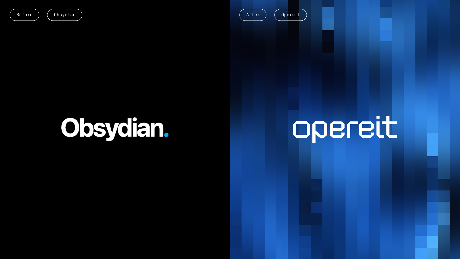
The old brand signalled the wrong industry and the wrong decade
Opereit was still Obsydian. A generic name, also taken by another AI platform. It said nothing about logistics, and pointed away from the category the product was built to lead.
The logo compounded the problem. A single logo. No strategy, no identity, no guidelines behind it.
The result was a credibility gap. A young, ambitious team needed to look trustworthy to investors and to the enterprise clients it aspired to serve. It was selling into a category that had not changed in 30 years, where 80% of logistics communication still runs on email, phone, and paper. The brand had to signal that Opereit belonged at the front of that shift.
Strategy first. The new name came out of it.
A brand workshop set the foundation, the brand system and name was built on that
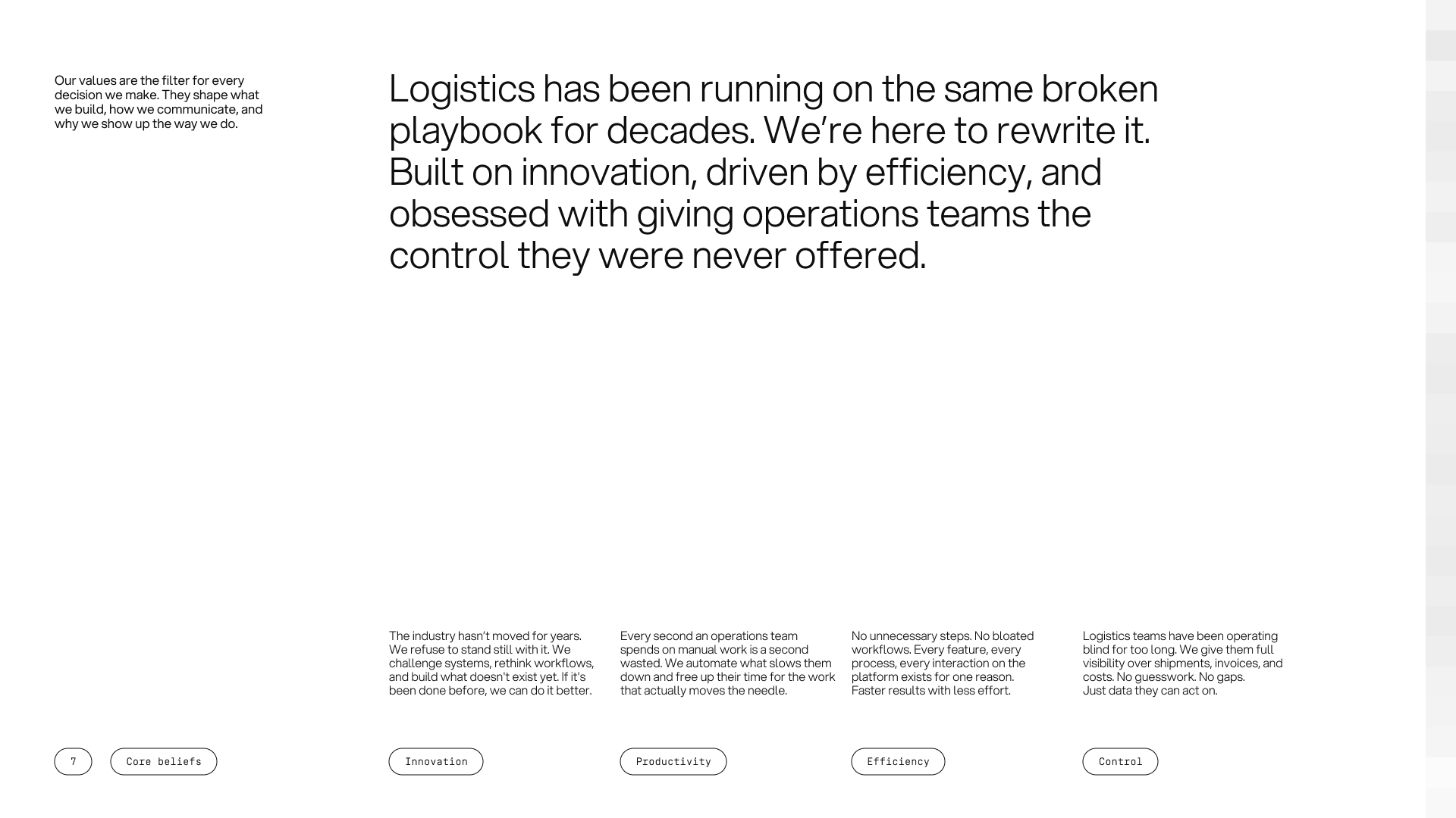
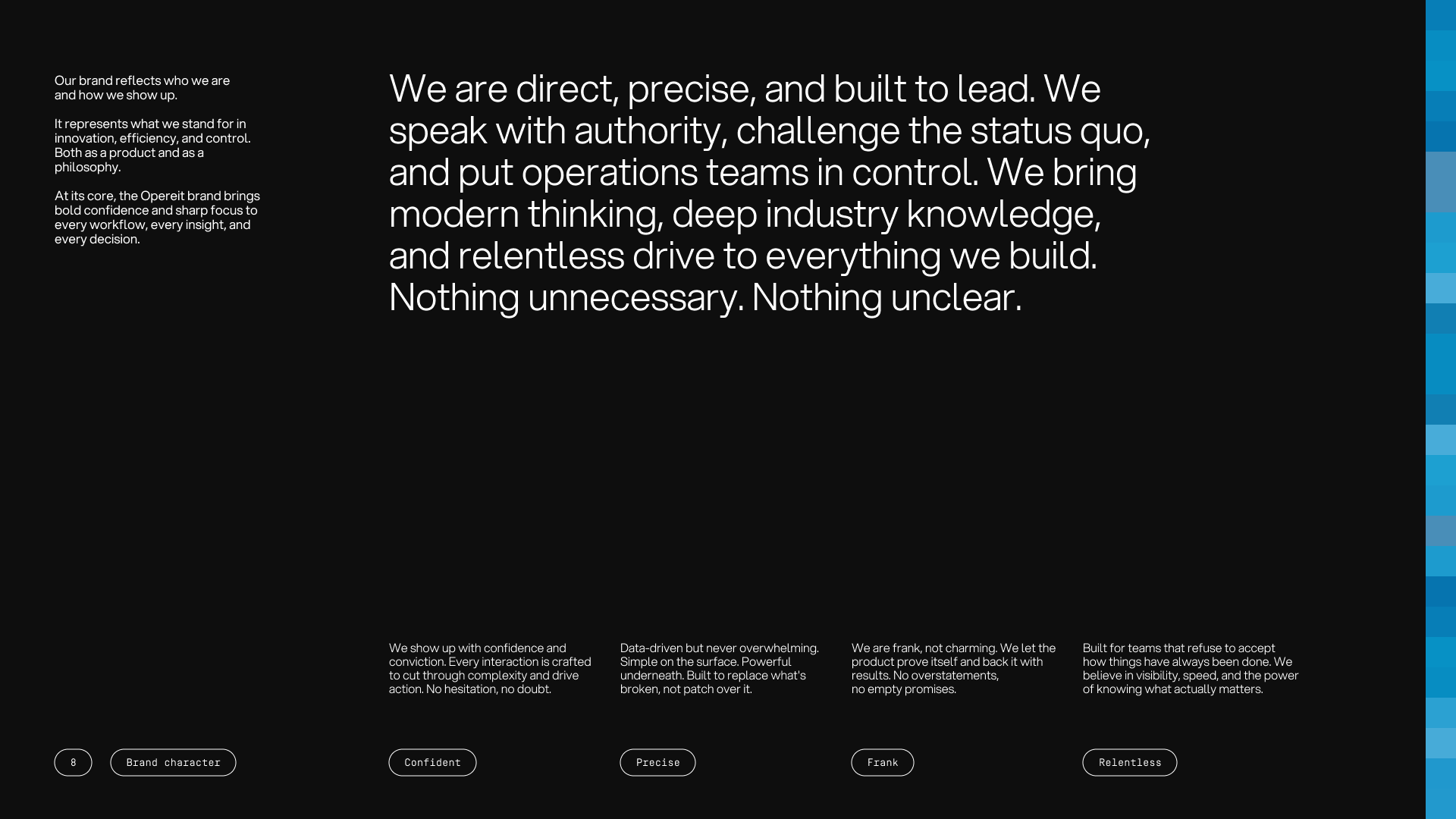
The project opened with a strategic workshop to define Opereit's positioning and foundations. We landed on innovation, productivity, and efficiency as the core values, with control supporting them, the things operations teams are rarely given and the brand now promises.
The positioning paired authority with disruption, confident enough to lead and bold enough to challenge an industry that had stopped moving. It set Opereit apart from the incumbents in the category, modern and expressive where they stayed reserved.
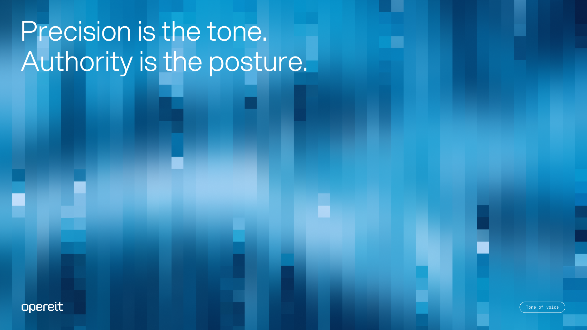
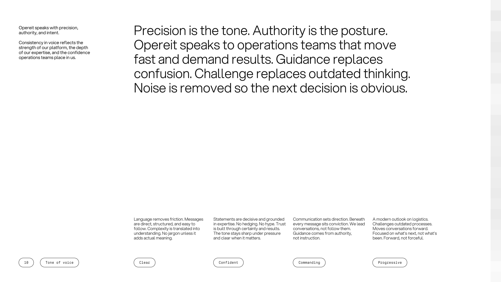
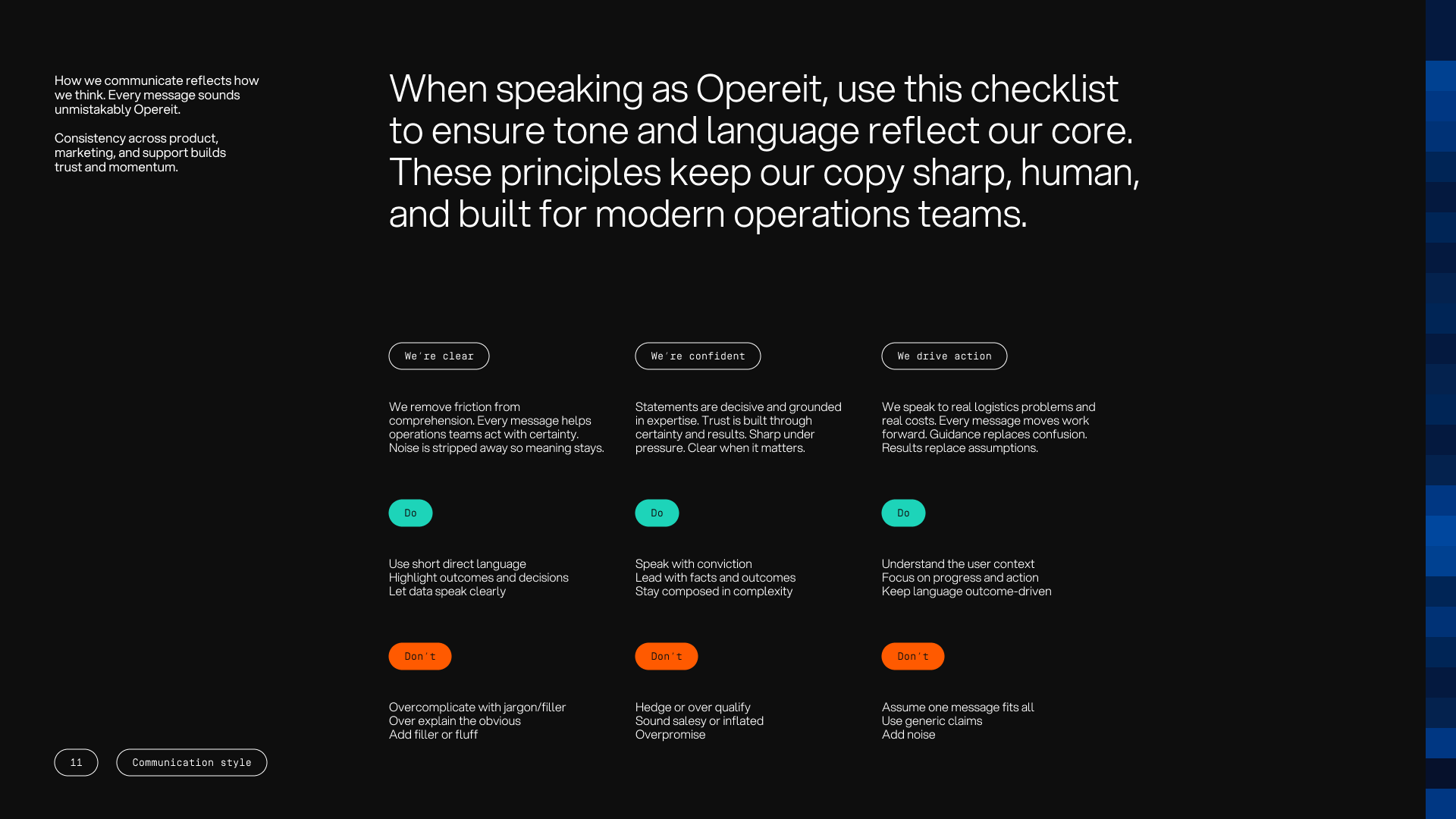
The name came out of the same process. The directions explored in the workshop led the founders to Opereit, a name they arrived at themselves and one that signals operations, intent, and forward motion. The voice was set alongside it, clear and commanding, direct without distractions.
An identity built on a grid, and a texture that never sits still
Every element engineered for precision and motion
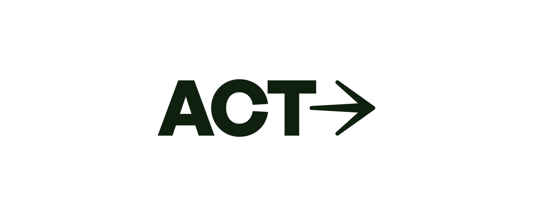
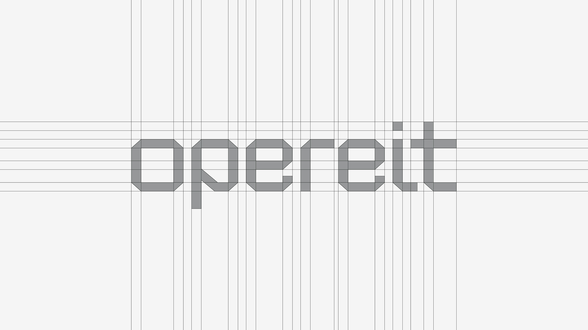
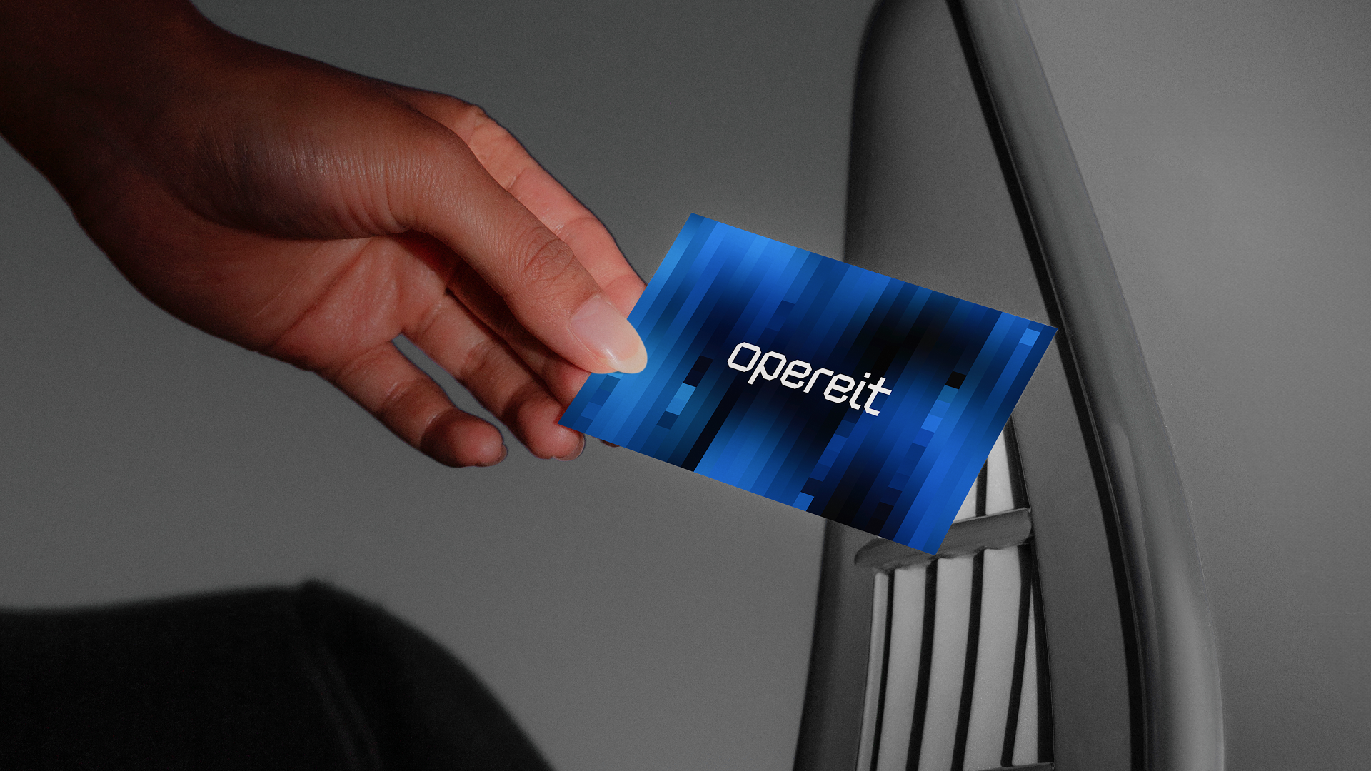
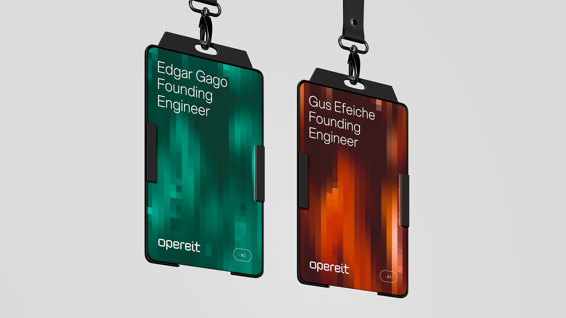
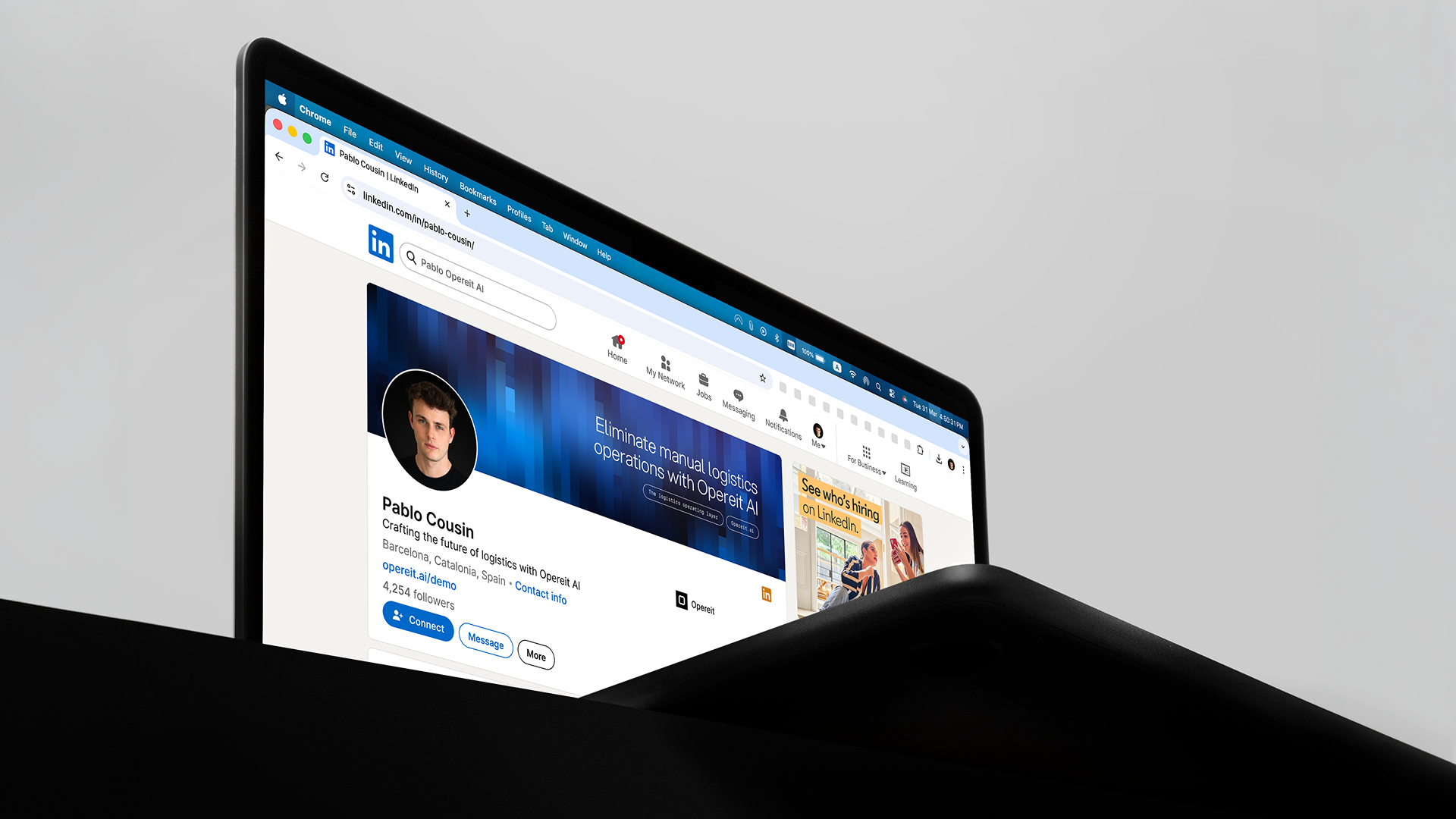
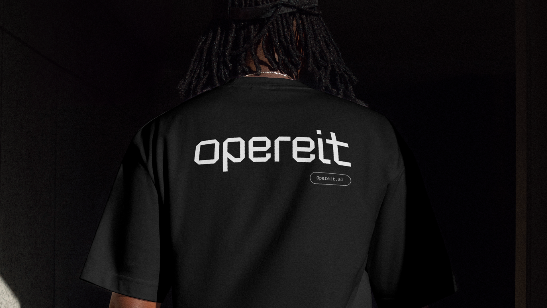
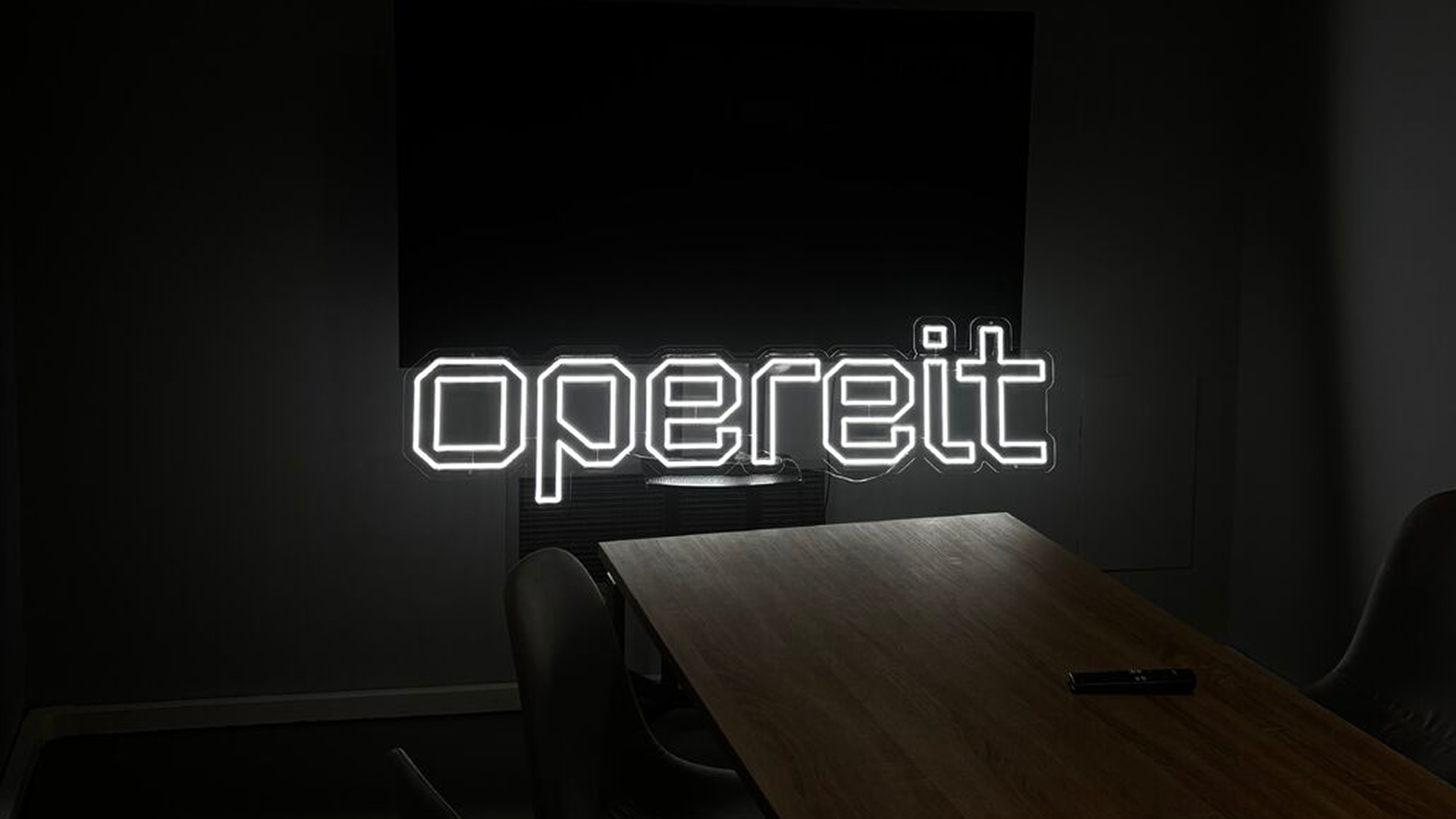
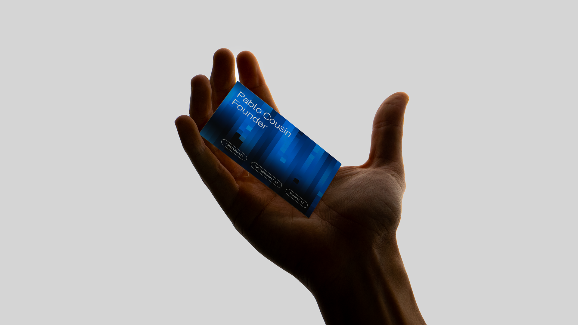
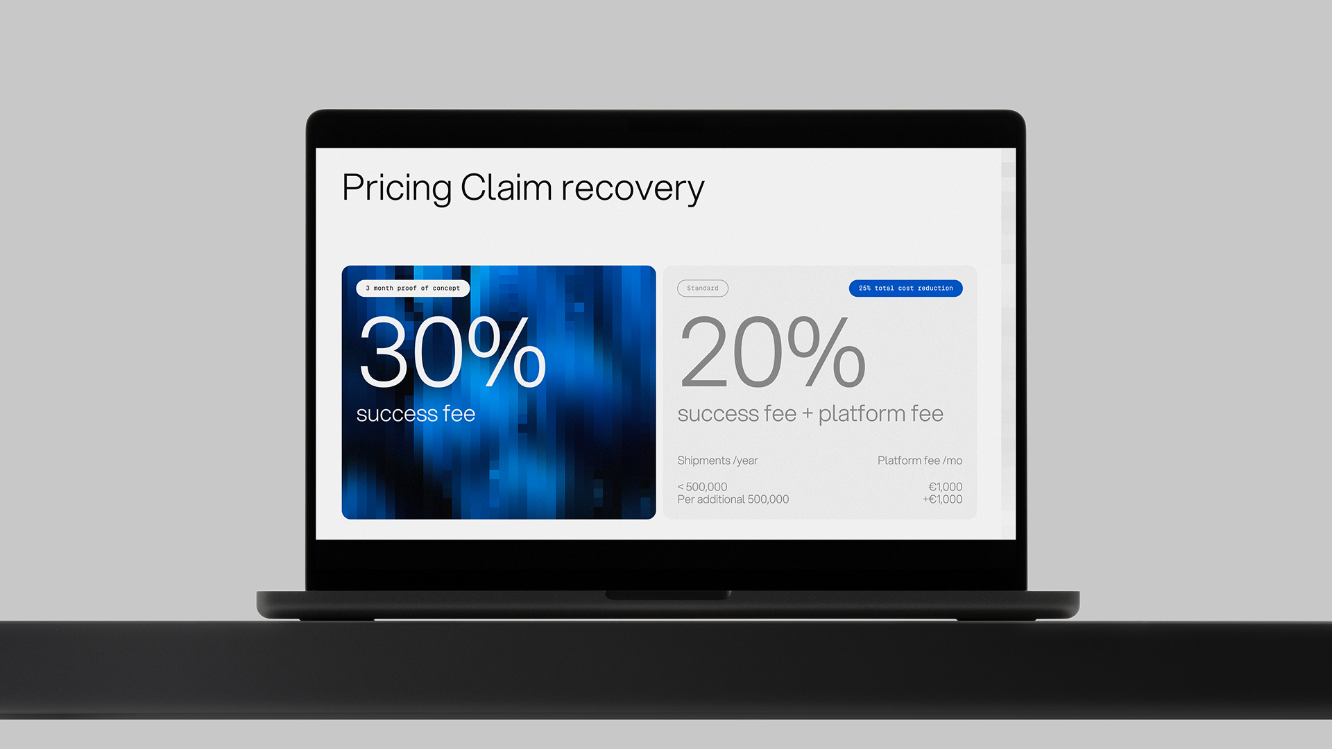
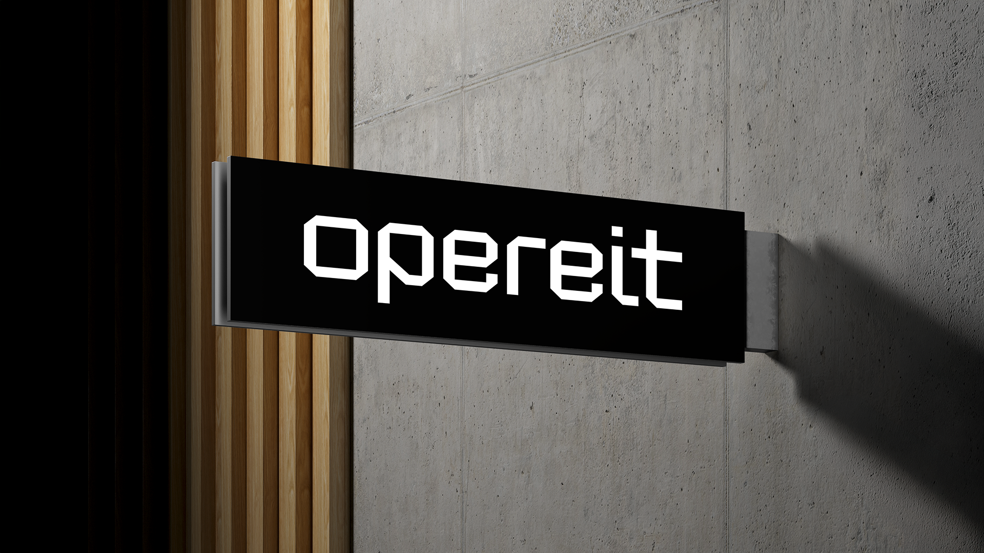
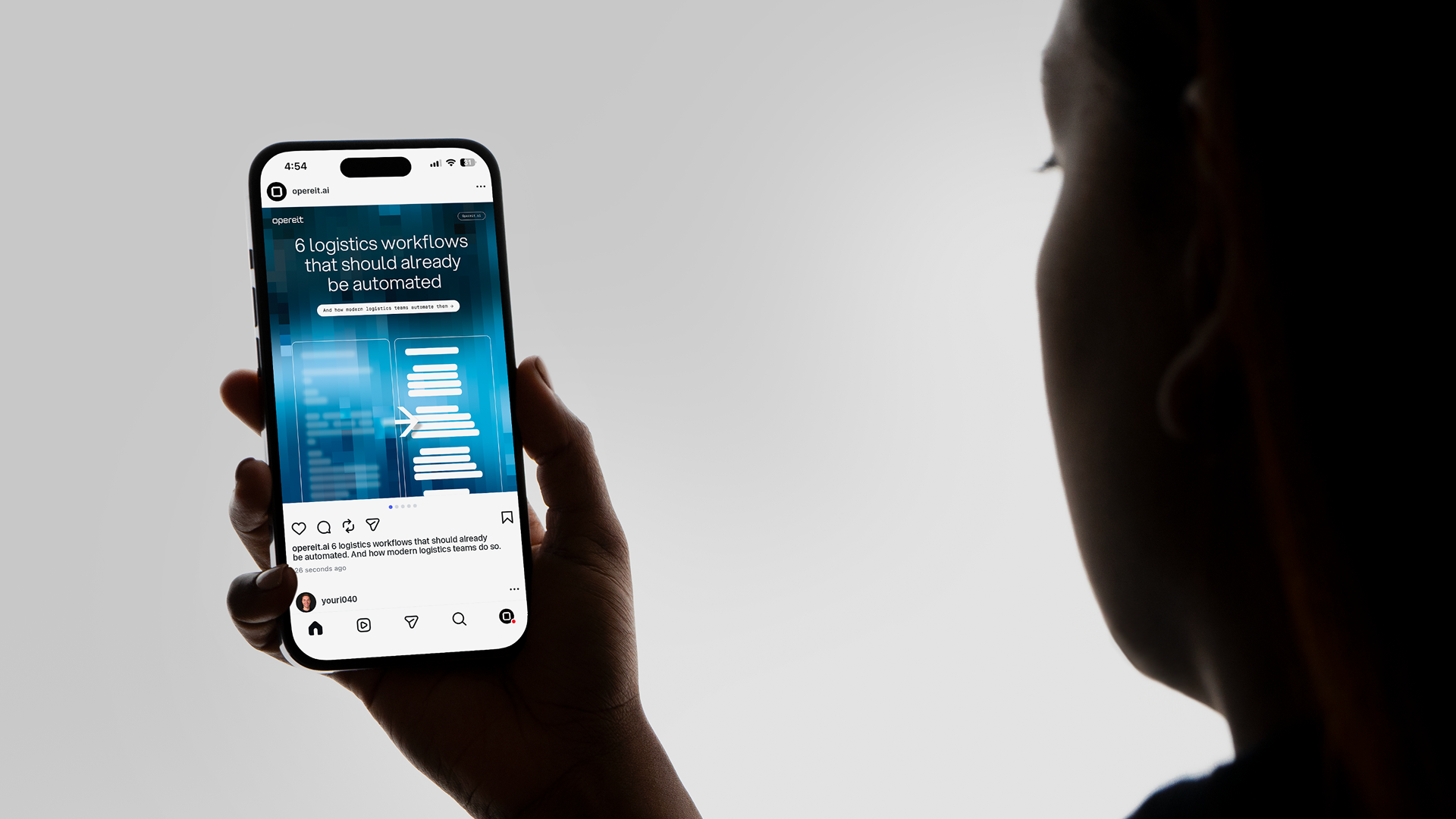
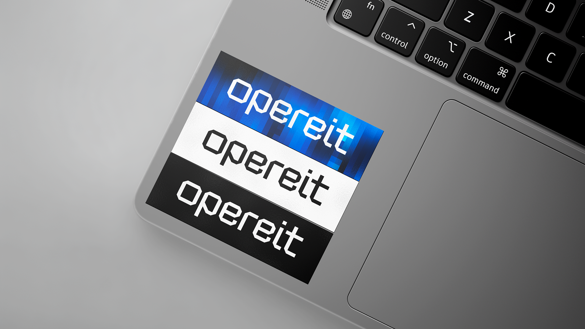
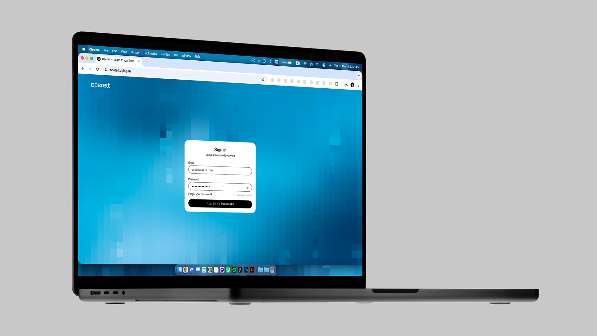
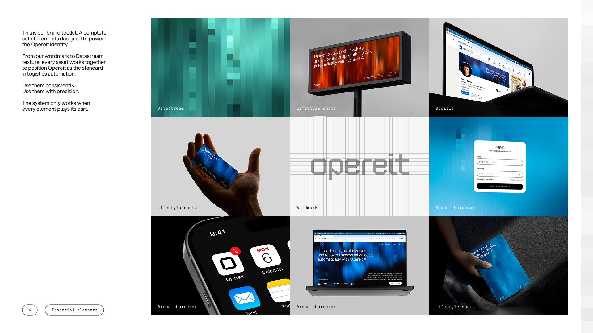
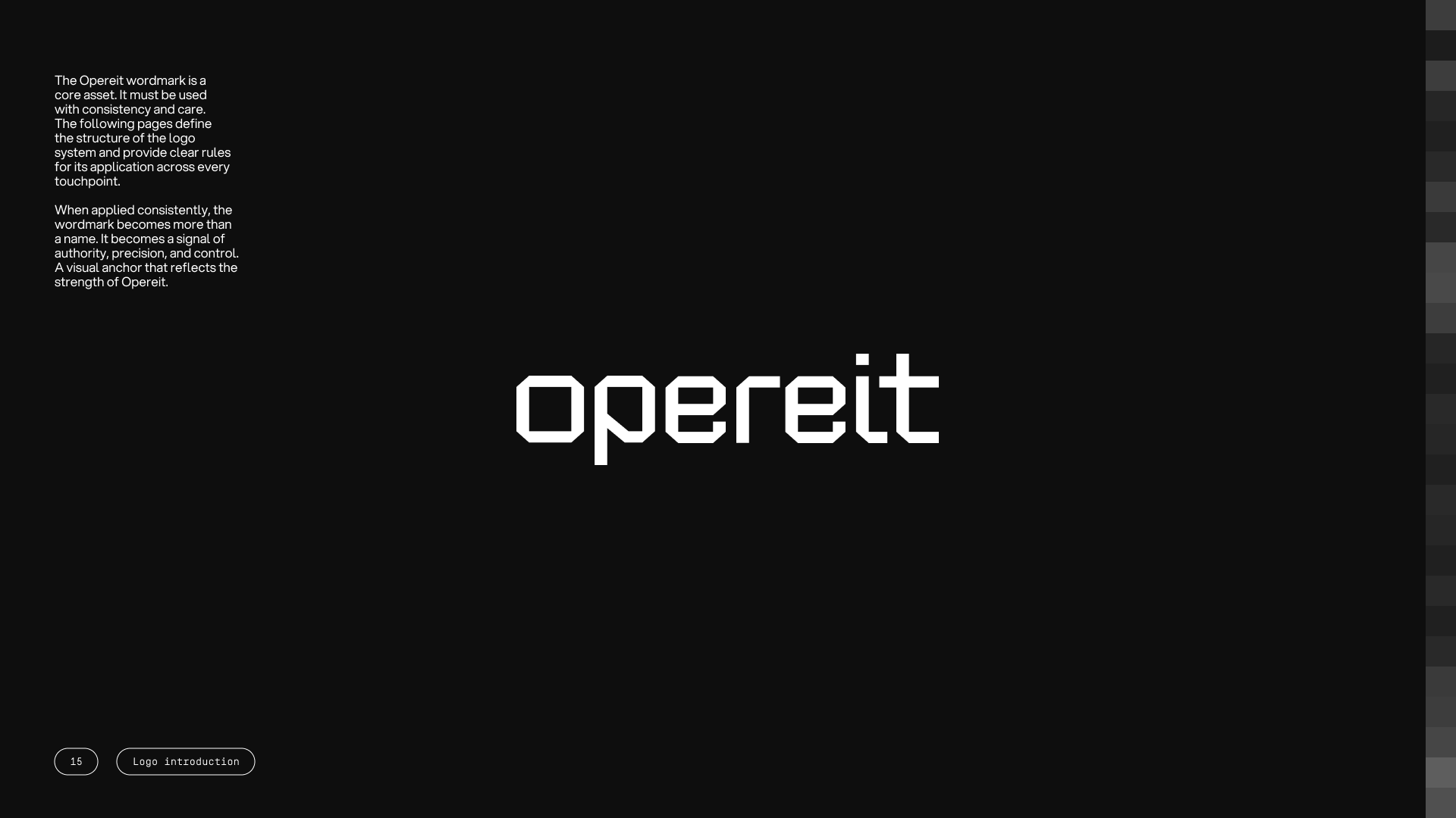
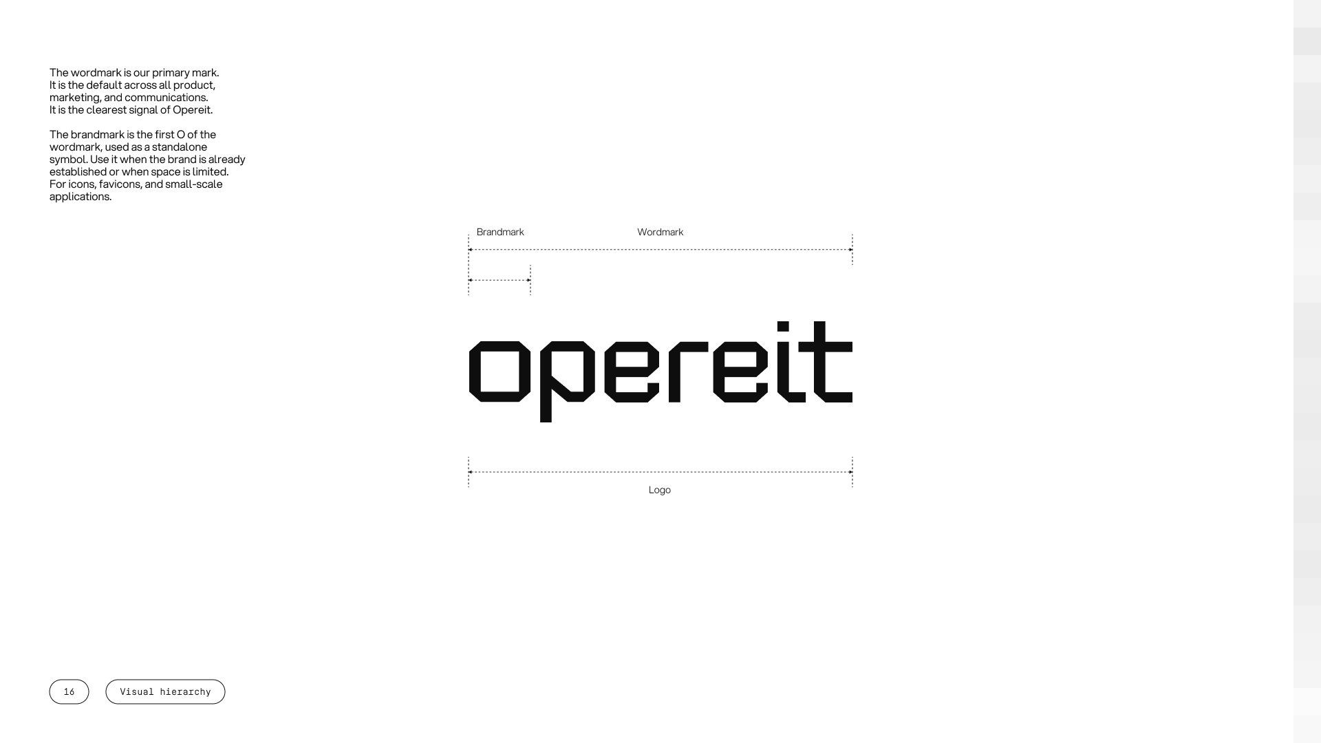
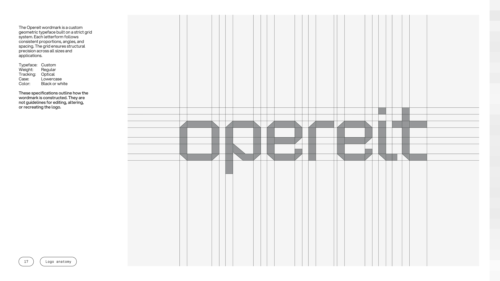
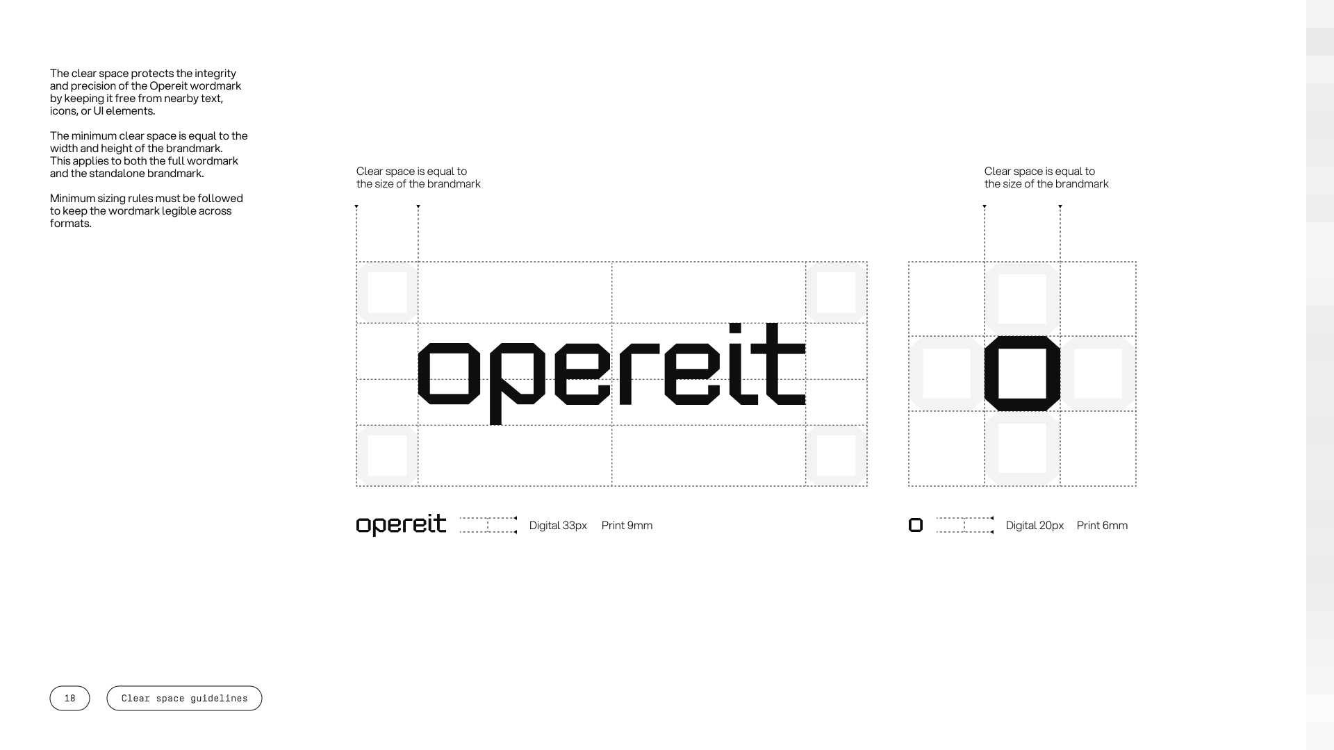
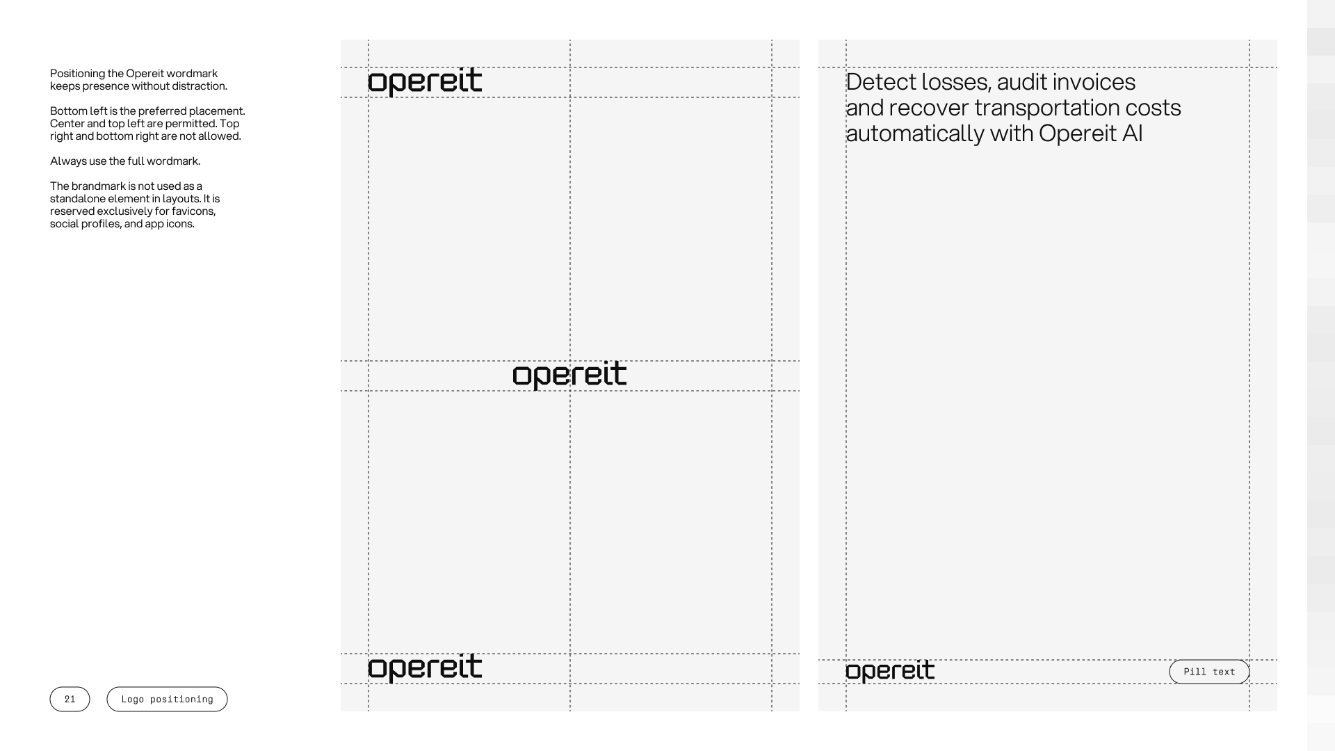
The wordmark is opereit, set in lowercase in a custom geometric typeface built on a strict grid. The letterforms are squared and cut with consistent proportions, so the mark reads as engineered rather than drawn. It is the clearest signal of the brand and the default across product, marketing, and communication.
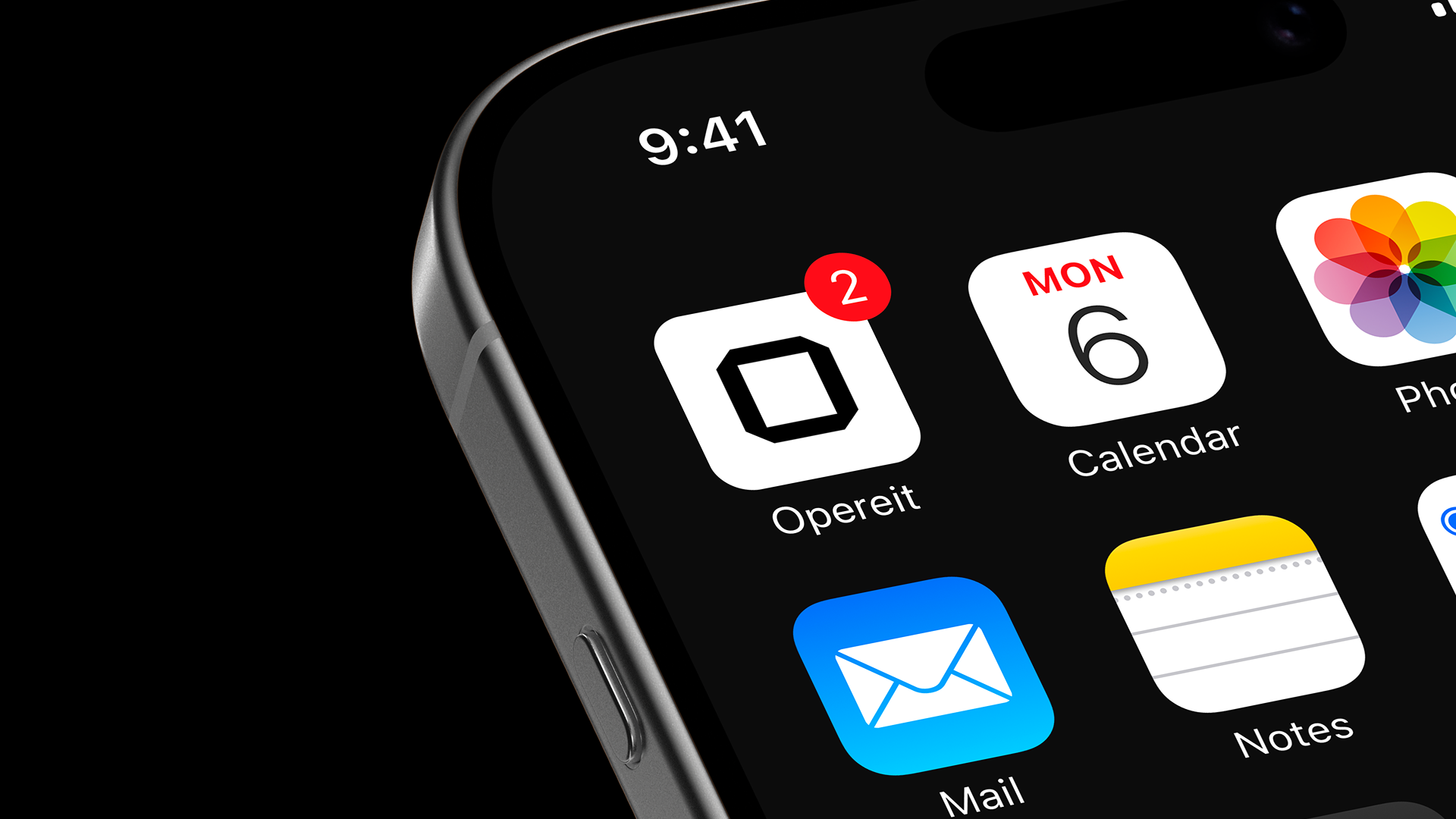
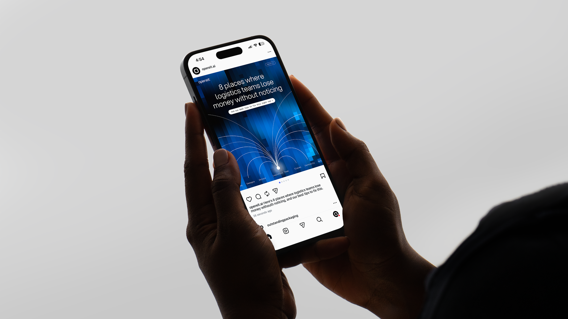
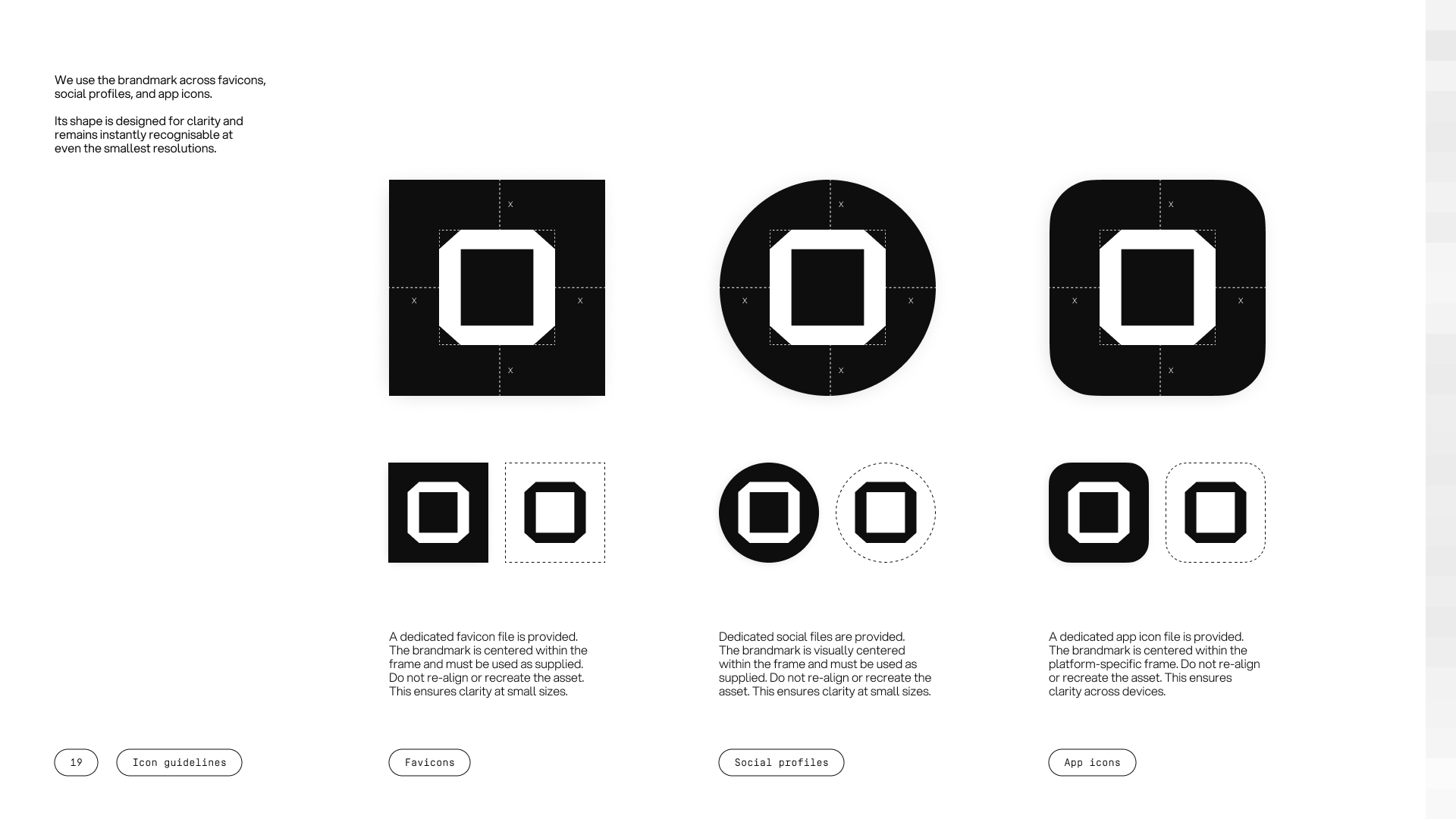
The brandmark is the first o of the wordmark, used on its own. It carries the identity at small scale across favicons, social profiles, and app icons, holding its shape where the full wordmark cannot fit.
Typography runs on Aspekta, an open-source geometric sans serif used for headlines, subheadings, and body in three weights. It reads as confident without being aggressive and technical without being cold. Simplon Mono is held back for buttons, labels, metadata, and interface micro-copy, where its monospaced structure signals precision.
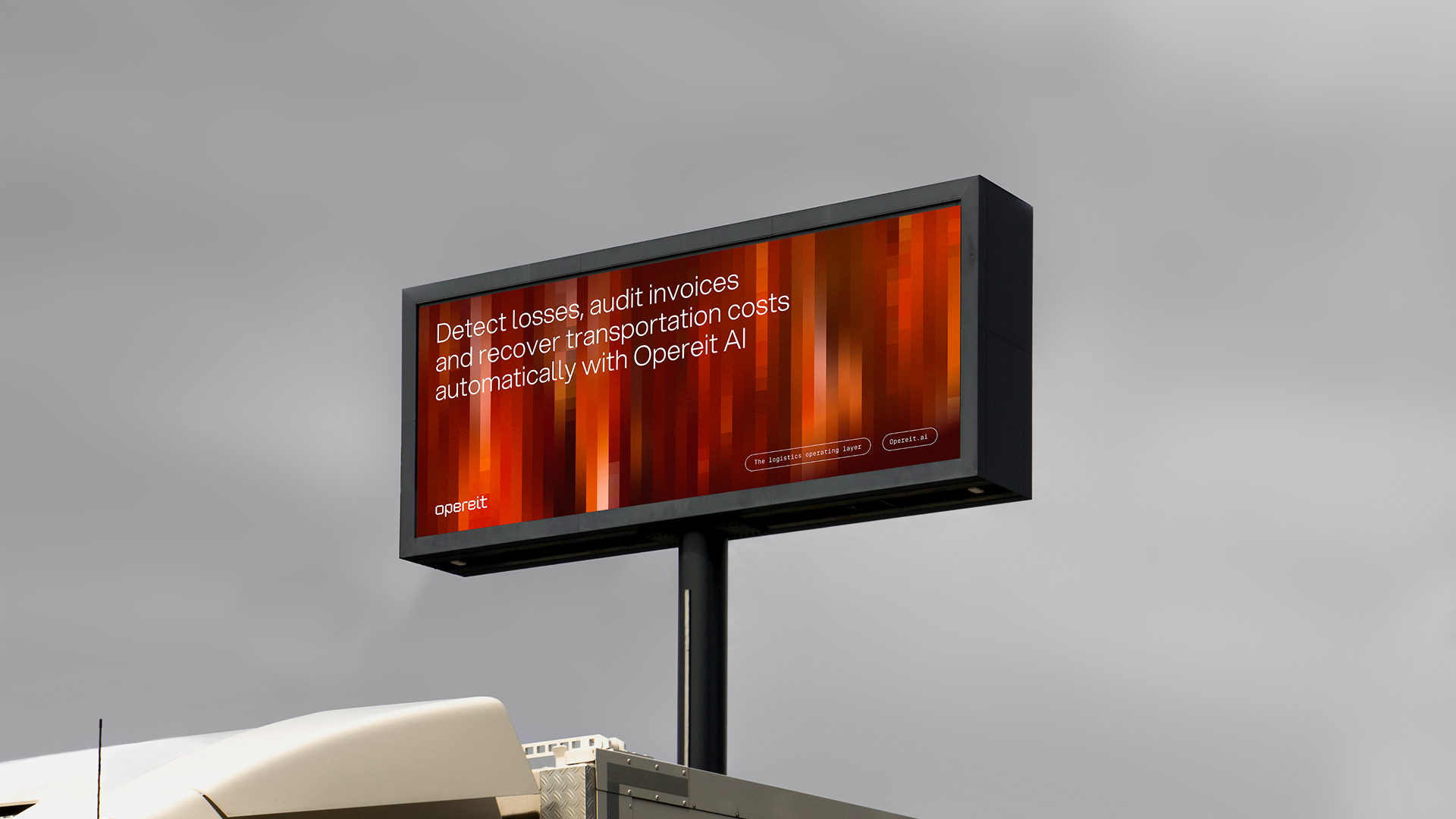
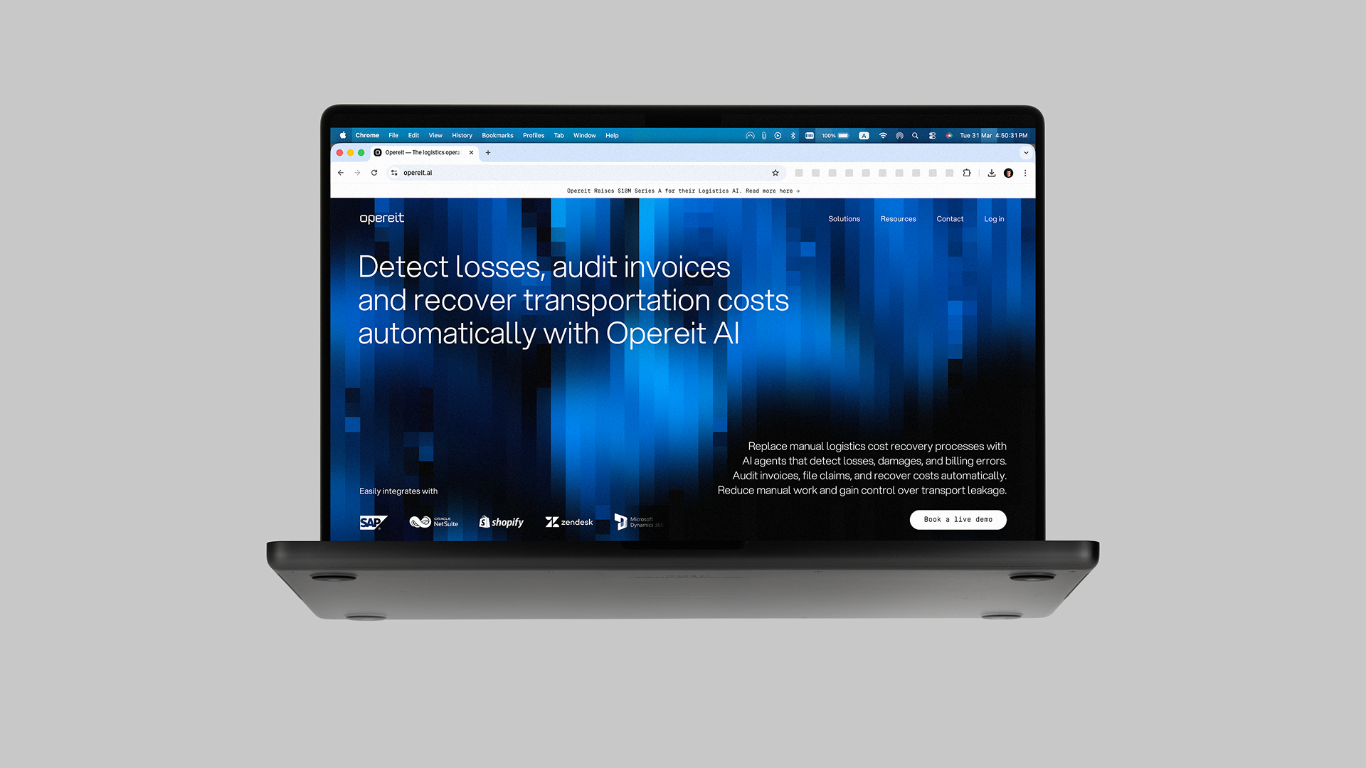
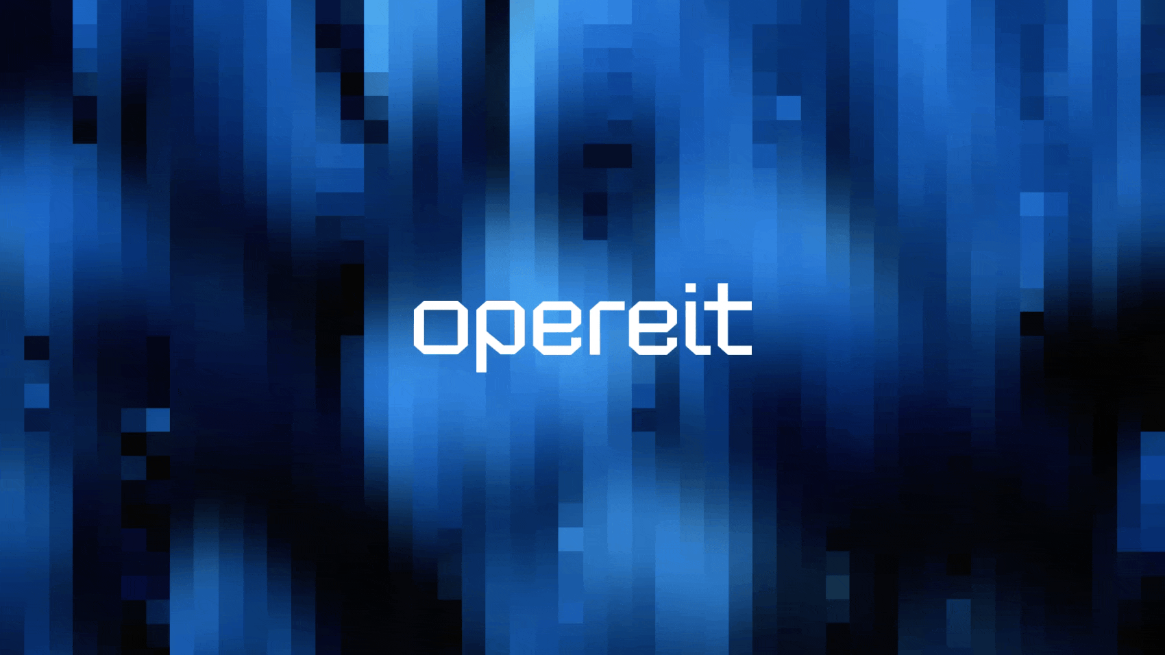
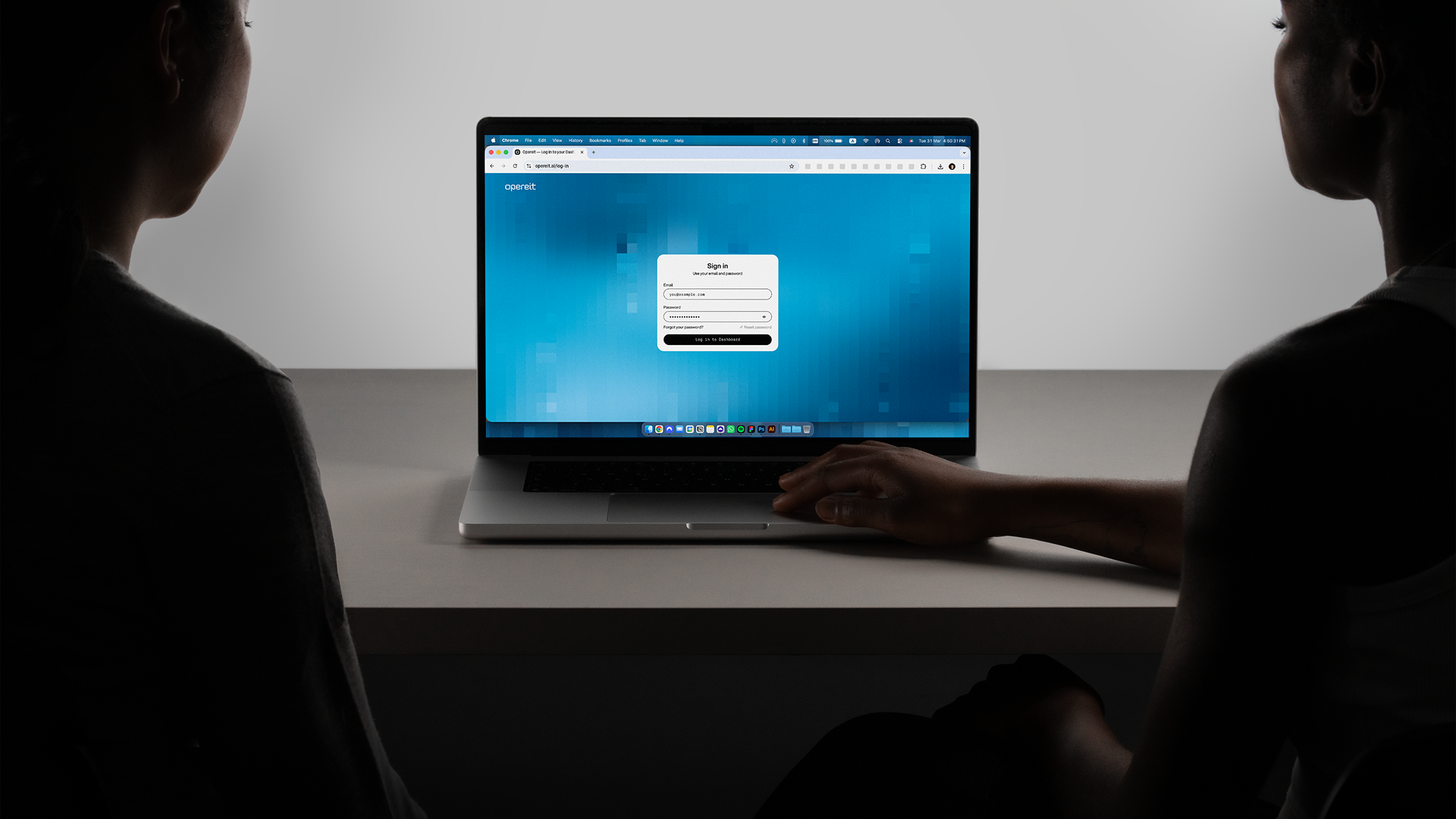
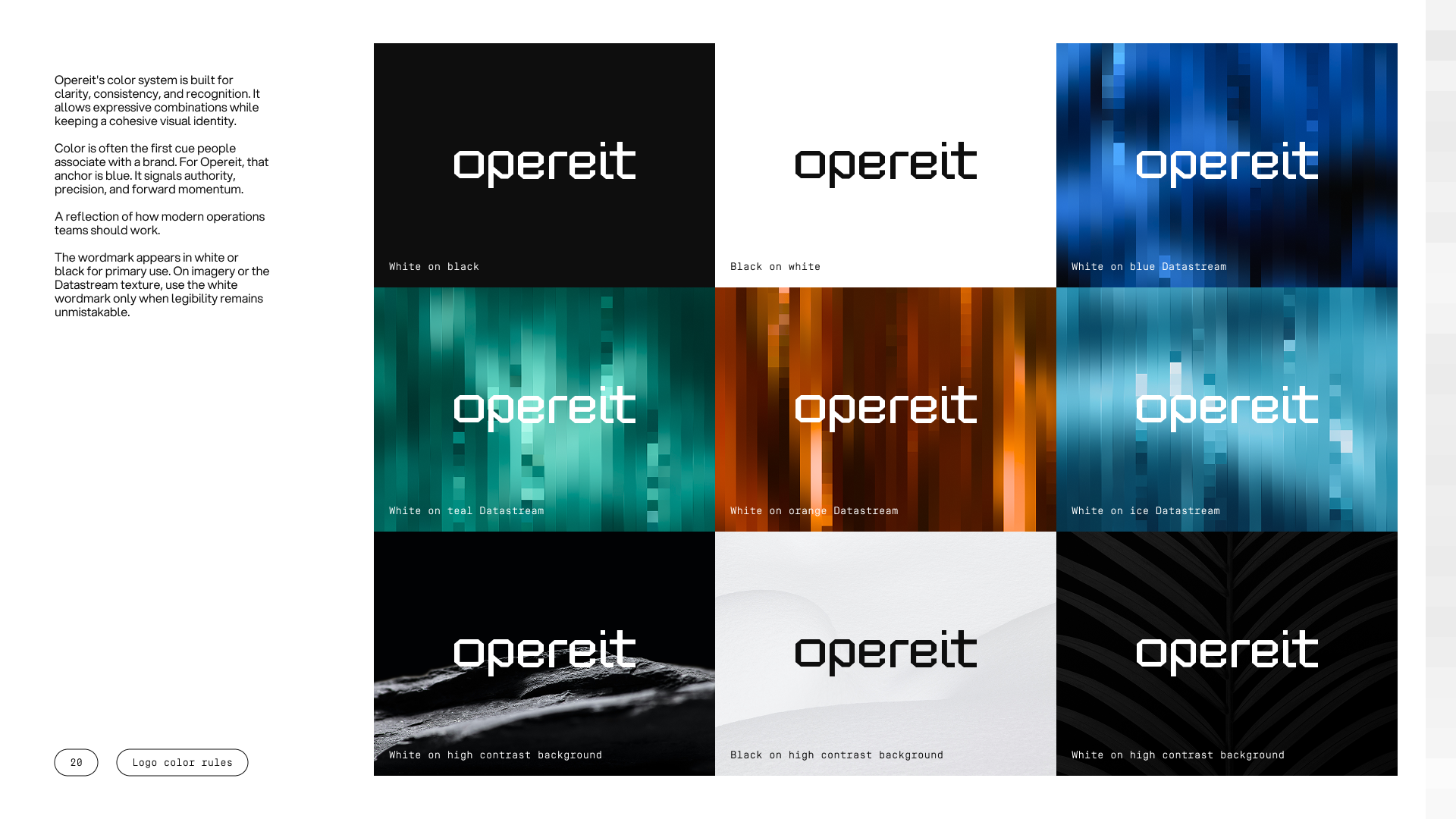
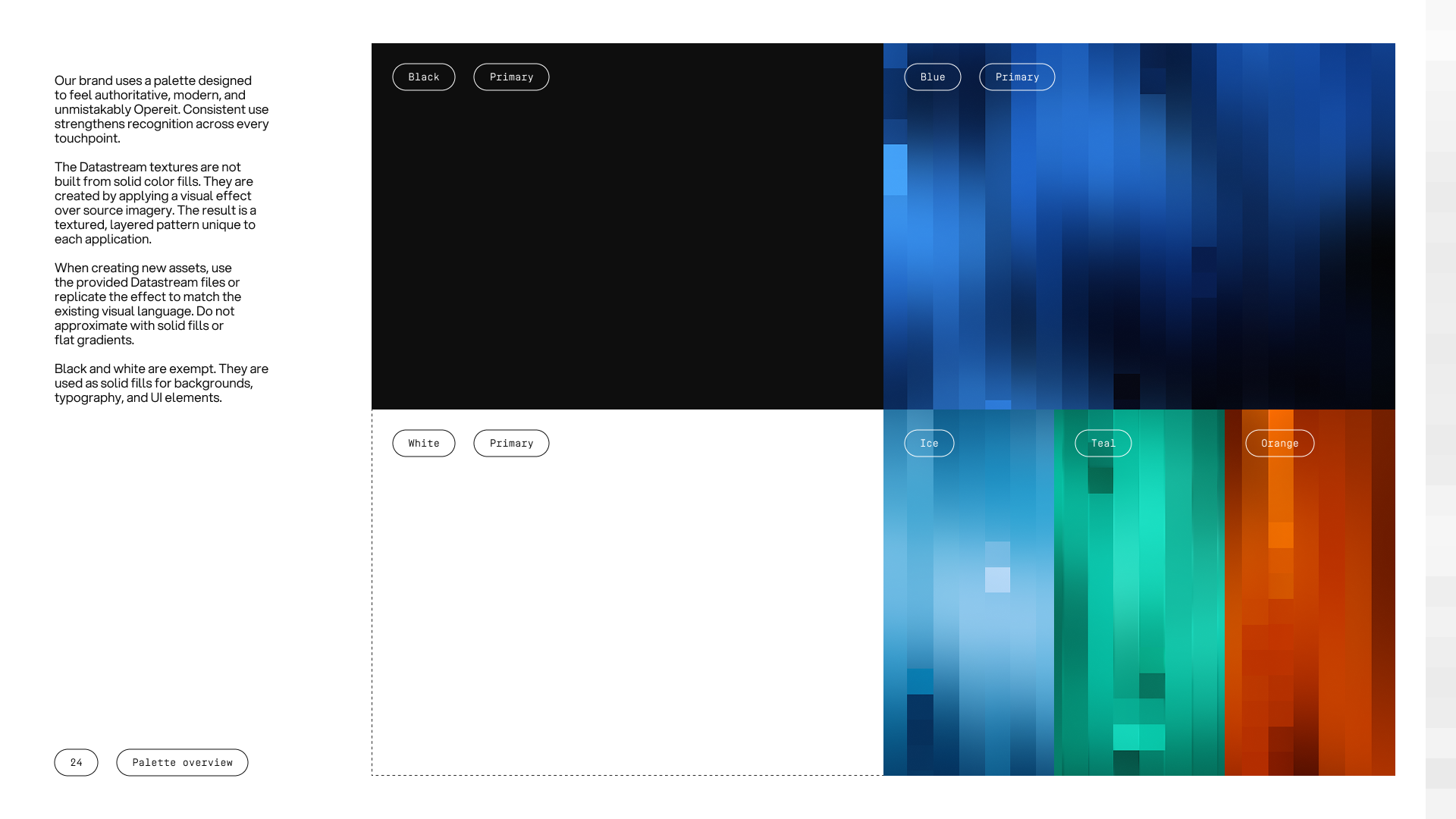
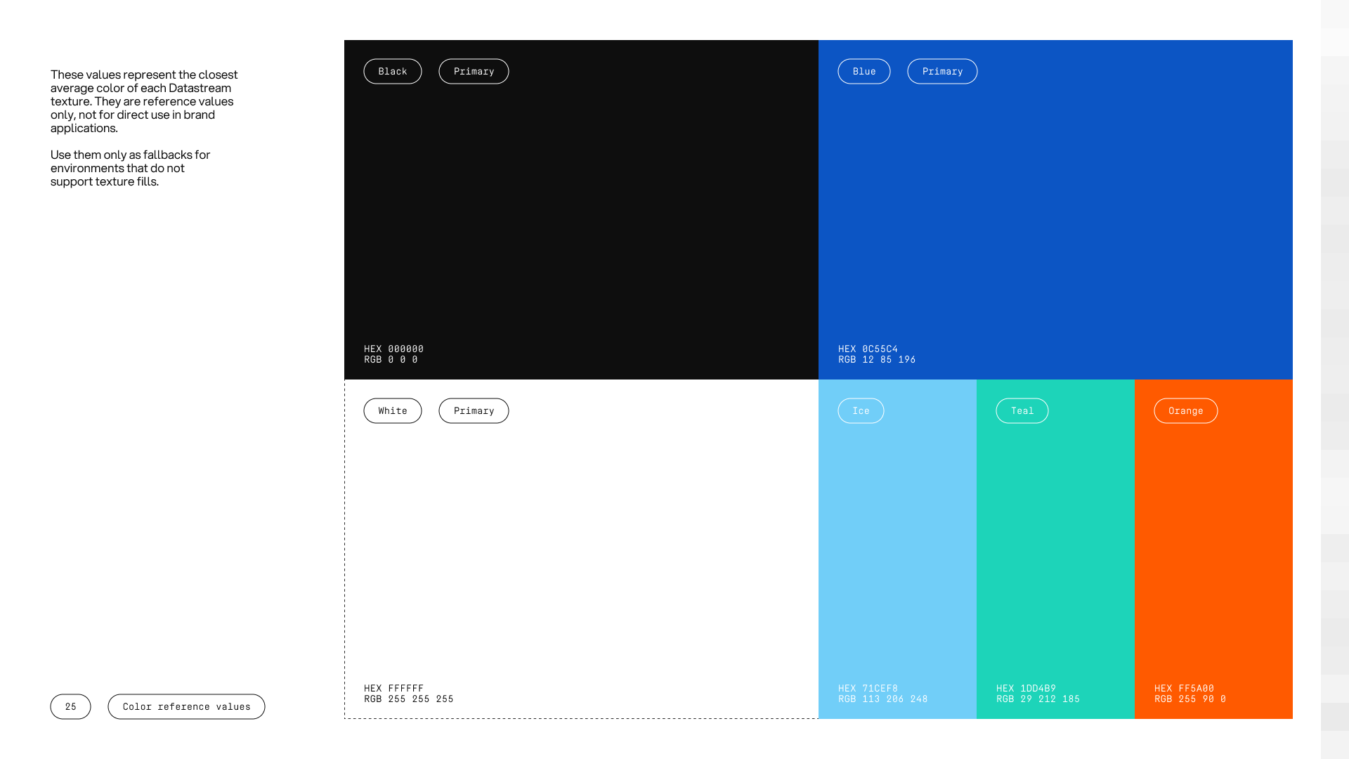
Colour is anchored in blue, with Ice, Teal, and Orange extending the system and black and white grounding it. The default is motion over flatness, with colour carried through texture more than solid fills.
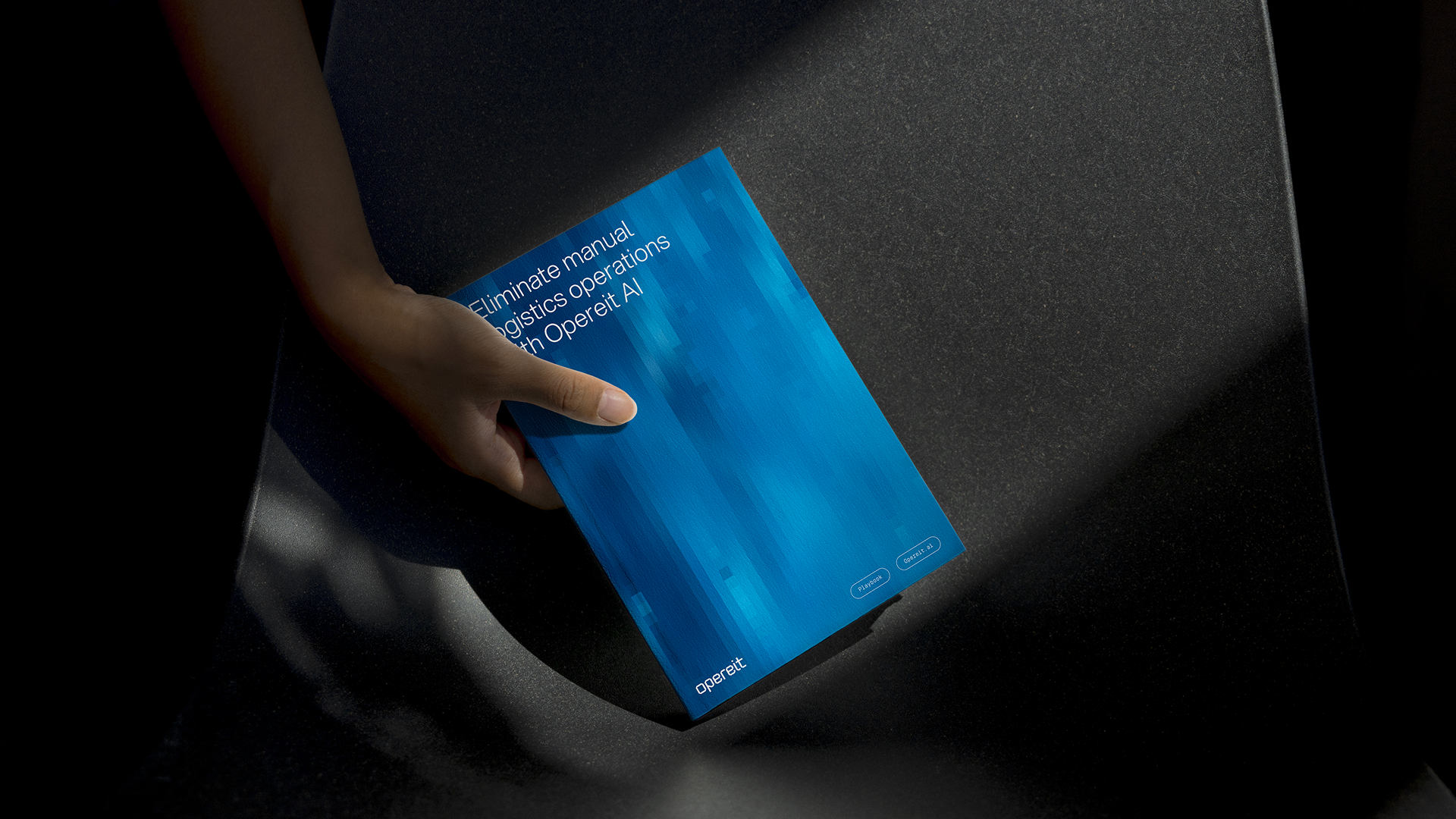
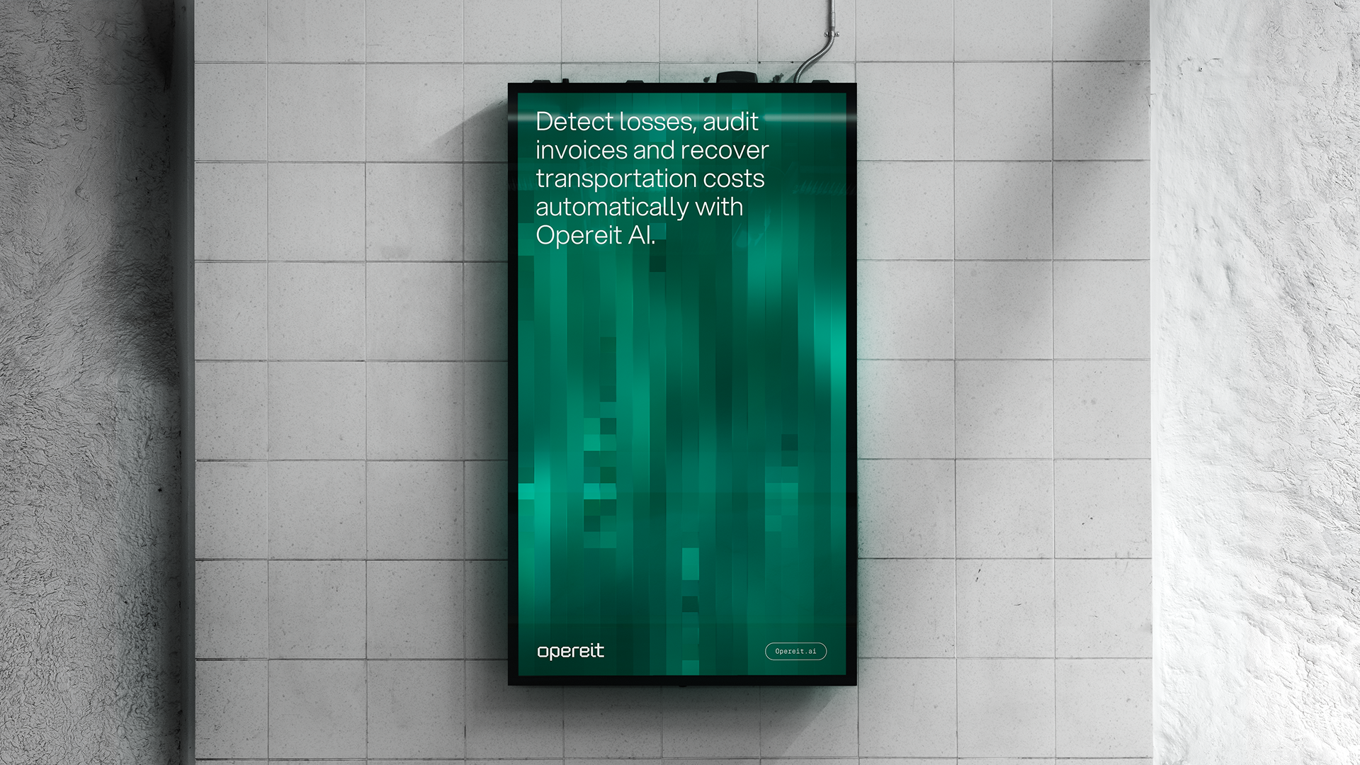
That texture is the Datastream, the signature device of the brand. It is a field of vertical fragments that reads as data in motion, never solid, always moving. It carries the brand across digital and print and gives it a surface of its own.
A brand ready for the room, and the raise that followed
From a credibility gap to enterprise presence
One month after the rebrand, Opereit closed a €2.5M pre-seed round. The identity was finished weeks before the announcement, ready for the deck, the room, and the conversations that followed.
The brand now reads the way the product works, precise, modern, and built to lead. The company that arrived with a single logo now has a full system, credible to investors and to the enterprise teams it wants to win.
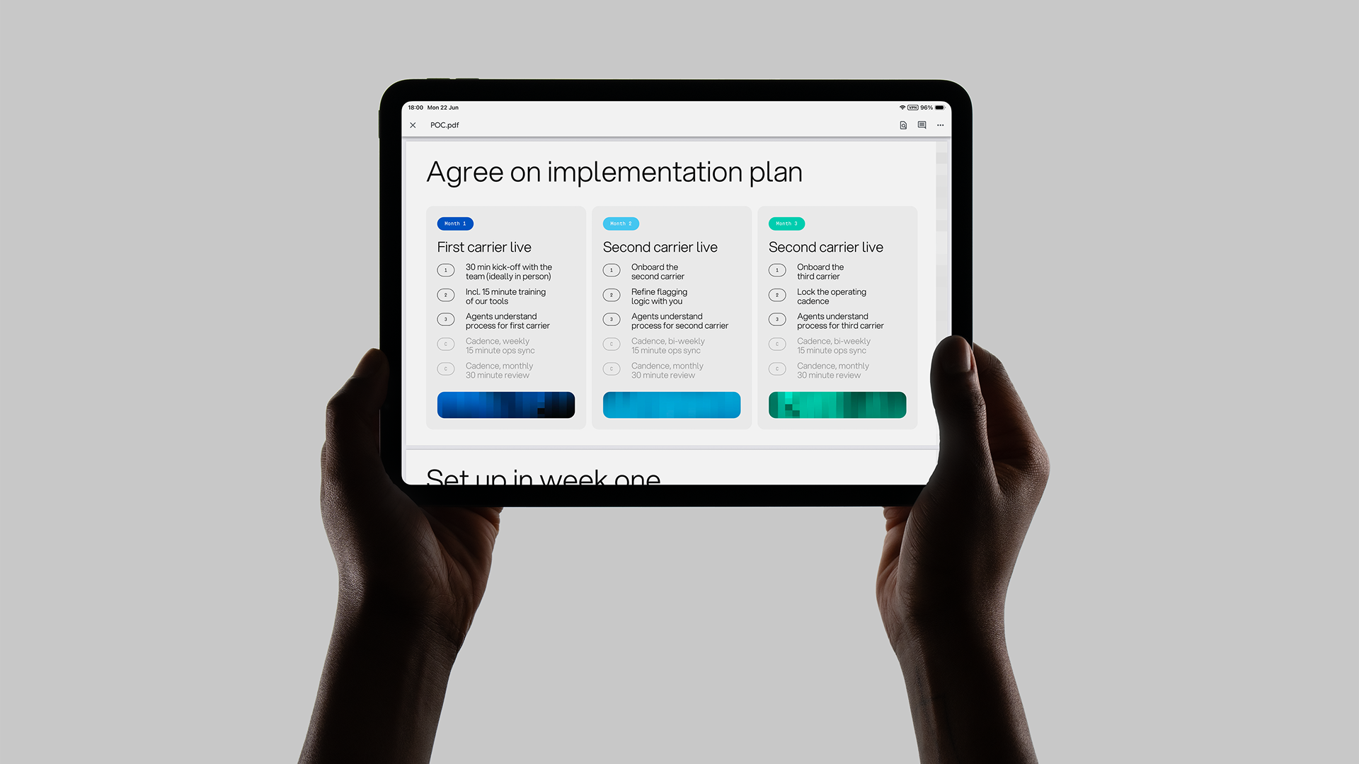
The work did not stop at the identity. We built pitch-deck templates the team uses to make their own decks, so the brand stays sharp in front of investors without a designer in the loop for every slide. For a company moving this fast, that is the difference between a brand that sits in a file and one the team actually runs.
For every Yvdh brand identity, we deliver an all-in-one online brandbook with everything a scaleup needs to raise and scale. Strategy, creative direction, assets, templates, and guidelines, in one system the team can run from the first investor deck to full rollout.
Read how
Pablo Sevilla
experienced our collaboration

Youri has been behind the full Opereit branding from the start, helping us turn the product and vision into a brand that feels sharp, modern and very recognisable. He understood fast what we want to communicate and always managed to make things look much better than we imagined.
Great designer, very easy to work with, and someone we’d fully recommend.


These scaleups raised €6M+
Rebrands
built to scale
Schedule a call and find out exactly what your brand needs for the next stage.